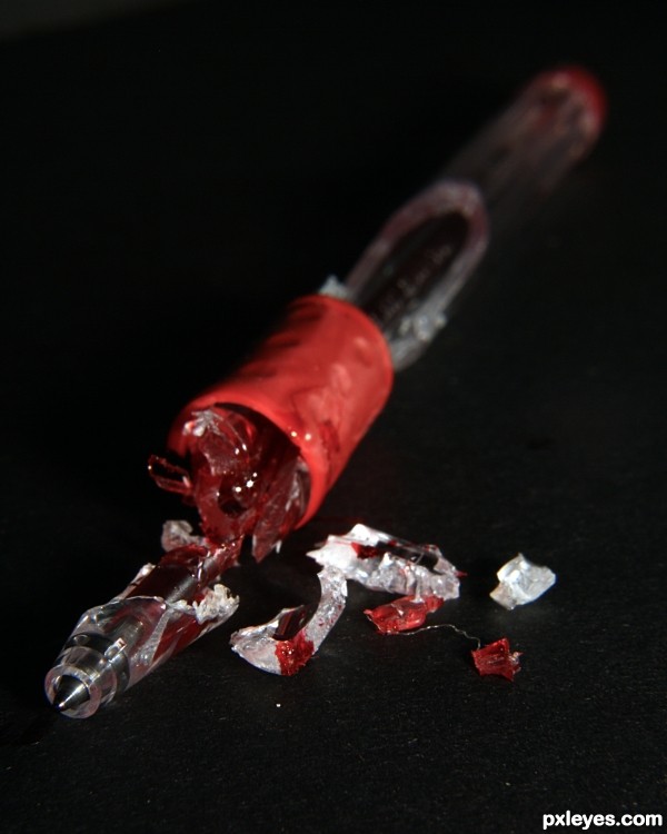
My reaction to spending too much time on multiple pens without reading the fine print. :p (5 years and 3530 days ago)
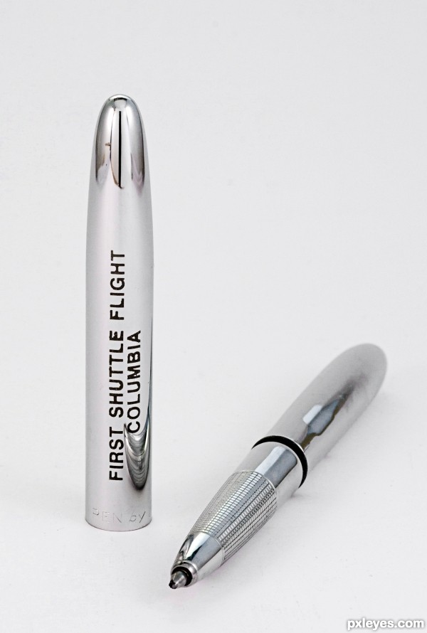
(5 years and 3532 days ago)
Nice clean shot
I love these shots with no shadow whatsoever.
Howdie stranger!
If you want to rate this picture or participate in this contest, just:
LOGIN HERE or REGISTER FOR FREE
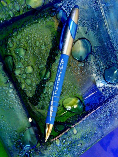
(5 years and 3532 days ago)
Love the placement, the colors are great, but the water droplets really set off the image. Nice work!
Hi its not water, its glass. My partner at work makes glass bowls and things, and this is one she gave me.
Congratulations to your partner! 
GOOD JOB!
Howdie stranger!
If you want to rate this picture or participate in this contest, just:
LOGIN HERE or REGISTER FOR FREE
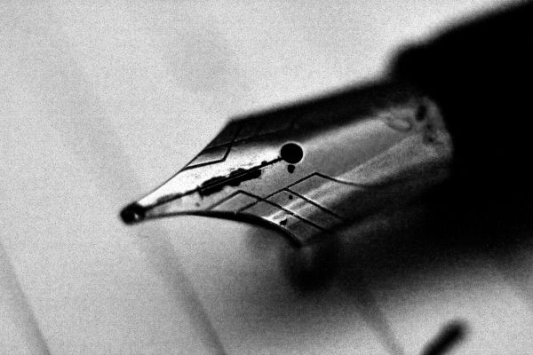
A black and white image of my fountain pen. I added noise and high contrast, to create an old looking, moody effect.
Hope you like it! (5 years and 3754 days ago)
Very nice close up but noise is just too much for my taste...i think you over did it (imho)!
I all so think that you should use a higher f number.That way you would have a "wider" in focus "clear" surface on the pen!
Over all, personally i "got" the "old" feeling that you wanted to impress & i really like this photo!
Sorry if i am "hard" on you author.
Good luck!
Karaflazz, I agree with you.........author, this has the makings of a great shot, but it has been over done. The noise is just too much for this type of close up shot......a good crisp shot of the face of the nib would have been much better.
Ok guys, thank you very much for your constructive criticism of course. I have taken note of your tips and of course will use them in the future. I thought that the noise, would just add a stronger sort of effect to the old age image, but if you think that it is overdone...
Like the contrast and noise -- quite effective image
I understand why people are saying that there is too much noise and from a photographers aspect that may be true but, my friend saw this picture just now and loved it because of the "graininess".
I think as photographers we need to evaluate our view of "what is correct" in photography. Is it what we as photographers view as correct or what the "uneducated" public thinks looks nice?
locksmagic, I guess that everyone has their own taste, and we can not really criticise them for doing so. Some people won't like this image, because it is too noisy and seems "incorrect", while others may find it quite artistic.
It is up to personal preference, and at the end of the day, thats why art is so beautiful - everybody likes different things.
I like the noise for the subject. It fits the old style pen. This would definately not work on a modern pen tip.
I like the noise in this. It adds to the aged look of the shot.... and I usually dislike noisy shots. Is that a mark on the paper just above the pen nib or do you have dust on your sensor?
I doubt that it was dust on sensor, because it doesn't show up with such small apertures. However I think that it could be possible a mark on the lens, or a bit of ink on the paper.
Thanks for your comment!
GL
Howdie stranger!
If you want to rate this picture or participate in this contest, just:
LOGIN HERE or REGISTER FOR FREE

I took this picture just, using a flash gun in slave mode and my onboard flash. I converted to sepia in photoshop and adjusted the contrast slightly.
Hope you like it! (5 years and 3754 days ago)
The paper on the left corner of the frame is BOH (blow out highlights,its when the light is so strong that you loose detail).You should diffuse it with a piece of paper or a sheet or something!
I like the mood but i believe that you can do better!!!
You should all so include the whole spiral of the book or nothing at all!
Just some suggestions (imho).
Thank you very much Karaflazz. I actually blew out the top left corner on purpose to add effect to the image, and the bindings were meant to add a compositional value in that empty space up the top, with no points of interest. I do understand your comments of course and thanks for taking the time to write these tips for me.
I did my best!
and, imo, choose your dof (depth of field) a little more carefully, it is a little oof (out of focus) around the pen itself.
Howdie stranger!
If you want to rate this picture or participate in this contest, just:
LOGIN HERE or REGISTER FOR FREE
Ooo Love it! But I see more than One Pen :/
I noticed this micromanaging rule shortly after posting this pic, I was excited while making this shot too

Mods : I will be replacing in the next couple of hours please don't destroy my rep points anymore than they already have been
Fixed
lol Awesome! ::highfive::
Howdie stranger!
If you want to rate this picture or participate in this contest, just:
LOGIN HERE or REGISTER FOR FREE