(5 years and 3570 days ago)

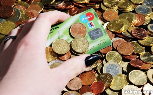
All these coins are worth something but they're nothing compared to the plastic card. (5 years and 3575 days ago)
The hand seems a little bright. Auto contrast would probably fix it. I am also having trouble relating this to the theme. Sure all the coins are worth something and the plastic is worth something but where's the math being done here?
Can't help the skin, my skin is simply light so the contrast won't do much with it.
The math of this is: The plastic card is worth more than the coins(you can buy much more with the card instead of with all the coins). Therefore in means of buying power plastic > coins even though there are soooo many coins. Therefore the hand is groping for the card and not collecting all the coins as they don't have a real value when compared to the plastic card(plus because of the weight of the coins much harder to carry around as well).
Trust me you could still adjust the contrast, no matter what your skin color and your explanation doesn't explain how the math is being done. It's just guessing. I have a credit card that ain't worth anything. It's just assumption. Sorry, IMO still off theme.
okay.... well, only because i have a severe urge to tell you this... with your fair skin...black nail polish isn't your friend. it just makes your skin look more pale, and causes this really horrible reaction with the flash. my skin is really pale as well, so i fight it all the time. but... perhaps natural lighting with no flash on this might could help? and then raise the skin tone levels to make the skin work out better.
and a credit card is not math. unless you are looking at how they charge you for all the fees... "late fee" "interest" yada yada. a plastic card with random coins balanced on it doesn't really show math being done. and...the card, although i see what you are trying to say....isn't anymore powerful than the coins. ask anyone in debt. i'm sure they'd tell you having a credit card is actually absence of math.
The contests rules state it has to be related to math, not show math being done.
It's not a credit card but a debit card. So you cannot go into debt you actually have to have the money to use it.
As for my skin color. It doesn't make a big difference if I use a flash or sunlight. In this picture the flash was only used as a fill in and not as the main source for light. I took this shot outside in indirect sunlight. It's either I sacrifice little detail on my skin or the whole image will darker. Selective editing isn't allowed, to my knowledge. Besides that I know no other way to do this.
As for the black nail polish, I don't usually use it but I just felt like it for the old times sake(haven't had them black for years). I usually have lighter tones(pink), which fit my skin tone much better.
debit/credit *shrug* who cares? Coins are worth the exact same amount if it's debit. If I have $1,000 in the bank for my debit card, I can get $1,000 worth of coins as well. Credit cards are actually worth less than coins as no one charges me interest or fees for my coins. All three are worth more in the hands of someone who can do math, although credit has FAR more likelihood of being harmful in the hands of someone who can't do math.
Kyricom: There's a clear difference between debit and credit.
You can definitely get 1000 dollars in coins. However if you were to buy something worth 1000 dollars and pay with those coins I'm pretty sure you won't find many places that would actually accept just coins as a payment for such a big purchase just because it would take so long to count all those coins. On the other hand there won't be any issues with a debit/credit card. Coins are great when used for small amounts but in larger quantities, despite them having the same value, they are much more unpractical than paper money or credit/debit cards.
Strange, I don't have to pay a penny for my credit card as long as I pay the bill on time. I only pay for what I actually bought. No interest, no extra charges or anything else. The same goes for debit with the only difference that it's taken straight from the bank account without the need for a bill.
Nator: Thank you very much.
Wasn't talking about convenience... was talking about value.
Let's talk about value. You buy something online with a credit/debit card and you only pay for what you bought and postage. You buy something online with cash(be coins or bills) you pay for what you buy, postage and the extra for cash on delivery. So which one has more value credit/debit card or cash?
You're missing the point. You've added a step which makes the comparison invalid. The two themselves still have the same value. But it's irrelevent. I really don't care. It was just an innocent observation.
So are you. The value of something is what you make of something. Different uses of the same objects will give you different values. With something like money, it's stupid to do the comparison without an actual example where its being used because the use of money is what determines it's value. No matter how much money you have if you can't use it; it's useless.
I really don't care either but I'm not the one who started up with this discussion anyway. Personally, I think the best would be just cut this crap out as it doesn't bring anything to the actual quality of the image or the contest as the ones who actually were saying this is off topic haven't said anything since the beginning anymore.
Howdie stranger!
If you want to rate this picture or participate in this contest, just:
LOGIN HERE or REGISTER FOR FREE
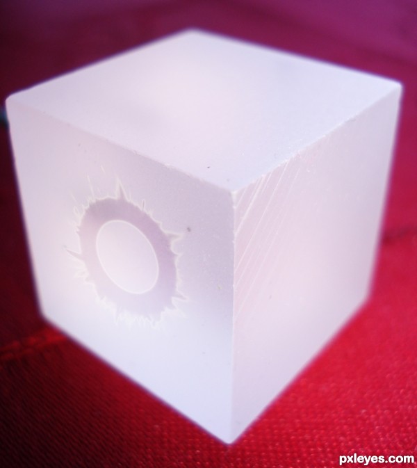
I think it would look better if more of it was in focus.
Howdie stranger!
If you want to rate this picture or participate in this contest, just:
LOGIN HERE or REGISTER FOR FREE