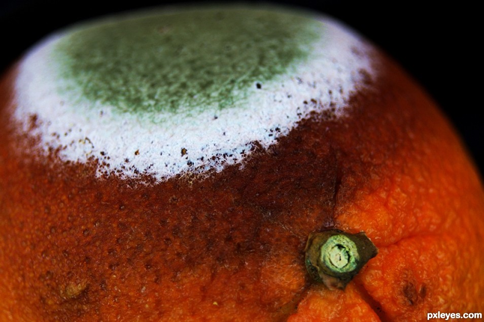
Don't let your food sit around too long. (5 years and 2539 days ago)

(5 years and 3332 days ago)
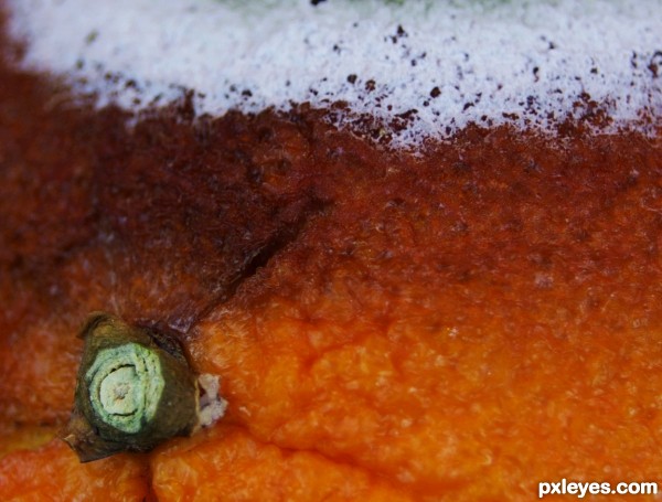
This isn't quite rule of thirds. The object is a little too far over the the left. Objects don't have to be on the third line, they can occupy the third space, but only if there is something else in the photo to balance it out. YOu don't in your case, so the photo is off spacial wise. If you cropped it down a little more it would be perfect. It is an amazing abstract piece, you have me sitting here wondering what the heck is that and gawking at the color contrasts.
I'm glad you're drawn to the color contrasts, because that's where the "thirds" are being used.  What the heck it is, is a deteriorating orange (yummy). The top, white third is mold, the middle dark third is getting ready to mold, and the bottom third is orange. The stem in the bottom left quadrant of a "thirds" grid also creates a (minor) "line of sight" to the upper right.
I have re-edited this shot to make it comply to the "thirds grid." I made the three color layers more explicitly horozontal, and put the stem in the middle of the lower left quadrant. Thanks for your comment, dem90.
Howdie stranger!
If you want to rate this picture or participate in this contest, just:
LOGIN HERE or REGISTER FOR FREE

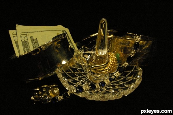
I wanted to create a bedroom setting for this shot. (5 years and 3480 days ago)
it's a little dark. you should bring out the "bling" with flash or more lighting. good photo though
I have to agree, It is dark, but I was trying to go for a dark bedroom setting. Where one would take off all her jewelry before bed. Thank you for the comment 
Howdie stranger!
If you want to rate this picture or participate in this contest, just:
LOGIN HERE or REGISTER FOR FREE
What is this and what is the white substance? Or the Green? Is this something you would normally bite or eat?
heh heh... You could eat it, I guess, but I probably wouldn't advice it in this state. This is just an orange. But it's an orange I had out in my workshop for a snack but forgot about. The white and green in fungus and mold.
OK - That explains it. Thanks. I thought it might be fungus or mold but one never knows for sure in a photograph unless there is a good hint of some sort. Perhaps a short expanded title might be helpful for this nice photograph.
Howdie stranger!
If you want to rate this picture or participate in this contest, just:
LOGIN HERE or REGISTER FOR FREE