(5 years and 738 days ago)

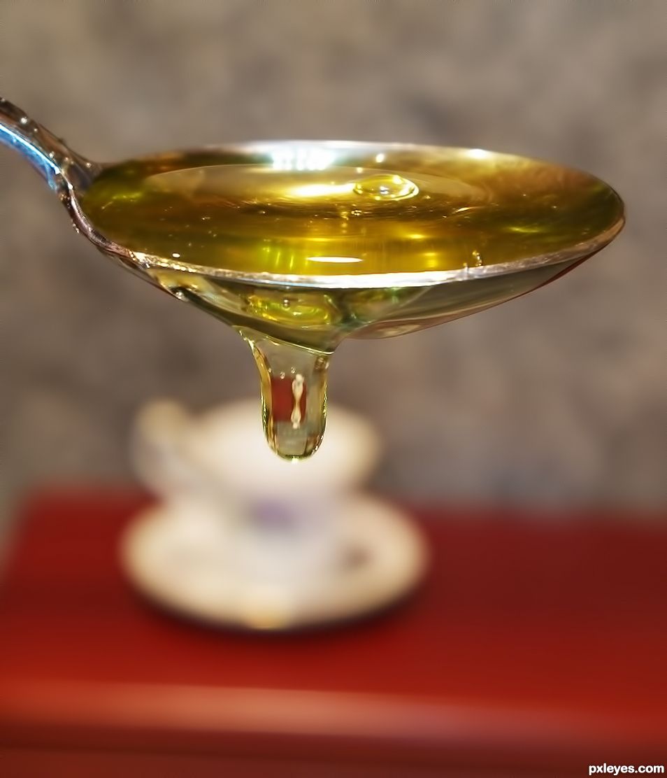
Hi! I'm Mr. Breakfast! Go ahead and eat me up! (5 years and 1184 days ago)
I love the creativity here. It is simple and strong and very effective for bringing a smile to the viewer. The colours are rich, the background doesn't compete, it is a sharp photograph, well exposed, nicely contrasted and good marginal space. When you have round objects, try using perfectly square format, the reason for this is because the equidistant sides of the square help keep our eye within the frame...the pathway of the eye goes around and around but bounces off the 4 walls....try it, see if you find the image becomes stronger. Top notch work here.
Thanks a lot for the feedback! I appreciate it! I will try this and think you're right, it would draw eyes into the middle more if it was cropped square 
Howdie stranger!
If you want to rate this picture or participate in this contest, just:
LOGIN HERE or REGISTER FOR FREE

(5 years and 1272 days ago)
Howdie stranger!
If you want to rate this picture or participate in this contest, just:
LOGIN HERE or REGISTER FOR FREE

(5 years and 1274 days ago)
Congratulations
Thanks!
Congrats
Thanks!
Howdie stranger!
If you want to rate this picture or participate in this contest, just:
LOGIN HERE or REGISTER FOR FREE
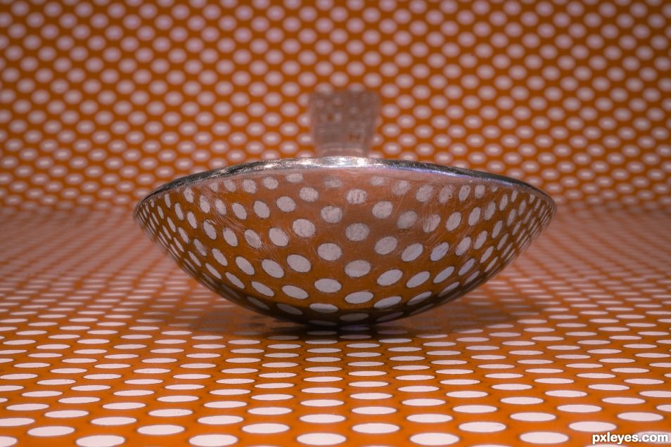
A spoon lying on top of a paper full of dots. (5 years and 1474 days ago)
Congrats Randy 
Thank you MM!
Congratulations
Thank you!
Congrats on 1st
Thanks!
Howdie stranger!
If you want to rate this picture or participate in this contest, just:
LOGIN HERE or REGISTER FOR FREE
The artistry of your eye is evident with the cup of tea in the background to give us a visual journey of delight. Nice composition. The technical elements are well done with good contrast shown, natural colour, sharp in focus. The background could be more level but that is strictly my own opinion and I bow to your artistic prerogative. Sweet upload (get it?)
Thanks a lot - even with the bad pun at the end.
Howdie stranger!
If you want to rate this picture or participate in this contest, just:
LOGIN HERE or REGISTER FOR FREE