(5 years and 3157 days ago)
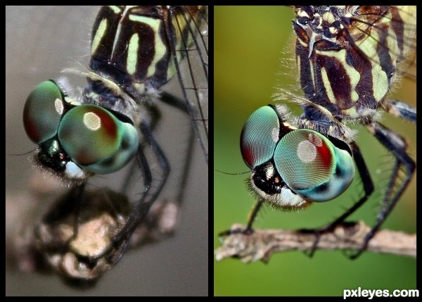
What I learned from this type of photography from 2008 until now 2011 is... (note: the pic on the left was taken when i first got my camera. It came with the 17-55mm lens. Thats all i had at that time. The other pic was with the 100mm macro which took some learning to use right itself)
1. Center focusing or just changing the focus point of the camera to all over to pin point a certain area you want in focus
2. A macro lens is needed to get the type of details I like to see and obtain
3. Working with contrast
4. Noise reduction
5. Cropping Limitations
What I learned since the second picture taken a couple weeks ago...
1. No flash on something in bright light unless you are at the perfect angle to not have more than one light circle in the reflection of the eye. (5 years and 3169 days ago)
Great work, and so right for the contest. showing wonderful improvement. Getting the same insect and angle is fantastic, top marks
At first I thought you just took the original picture and re-finished it. Great job! (lenses make all the difference, don't they?) 
Wow, what a difference between the two! The detail is stunning. Well done!
awesome - well done author 
Fantastic work author! But I am not surprised!! 
Thank you everyone! It is kinda weird to see such similarities in the two but I promise you one lives in the ghetto and one lives on the golf course. LOL The ghetto one is probably dead by now though .
Good to hear you moved out of the ghetto and live close by the golf course now author 
Great improvement, really excellent example of what this contest is about!
wowzers, that really is improvement! 
very nice photo
Congrats Amanda  wonderful shot
congrats well deserved, amazing improvement
Howdie stranger!
If you want to rate this picture or participate in this contest, just:
LOGIN HERE or REGISTER FOR FREE
(5 years and 3231 days ago)
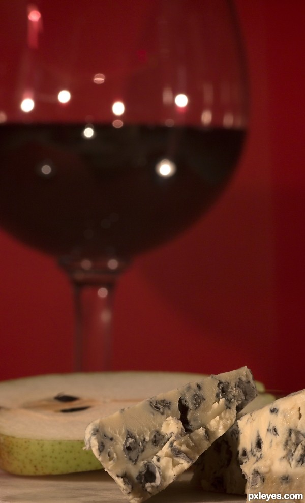
Since this is a set up (composition) you could try to "arrange" your items a little bit better.
The red background does NOT help the red wine on your glass to show properly.
You should use a white background.
All so the shallow DOF (depth of field) makes the viewer focus on the cheese & not on both of the items.You could use a higher f number to have the maximum DOF.
A wider frame so you could include more of the dish & cheese would be good (it's tooo tight the way it is now).
Thanks, You are most likely right, but this is the effect I was after. But I will consider your suggestions for the next shot. I do appreciate your comments.
Although karaflazz mentions some nice options, I do like this version. For me no problem that the focus is on the cheese, the glass shape and color gives enough indication that we deal with wine. The red background is also fine, with the blurry glass it almost becomes one, but still enough to see what's what and gives the photo something extra to the cheese (like cheese with wine mood, dunno how to explain). Also the close framing with left the wine and right the cheese works well. maaaaybe the front part could do with some more highlights so it repeats with the backparts (light reflection in the glass), but that would be it imo. Good luck!
I actually like this a lot. The darker burgundy is dark enough against the background along with the white speckles from the light.
Howdie stranger!
If you want to rate this picture or participate in this contest, just:
LOGIN HERE or REGISTER FOR FREE
(5 years and 3347 days ago)
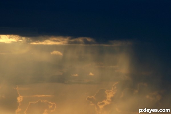
Spectacular!
I love that word rbsgrl; and I agree it was, glad I was there to catch it and to be able to share it with ya!
Howdie stranger!
If you want to rate this picture or participate in this contest, just:
LOGIN HERE or REGISTER FOR FREE
(5 years and 3393 days ago)
Very pretty 
Thank you, MnMCarta, and on my way to vote!
Howdie stranger!
If you want to rate this picture or participate in this contest, just:
LOGIN HERE or REGISTER FOR FREE
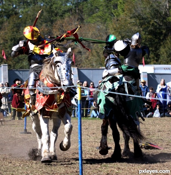
I will be going to one of these places on the 25th and hopefully dressing up this year and getting hammered! We just need a DD Oh I so can't wait for the turkey legs and the chance to show some cleavage!
Howdie stranger!
If you want to rate this picture or participate in this contest, just:
LOGIN HERE or REGISTER FOR FREE