Photography Pictures: Tools (page 5)


results 21 - 25 of 32

Tools of the Trade - created by DrewBlood


Tools of the Trade
Favs: 2SBS: n/aHi-resRank: 1/32Score: 71.9% (42)14807 views

No vignetting was adding in this set. Raw files can be supplied on request. Please do not critique unless you understand the difference between cropped and full frame sensors and the effect DC lenses can have upon full frame.. (5 years and 2891 days ago)

avatar friiskiwi
friiskiwi says:

vignetting not allowed, a small border are allowed in this contest, that is quite a heavy border, IMO

avatar MossyB
MossyB says:

I really like the lighting of this. Did you add lighting, or was this just your exposure settings?

avatar UncleJimmy

The lighting and tonality of the shots is very good, however, the focus appears to be a bit soft on the second shot. The focal plane appears to be just a few inches behind the subject as the head of the guitar is in sharp focus and the subjects face is not.

avatar CrystleClear

amazing

avatar friiskiwi
friiskiwi says:

Congratulations on 1st and 2nd place, great shots.

Howdie stranger!
If you want to rate this picture or participate in this contest, just:

LOGIN HERE or REGISTER FOR FREE


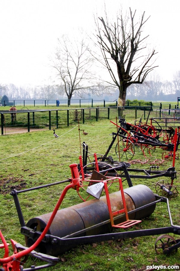
Old farm tools - created by Artifakts


Old farm tools
Favs: 0SBS: n/aHi-resRank: 32/32Score: 58.7% (0)5578 views

Let's try it in color (5 years and 2961 days ago)

avatar MossyB
MossyB says:

Black and white doesn't serve this image well. It's hard to really discern the subject matter of old farm tools from each other - It's just a jumble of black lines with a wheel and a tank mixed in. The tree is far more dominant in the image. Color (and a better focus on the tools, not the tree and sky) would have helped the viewer appreciate the focal point more.

author says:

You're surely right ! Let's try the colored one !

Howdie stranger!
If you want to rate this picture or participate in this contest, just:

LOGIN HERE or REGISTER FOR FREE


You and I - created by aleadavina


You and I
Favs: 0SBS: n/aHi-resRank: 26/32Score: 57.4% (0)8425 views

don't know why...
I can't go far from U....
(5 years and 2982 days ago)

No comments yet... Be the first!You, and, keyboard, writing, tools

Howdie stranger!
If you want to rate this picture or participate in this contest, just:

LOGIN HERE or REGISTER FOR FREE


Early Grand Master tools - created by Remsphoto


Early Grand Master tools
Favs: 0SBS: n/aHi-resRank: 14/32Score: 62.2% (0)5780 views

Sidewalk chalk masterpiece runioned by afternoon showers. It was a tie anyway. (5 years and 2983 days ago)

avatar friiskiwi
friiskiwi says:

great colours and composition

Howdie stranger!
If you want to rate this picture or participate in this contest, just:

LOGIN HERE or REGISTER FOR FREE


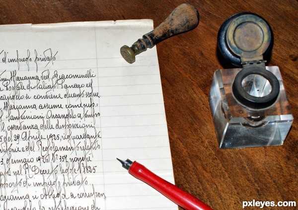
Old writing tools - created by patty


Old writing tools
Favs: 0SBS: n/aHi-resRank: 11/32Score: 62.4% (0)8168 views

(5 years and 2985 days ago)

avatar friiskiwi
friiskiwi says:

Beautifully done, but I think it would ahve more impact if you cropped it a lot closer.

author says:

Thank you Friiskiwi, I cropped a bit in the bottom, do you think I've to crop more?

avatar friiskiwi
friiskiwi says:

Personally I would crop out most of the writing and a little of the right. Really cutting out 50% of the image. This is just my opinion, but it's about writing instruments, not about writing.
Good luck, and do what you feel happy with.

author says:

I would follow your suggestions, thanks again friiskiwi

avatar drskn08
drskn08 says:

amazing...! the objects in the photograph giving me 3D appearance ! Particularly the stamp (i think its stamp) and the paper-weight/ink-pot on the side...

author says:

I don't know vaiibhavjain, I took this shot from the top, with the camera built-in flash on
In the hi-res you can see a thin shadow under the stamp and the pen.

avatar Remsphoto
Remsphoto says:

I love the old tools but they seem unconnected. Nice idea and the handwriting is outstanding

avatar MossyB
MossyB says:

There's no ink in the inkwell, and it seems too disconnected from the rest of the image, which is compounded by the positioning. If it had been angled about 45 degrees, the visual movement would have echoed the pen and stamp, making it more a part of the overall composition.

Howdie stranger!
If you want to rate this picture or participate in this contest, just:

LOGIN HERE or REGISTER FOR FREE