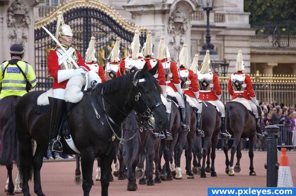
Source from Flickr : Uploaded
by Kol Tregaskes
Main works: mask / proportion / color match(management of color)
(5 years and 3848 days ago)
- 1: source1

Howdie stranger!
If you want to participate in this contest, just:
LOGIN HERE or REGISTER FOR FREE
Just a suggesting, I would adjust the brightness/contrast a litle bit more to make it look less layered but kudos to the idea.
you found a great source, my suggestion is to try to make the horses all the same color, so slightly more brown with less contrast might make him fit in very well.
simple...and looks nice
ponti55: why the horses all the same color? Due prejudice the black horse went to the wrong way!!!!!!!!


very nice idea
Congrats for another first place!
Congrats, well done
Congrat Having Fun...
congrats!
Congrats!!
Congratulations for 1st
Howdie stranger!
If you want to rate this picture or participate in this contest, just:
LOGIN HERE or REGISTER FOR FREE