replacement (5 years and 3913 days ago)

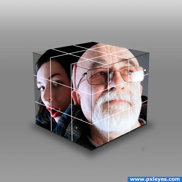
I simply cut the photo into squares, drawn the white lines, added a gradient, shadows and filled in what didn't fit in the cube,
yes i know it looks 2d, it's one of those new products, that measures the distance from your eye and compensates the angles, have you never heard of it???? (5 years and 3911 days ago)
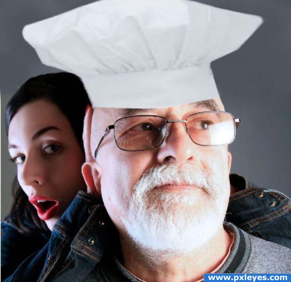
Not a bad idea, but the light source on the chef hat is opposite grandpa's light source...maybe you could flip it...and the drop shadow doesn't work, again it's opposite the light source, and there's nothing for the shadow to fall on anyway....
Oh, and sorry author, but I just don't believe you "drew" the chef's hat. It looks just like a photo...a low res photo at that.
if you drew it then why not draw it big enough so it looks real. It does look like a bad photo that you have tried to blow up and its bad. no offence.
Thanks for the info ....Yes I did do a sketch of chef hat and copied how it looked and was colored Bad idea so I got one from internet hope this is better again Thanks to both of ya
Actually, the first one looked real....so real that it looked like a photo. That is why CMYK said that he didn't believe you drew it. The hat you have now is not better because the edges are very blurry. I would go with the first one but resize it bigger. If you need help resizing, just ask and someone will help you.
Sharpen the hat overall, I would use the pen tool and recut it, curve it at the base a bit to match curve of head, add some shadow to head(as hat sits on it)... GL
Ok Guys does that work any better back to original made it a little whiter?And thanks for your suggestions
oh its so good!
Nicely Done!
Howdie stranger!
If you want to rate this picture or participate in this contest, just:
LOGIN HERE or REGISTER FOR FREE