
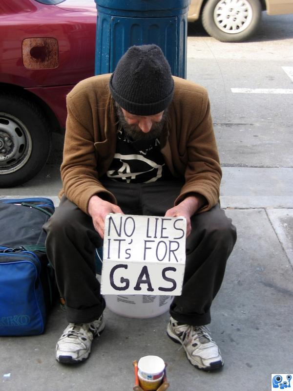
Took this picture of a homeless man a few months ago, and used one other source. (5 years and 3789 days ago)
1 Source:
credits ro pale,andreyutzu,and gravityx for theirstocks in sxc.hu (5 years and 3788 days ago)
Photography and photoshop contests
We are a community of people with
a passion for photography, graphics and art in general.
Every day new photoshop
and photography contests are posted to compete in. We also have one weekly drawing contest
and one weekly 3D contest!
Participation is 100% free!
Just
register and get
started!
Good luck!
© 2015 Pxleyes.com. All rights reserved.


Looks like you put a piece of the wall under the man...? Doesn't work...step 3 is better.
Thanks for the suggestion CMYK .....made some improvement, at least in my eyes
Lihting is not good...u cannot have this light on the man and on the basket with this sky...good luck author....
nice concept ... good message. all you need is to develop more skills and you will be creating fantastic images .. good luck with future entries.
Howdie stranger!
If you want to rate this picture or participate in this contest, just:
LOGIN HERE or REGISTER FOR FREE