thanks and credits sxc.hu, and cgtextures (5 years and 3769 days ago)

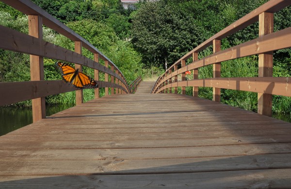
I've used transform tools (floor, railings) for the end of bridge . The butterfly with Gaussian blur and motion blur at low opacity. The rest is obvious.
Edit2: Butterfly shadow.
As I see it now.Light source is from the left and low, 4 o'clock direction.
Adjustments of position, size, tone, saturation and opacity.It is not easy. (5 years and 3772 days ago)
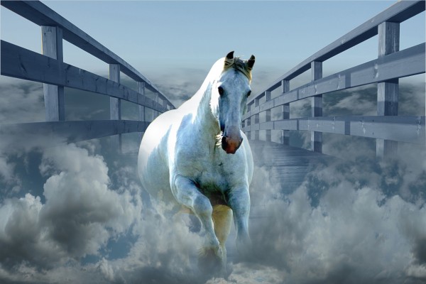
Compared to the bridge the horse is about the size of a dog, but it's not a bad idea...
Only thing I would really knitpick about is the horce not being center with the bridge. Other than that it's a great chop. GL.
as artists we all have ideas and i too think this image would shine if the horse was a unicorn.... In stating that i love your creativity and the image you have created.
Howdie stranger!
If you want to rate this picture or participate in this contest, just:
LOGIN HERE or REGISTER FOR FREE