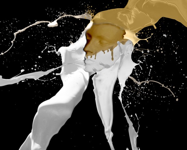
Thanks to Media Militia website for the Paint Tossing Pack (5 years and 3871 days ago)

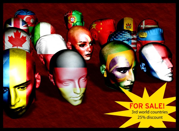
I've cut some of the heads out of the original image, then duplicated them. the duplicate -desaturate. over the original heads i've placed the flags then the desaturated heads over them all with blend mode set at linear light. then i've toyed with contrast/lighting. and last drop shadow. (5 years and 3870 days ago)
Lighting is wrong. Light on the white stuff is from the left, light on the head is from the right.
I agree with you CMYK but maybe I have 2 point of light one from left the other from right (like in a foto studio)
like the liquid effects you have used. GL
Howdie stranger!
If you want to rate this picture or participate in this contest, just:
LOGIN HERE or REGISTER FOR FREE