That's the last time I ever go on another blind date. :D (5 years and 3833 days ago)
1 Source:
Photography and photoshop contests
We are a community of people with
a passion for photography, graphics and art in general.
Every day new photoshop
and photography contests are posted to compete in. We also have one weekly drawing contest
and one weekly 3D contest!
Participation is 100% free!
Just
register and get
started!
Good luck!
© 2015 Pxleyes.com. All rights reserved.
 looks pretty cool. Goodluck.

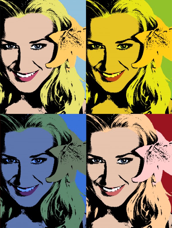
 Inspired in Warhol?


nice one
haha funny as!!
Funny , but is it possible to make the face somewhat sharper? For example with the High Pass filter. Good luck!
Waz, I have no idea what a high pass filter is. Can you explain?
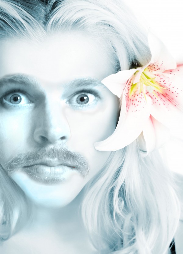
I dunno, "creepy" comes to mind. I think the face is a little too large for the head. It seems a little out of proportion. Nevertheless, I like it. GL
I'll take creepy. Face porpotions are probably never going to look right, mainly because a woman's face is different from a man's. Trust me, I thought about that when I came up with the idea. I'm mainly looking for humor and originality points.
Ok, duplicate the face layer, go to filter-other-highpass, just press ok when you see the window and then put the blending on overlay or soft (perhaps also lower the opacity a bit, depends what the result will be). Good luck!
Waz: Ok mades edits. Useful trick I definitely wasn't aware of. I think it improved it's sharpness but I'll let U be the judge
very nice
haha
yes very funny good luck
uff ugly
Howdie stranger!
If you want to rate this picture or participate in this contest, just:
LOGIN HERE or REGISTER FOR FREE