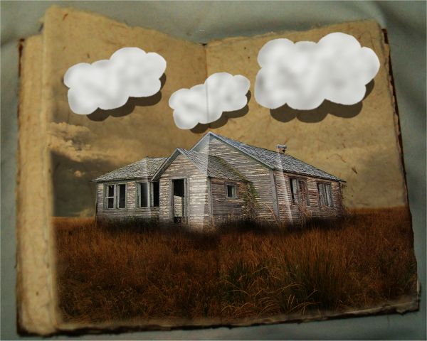
For the clouds I just did a seperate white layer and cut them out, used burn tool, duplicated and made shadow, then blur'd
thanks to fallen stock@DA for the photograph of the book. (5 years and 3822 days ago)

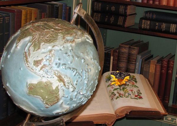
thank you louchiere for the book and globe pic
also thanks to ediosborne's
for the butterfly both pics are from sxc.hu (5 years and 3826 days ago)
nice image choices, but it doesn't really have the pop-up feel to it. well, except for the clouds
agrees with elficho
agrees with elficho
get a brain....... and be constructive... how did either of you help me?
Howdie stranger!
If you want to rate this picture or participate in this contest, just:
LOGIN HERE or REGISTER FOR FREE