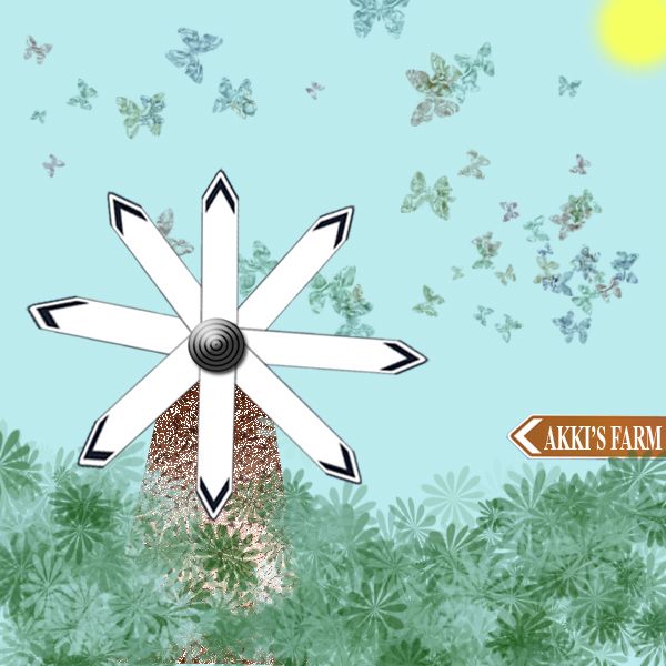
Needs a high res...can't read the red type. (And hey, just be glad you don't live in NJ like me!).
jawshoewhah [banned] says:
Why exactly did you put "My Lard Tax" on the big toe, because that's what it looks like in this resolution. If you're not going to put much effort into the source, the least you could do it make the fonts clearer and sharper and a little bit more level to the signs. "Home of taxes" is not level, noticeable even in this res.
author says:
Thanks guys I guess red wasn't a good idea I hope this is better I also inlarge picture.Oh yea it says My last Tax because even when you leave this world you have to pay a tax...LOL
jawshoewhah [banned] says:
That's better, but you should blur the fonts a little bit. The resolution of he source is not that clear and it would look more authentic and not so chopped if you did.
author says:
Hey again Thanks ! I hope I didn't over blur. It does give it the weathered look I never even thought of that. I did see I had one panel that was not blured like others I took care of that also Thanks.:cool
jawshoewhah [banned] says:
Better than it was before. You can also take down the olpasity on a font layer for a better effect. GL!
Howdie stranger! If you want to rate this picture or participate in this contest, just:
Bravo, Wonderful, Fabulous, is there anymore to say?!?!
jawshoewhah [banned] says:
Wow I get brozed but yet you used my suggestion. By the way, the shadows on the sign are wrong. They would be like the one on the left but try drop shadow, not whatever you did. Also shoes need a lot of work on the edges and a shadow too.
well honestly speaking i don see any logic in this..you've jus written one simple note in a direction board which is going all places..you could have used the source image in a much better way..
Don't take my comments on this as rough criticism, just constructive, well meant suggestions.Good imagination on this, but there are several things that you could do to improve on it. I think the shoes have been mentioned by others, and the cloning on the grass next to the pathway needs to be cleaned up a bit. Changing the signs to point all the same direction could really be a plus. Overall you did have a good concept, it's your execution that needs some improvement.
jawshoewhah [banned] says:
Those kids of yours must really be occupying your time but the sign shadow is not hard to create. I wish you at least tried,,
Howdie stranger! If you want to rate this picture or participate in this contest, just:
You windmill blades are a little off. Try copy and pasting each plade after rotating each 45 degrees.
This is a different way of looking at the source, nice imagination
thnx dollmommy..this is what i really intended to do sumthing different from the sign board
Howdie stranger!
If you want to rate this picture or participate in this contest, just:
LOGIN HERE or REGISTER FOR FREE