ALL SOURCE AND PHOTOSHOP
Better Viewed in High Res (5 years and 3736 days ago)

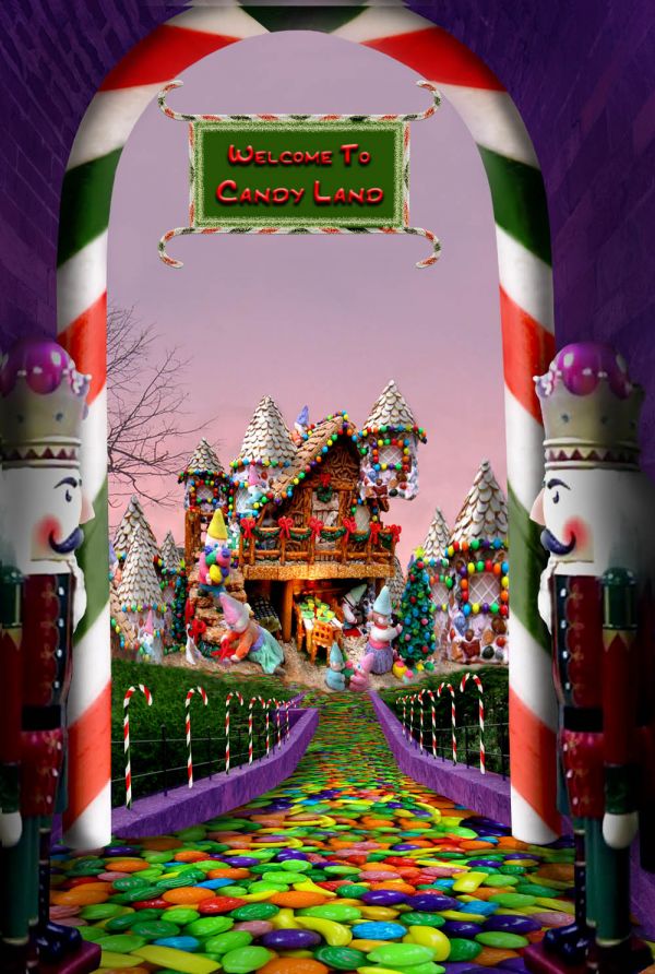
A special place for kids. Thanks to zambyoo7 at pxleyes.com for the doorway photo, to vilhelm at morguefile.com for the candy used to create the street, to jetolla at morguefile for the gingerbread/candy house, to xblackxcreedx at morguefile for the nutcracker photo, and to imagina for the sunset sky. I began with a photo of my own for the sky, but changed it in the end. (5 years and 3735 days ago)
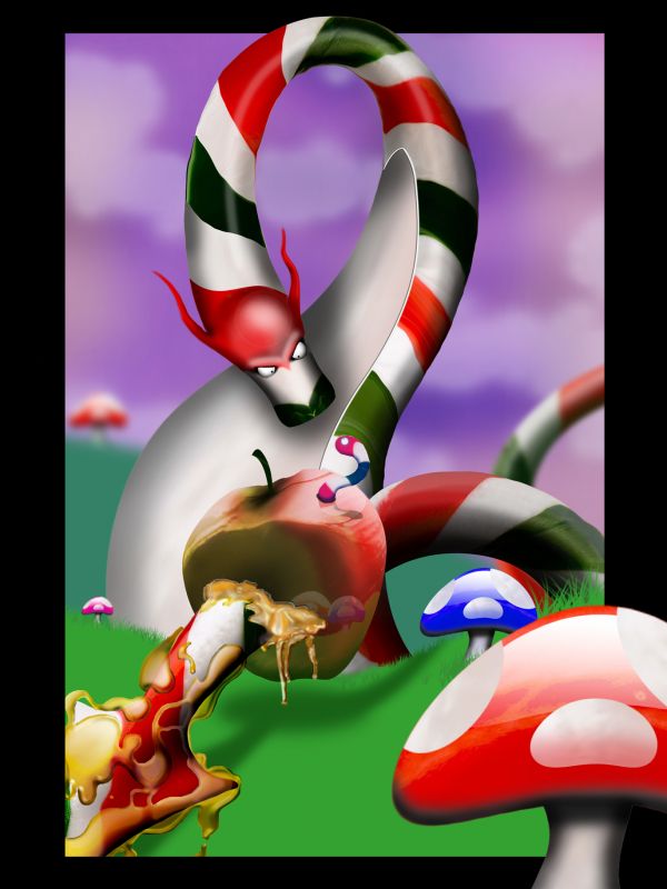
The syrup needs more realistic highlights, and some of the edges on the dragon could be cleaned up...otherwise this is great! (y0
(y0
Perfect! Really creative work.
Thanks to you both! CMYK46: I've tried to ammend the syrup, and i've cleaned up some of the edges
  - trust you to pick up on the syrup though LOL!
brilliant image I would love this in a frame
Very nice
very nice. I like the color choises.
That's one chubby Dragon.. love all the fun textures
I love the cartoony feel of it. Well done!
Great!
really cool the final result
Wow...good work
well done
Congratulations for 1st
Congrats!
Wow, congratulation on your first place. I finished my dragon almost the same time that you submitted this work (I intended to name it as Candy Dragon, then I had to change to Fire Dragon because of this one, lol)
congrats on win... well deserved mate
Congrats for yout first place, James!
Congrats! great work!
congrats =)
Congrats,very nice work!
Howdie stranger!
If you want to rate this picture or participate in this contest, just:
LOGIN HERE or REGISTER FOR FREE