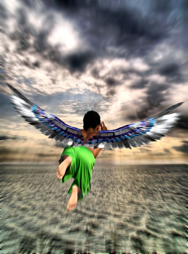
Thank you to Coda for the Angel Wings photo and Grant McDonald for the Changing Sky photo.
Just a basic edit using quick selection tool, flip, masking, hdr and added motion effect. (5 years and 3715 days ago)
- 1: Angel Wings
- 2: changing sky

Thank you to Coda for the Angel Wings photo and Grant McDonald for the Changing Sky photo.
Just a basic edit using quick selection tool, flip, masking, hdr and added motion effect. (5 years and 3715 days ago)
(5 years and 3709 days ago)
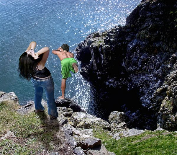
where is the shadow, and the sbs!
..and your sources, remember to post them.
The scenary is sunny, the two people need a little more lighting, I suppose.
Oh, there he goes....  GL
GL
Adeincyprus, the sun is high and he is diving over the face of the cliff, so you wouldnt see his shadow.
LOL...deja vu...
Hahahaha CMYK....i just thought it fitted in nice.
you can see hers! and the sun is high on her...........and if it is high, then the back of left his leg would be darker......look at the other shadows in the shot, and compare them to the position he is in.......
He is vertical....she is upright
Shadow needs a little working....and people also need to be a little brighter as its a sunny day...The shadow of the lady is there but the light is less....
ok, so where would he have been standing before he leapt off......I am sorry, but the shadows are still wrong for him, and also, as has been said, the girl should be brighter than this.
Ok....made her brighter and adjusted th shadows on both of them.
Howdie stranger!
If you want to rate this picture or participate in this contest, just:
LOGIN HERE or REGISTER FOR FREE
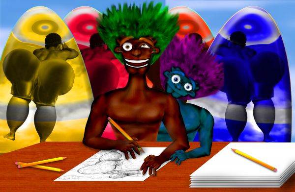
Big Butt Big Brother Blue Brother Surfboard Company
(No Nipples)
okay I'm weird.. I just love the process :)
all source.. see sbs
(5 years and 3713 days ago)
wow, i thought i had left a comment here???

 MAO
MAO 


hehehehehe
dang i did too  good luck Author
......
now... it looks like we are getting the band back together

hey... we already got lady ga ga LOL
 MAO with ichappell
Good work...Hard work infact...
guess we all know who the author of this image is hey.............. lol
@Keilly22... yep.. it's me.. hehehe.. just plugging along (I'ved tried to conform.. really I have, but then I hit those two contrast/saturation buttons, my brain just leaps back into me and takes over) giggle snort
Hee he he he ...hoohhoohhoohooooo!!!!!!!!!!!
Howdie stranger!
If you want to rate this picture or participate in this contest, just:
LOGIN HERE or REGISTER FOR FREE
(5 years and 3713 days ago)
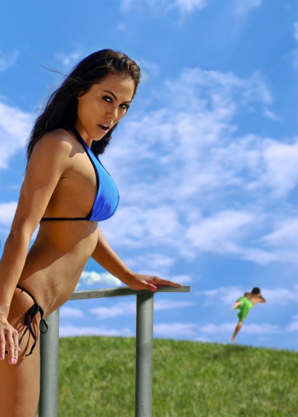
He must be insane to be running away from her...
not sure many will notice him jumping......
"He", "him"...who you people talk about?! 
@Author: funny image, light source seems to look ok. If possible, try to make the edges from the girl somewhat sharper, the source you used is really very sharp, right now it looks a bit blurry. Good luck!
OK Wazo, You’re exactly right, it was a shame for me to blur this sharp looking lady wasn’t it?
LOL , funny 
LOL perrrfect Author 
 and let the guy jump
you can do that to ANY contest, just put the source somewhere and make it disappeared, lol
yeh, but when the babe is this hot, who is looking at the source, unless of course, she is the source...
Well the source image has a very less presence felt because of the hot babe.....A nice idea....But why is that fellow running away from such a hot babe? 
Lol...
good question govindrathod.............perhaps we are not seeing the full picture..........maybe, she is a he!!!..you know, like this lady boys they have in thailand....
Kooks like he is commiting suicide.. I would too.. Shes gross.. and needs to eat.. Real women have curves and shape and padding... thank you for making me hurl my breakfast
Hello Jello
pudding I'm happy I could oblige you with that hurling of the breakfast thing ( you won't miss it, I'm sure) 
Was that a fat comment??? I won't miss me breakfast... LOL I am sorry you (all of you) have such Bland taste in women you actually believe media propaganda is beauty
The choice I made in using this particular woman had nothing to do with my perception, or for that matter, the worlds perception of how WOMEN SHOULD LOOK. I chose her because of the way it matched the lighting and the color of the source image. Uhmm...I have no idea what your weight is
LOL!! I like the pic I just don't like the girl... you shoulda filled her out made her look healthy .. but thats all because I am anti Media whores.. the grossness isn't in regards to your work it is in regards to the eyesore ... Just thought I'd clear that up
Maybe I've still got time to do one for the BIG GIRLS...
LOL!! I sent you a message about it.. I like your work.. I just thought my suicide comment was funny!!! could of been worse I was gonna comment on the sexual expression of her mouth and make a reference to STD's
i agree with jellopudding, bring on the big girls 
Howdie stranger!
If you want to rate this picture or participate in this contest, just:
LOGIN HERE or REGISTER FOR FREE
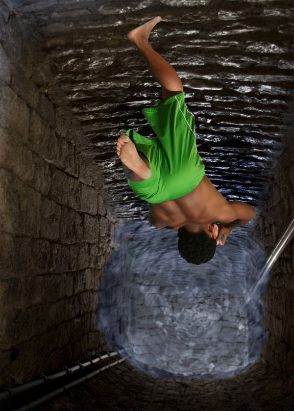
its simple used pic for passage and added water effect to it masked the source and now he is jumping in (5 years and 3712 days ago)
cool idea and good job too 
The water looks really fake but it's a really good idea  You should put it more transparent.
the water, as well as looking fake, is also too light for the depth it is at!
You could have selected a better source picture for the background.. a picture of a well or something. I like the idea, but a lot of more work needed.
great,gl
Well nice idea and nice use of the source but the water beneath if would have been made sort of a twister then it would have been the best....a superman tag on the fellow would also have added some funny part i guess....
Not bad, blur the wter edges a bit, and use the smudge brush to make them, look like they are actully touching the walls...also try making the water a bit darker and his shadow a tad smaller..GL
so what about it now hope to be good than the first one
yes thats better ..good job 
Howdie stranger!
If you want to rate this picture or participate in this contest, just:
LOGIN HERE or REGISTER FOR FREE
Photography and photoshop contests
We are a community of people with
a passion for photography, graphics and art in general.
Every day new photoshop
and photography contests are posted to compete in. We also have one weekly drawing contest
and one weekly 3D contest!
Participation is 100% free!
Just
register and get
started!
Good luck!
© 2015 Pxleyes.com. All rights reserved.

A bit too much blur, esp. on the figure...
Though the overall image is blur its nice to see that you have made his feet a little blur as well...
Cool...
Howdie stranger!
If you want to rate this picture or participate in this contest, just:
LOGIN HERE or REGISTER FOR FREE