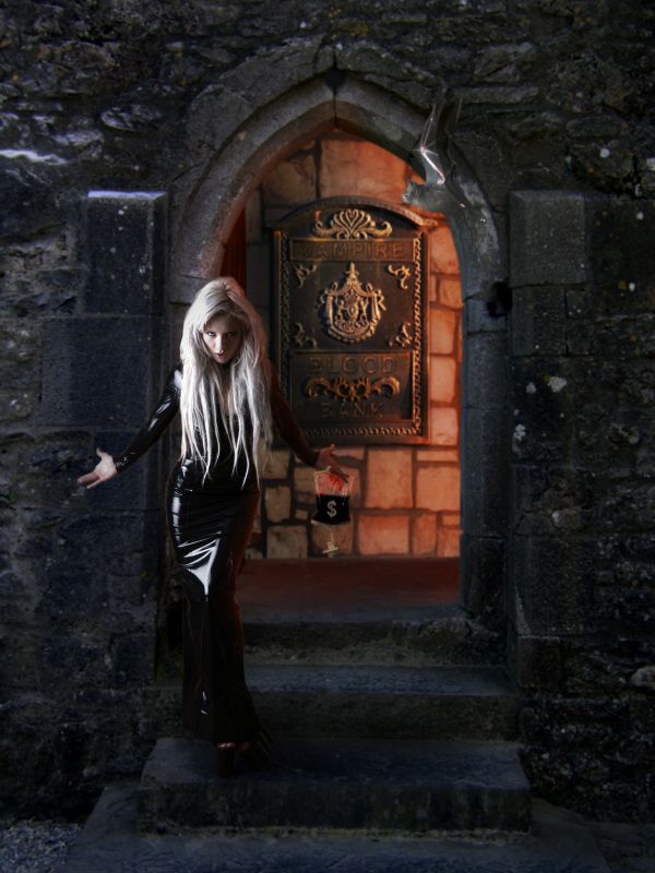
made in Photoshop CS3, only contest source used. Lots of cut and paste, warp and transform (5 years and 3701 days ago)

Howdie stranger!
If you want to participate in this contest, just:
LOGIN HERE or REGISTER FOR FREE

Very Important Vampire
...
Credits:
Castle door by Cornelia http://www.pxleyes.com/picture/4748/One-of-Cah---.html
Model by Marcus Ranum http://mjranum-stock.deviantart.com
Bat by falln-stock http://falln-stock.deviantart.com
Blood bag by CarbonNYC http://www.flickr.com/photos/carbonnyc/4120638141/sizes/l/ (5 years and 3704 days ago)
SBS?
its coming hold your horses
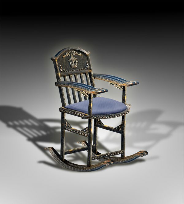
Ooh nice clean and beautiful job, author! Anxiously awaiting SBS...my horses are held...one small suggestion...the lower back end of the rocker appears to be getting a light source from the left, but the shadow doesn't reflect that. I know it's nitpicky...just something I thought I'd mention...
The perspective with the sitting cushion part vs. arms vs. "foot" isn't very accurate. On the other hand it's not 3D image, but done with basic tools.. pretty good job overall. The shadow edge is bit rude too. + for the creativity and using a lot of source.
Nice job....Nice work really....only thing is the rocker doesnt look that comfortable to sit because of the perspectives...but a nice job...
Totally agree with Widiar, look strange )
)
fixed.... Thanks for the comments
woo HOOO.. perspective is fixed now.. excellent job author
Still a little twisted. The double light source explains the bright spots under the cushion too. I still think the side further away should be a little smaller from this viewpoint, but it's quite good. Would fit good to some background source with an old, dusty room or something. High points from me for the idea and effort..
Love this,great final result...high marks
Very good!!!! nicely done!
the right side curved rocker bar looks skewed inward, otherwise, very clever for this source.
FYI: Use the "submit entry later" option when at the entry submit page, to submit entry and SBS at the same time and no one will ever ask "where the eff is your SBS" in the future.
I use it every time and no one ever gives me grief over an SBS
nice work!
Very nicely done......G/L Author.
great job
Congrats buzzy on 1st place! nicely done!
Congrats for your first place, Buzzy!
Wonderful work...congrats for 1st....
thank you soooo much
Congrantulations....even though the perspective of the cushion on the seat is out.
Congrats
wauwwww!!!
Congrats. good thinking, usage of source image is good. some perspective issues are there, otherwise a good job
Howdie stranger!
If you want to rate this picture or participate in this contest, just:
LOGIN HERE or REGISTER FOR FREE