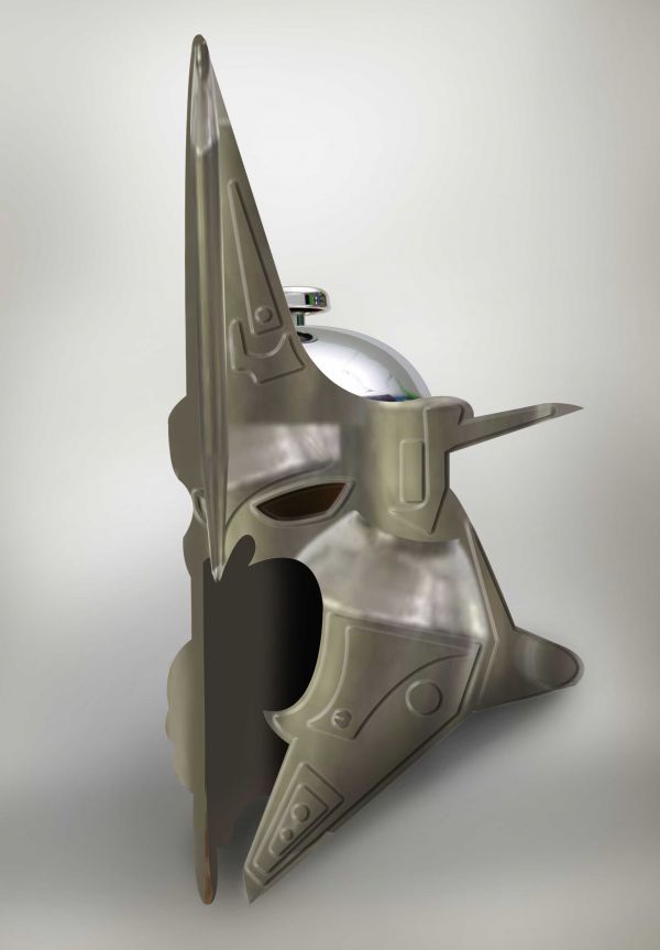
Creative approach, but the colour of the orig. source and the helmet are quite different. Also the inner side of the helmet looks a bit strange. Clean the strikes and the green reflection from the orig. source maybe and clean that transparent tip of the 'spike' on the right side. Good work.
author says:
Thank U all...., i made some changes
jawshoewhah [banned] says:
You did? Seems like shadows in the helmet should be softer.
Howdie stranger! If you want to rate this picture or participate in this contest, just:
I AM HAVING ISSUES UPLOADING A HIGH RES VERSION OF THE PICTURE ..IT IS BEING LOOKED INTO AND HOPEFULLY IT WILL BE RESOLVED AND I WILL HAVE ONE SOON!!! (5 years and 3570 days ago)
Did you try checking the box where it says "upload high res" on the upload page?
author says:
@jawshoewhahou there was a glitch and was unable to upload high res for this entry...and like I said I would appreciate you not marking my work with ignorant condescending comments... if you can't be polite friendly and constructive then keep your fingers off the keys ....... @ everyone else thanks for your comments and votes !!!
Howdie stranger! If you want to rate this picture or participate in this contest, just:
Looks great, I am suprized how well the metal and glass of the press goes together with the flowers. Nice treatment, and I also enjoy how you cropped the press. Even though I know what it is, I envision the rest of it looking completely different thant the original press if we zoomed out.
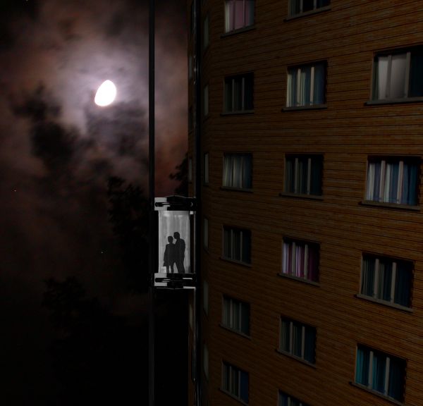
Very cool concept. I agree with erikuri that the angle is off. Also, I feel like the building should have been more futuristic looking to match the concept.
Howdie stranger! If you want to rate this picture or participate in this contest, just:
Fantastic work... but this one needs more perfection in shade and shadows.
Great, different approah Nicely done!
Nice idea, good variation on the original.
This has the feel of the Witch King of Angmar, good luck in the comp.
The interior of the helmet iusn't realistic, and the top metallic color should match that of the bottom...
Creative approach, but the colour of the orig. source and the helmet are quite different. Also the inner side of the helmet looks a bit strange. Clean the strikes and the green reflection from the orig. source maybe and clean that transparent tip of the 'spike' on the right side. Good work.
Thank U all...., i made some changes
You did? Seems like shadows in the helmet should be softer.
Howdie stranger!
If you want to rate this picture or participate in this contest, just:
LOGIN HERE or REGISTER FOR FREE