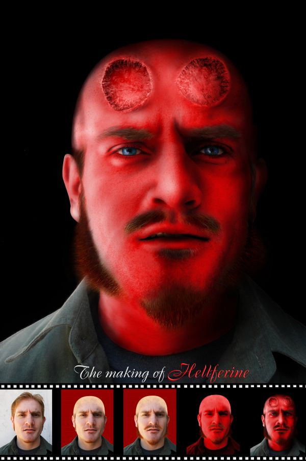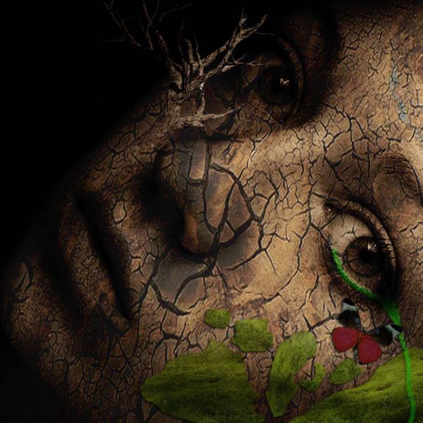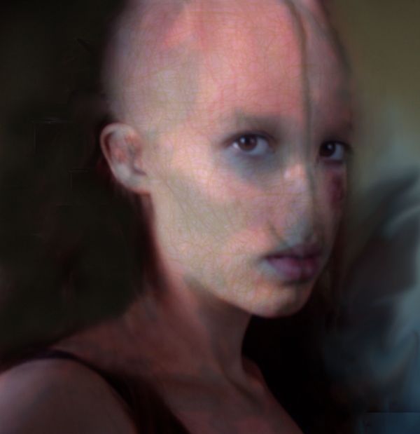
Not exactly Hell boy or Wolverine, just my imagination.
Thank to Johanna Chambers (chamberstock, DA) for providing the photo of her husband as the stock, also excelstock (DA) for the photo of the tree stump. (5 years and 3704 days ago)

(**_)
To: All the people who are saying that my entry is out of the theme:
My inspiration is “The Thing†from Fantastic 4. Please look at his make up
http://www.cinematicwallpaper.com/movie-pictures/wallpapers/Rise_of_the_Silver_Surfer_wallpaper/Rise_of_the_Silver_Surfer_the_thing.jpg
I think they are just the same =)
(5 years and 3705 days ago)

Here is the step by step:
1.Started out cloning from the center of the forehead creating a bald head.
2. clone in the background from the outside, in creating an edge for the shape of the head.
3.set healing brush to something medium like 18 pixels or so and start targeting the most obvious of your bad clone marks. Clone again from the center of the forehead. Magically upon letting up from each brush stroke it will lay down the texture you've just placed there, and then auto color correct it in to match the surrounding pixels!.
4. Use rubber stamp tool and rough in the removals of both eyebrows as well as the nose. Use the healing brush again to smoothen it all and make it look more real.
5.Create new adjustment layer = levels
when a levels adjustment layer is added to an image it creates a new blank white layer mask. Target this mask in the layers dialog box and invert it changing it to solid black.
6.Take brush tool and set size to 8 pixels, and then select the color white in color picker. I start of with drawing a line down the center of the face separating it into two halves. Then I put two small vertical lines, one on each side of the top lip of the mouth.
7. to give these lines a bit of depth , add a layer style to the adjustment layer.
Either double-click in a negative area of the layer in the layers pallet or right click on the layer and select Blending options from the contextual menu that pops up to invoke a layer style.
add a Bevel and Emboss Depth 61%, Direction Up, Size 13px, Soften 3.
7.add another adjustment layer with levels just like before. Play around with it to give the strokes in the face another coluor that matches.
8. In the RGB slider take out highlights using the bottom white arrow pulled in towards the center. And take out mid-tones by sliding the grey arrow to the right. Next target the green histogram and take green out of the highlights, (bottom white arrow, move to the left.) then do the same with the blue. Although I take out more blue to push the color to more of an orange- red as opposed to a purpley red. Hit ok in the dialog box and then target the mask of the adjustment layer and invert it.
Now, we're ready to paint with the red color correction. Use a soft edge brush 20-30 pixels in size and lightly color in around all of the lines of the face. I'm also using this color correction to start some of the bone work around the eyes using it to create some shadow areas.
9. same step as before, set up your levels, invert the mask and then start painting.
10. for the texture on the face.use my same technique as with the previous adjustment layers and start drawing all kinds of curly lines. For this adjustment layer I'm color correcting to a rusty orange color. Invert the mask and start painting.
11.next I create a dark green color correction and start painting squiggles all over the face.
And correct stuff until your happywith the result
(5 years and 3705 days ago)
cool!!! but why red
Do you know Hell boy? He is my inspiration ^^
Claws on cheeks...?
EDIT: Looks better now.
No, just look like claws. He has the titan bone, some of them extruded out of his face. I forgot to mention that there is fire in his head, so you can see his glowing left ear in the dark
I like the idea very much,great work,but i don get that titanium things...and u can add a cigar...u know that Hell boy like cigars and candy bars...
@erathion: thank you, but as I mentioned, I didn't intent to make Hell boy, I just took some of his appearances that I like
Overall I like the concept and hybrid character thing you have going on. Coloring looks good and I like the eyes. The only complaint I have is the metal pieces look like they are floating above rather than protruding from the face. I like the sbs making of at the bottom, it gives it the feel of being a DVD extra or something.
Thank you for your comments. Seems like these "claws" brought more troubles, so I removed them (I don't have time to fix them now, so this is the only solution)
VitalExpressions is right on IMO. I would add that the forehead pustule thingies don't seem to be embedded in his forehead, perhaps because they are more distinct than the rest of his face.
Actually, they are the skin and the remaining parts of his horns, which were drawn out by his enemy, revealing his skull
nice result, but remove the work in progress slides from the final image.. not necessary
great work!!
Great hellboy....Nice one....Does resemble well with the original hellboy....
Good work.
Howdie stranger!
If you want to rate this picture or participate in this contest, just:
LOGIN HERE or REGISTER FOR FREE