An entry i created 2 years ago for PST.
Made a few minor changes since, and thought this fitted the theme nicely. (5 years and 3716 days ago)
 Thats not fair !! I've just done an interesting picture but i can't submit it !!! ( 5 years and 3716 days ago )
 Howdie stranger!
If you want to participate in this contest, just:
LOGIN HERE or REGISTER FOR FREE

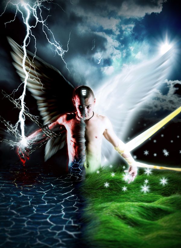
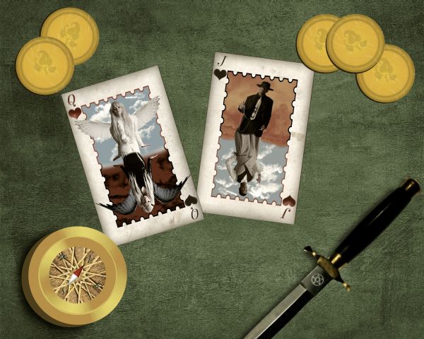
The everlasting battle inside of human kind...
Credits to these authors on Deviantart:
b-e-c-k-y-stock
wingsofahero
starna
fantasystock
tash-stock
poliu365
heyla-stock
stock-by-kai (5 years and 3712 days ago)

Kai Princess-http://kaiprincess.deviantart.com/
Marcus J. Ranum-http://mjranum-stock.deviantart.com/
www.bashcorpo.com-http://bashcorpo.deviantart.com/
Mila Vasileva-http://milavasileva.deviantart.com/
Resources + Images-http://euphoricdesire-stock.deviantart.com/
alta-http://alta-photopraphy.deviantart.com/
Brenda Clarke-http://inadesign-stock.deviantart.com/
Thanks guys for the great resources...
For PXLeyes voters
CHECK HIGH RESOLUTION BEFORE VOTING...Thanks (5 years and 3711 days ago)

What is happening inside our chest? Can we be both sin and saint? One deal can decide that...
This is the idea of showing the nature inside, so the appearances of the characters are not important, not need to be the same person.
Please check the Hi-Res before voting. Thank you very much, hope you like it.
Thank to Marcus Ranum for the awesome stocks of models, atomicpixel (Deviantart) for the X-ray image of the hand, isostock (Deviantart) for the X-ray image of the chest, and aestchen (Deviantart) for the metalic heart. (5 years and 3711 days ago)
oooooh wow
Nice work. Seen a few of these "Face off's" around but very nice addition with the lions teeth. On the head, where the face was removed looks unrealistic. Girl source ? Nice overall job. Good luck
super creative take on the theme
Thanks Barnacle....you are entitled to your own opinion, but i have to disagree.......it looks realistic to me, but then again ive never seen a face removed like that so i guess i wouldnt know. The girls is from an old PST source pic. Its in the step guide.
old entry :O the edge of the lion's mouth needs to blend better
This is very nice work...i am personally against uploading old creations...but this work fits great to the theme...gl
Thanks kid....i cleaned up the edges of the mouth more.
Erathion........All my work was lost when PST crashed.....more than 300 entries and over a thousand hours in work down the drain.......i would love to see all the great works from the past re-submitted by everyone in the same boat as me.
I remember that entry, and yes, this fits the theme here perfectly. did it have the lion's mouth on the old entry? nice forked tongue!

WOW!!!!!!!!!
Amazing
cool !
Very cool !
Very cool !
wauwww! good luck author!!! ( how you do that so fast! ) it is super beautiful! and a nice idea
I like it.
Uh how can it look like a realistic cut ? The face has four parallel red fuzzy lines where the cut was made. I would expect to see one cut line and some swolen tissue along the incision line. That said, I rated it high even for an old entry
Thanks Barnacle.....wow....your a tough critic......who says its human? Perhaps its just 4 layers off skin at the edge that can be seen. To me, it looks realistic enough.
Very Well Put ... Excellent...
Someones gotta keep you on your toes :P
great.
WOW... visually amazing!... lost for words
one of best crazy photoshop effect... that I ever seen... Fantastic
Judging from the other entries I've seen so far, I'd be quite surprised to see this place any less than first. The originality and take on the theme is extraordinary. I'm just wondering, did you do this image just for this contest or was it something from a previous contest on PST? Just curious.
Hahaha..what the heck? lol
It was good back then, and it's still good. As a matter of fact, better than most.
Good work.
Congrats for your first place, Freejay!
Congrats freejay!
Congratulations on you 1st place. Great job!
Congrats, terrific work
Thanks all for the great comments.
ooo nice
Howdie stranger!
If you want to rate this picture or participate in this contest, just:
LOGIN HERE or REGISTER FOR FREE