(5 years and 3671 days ago)

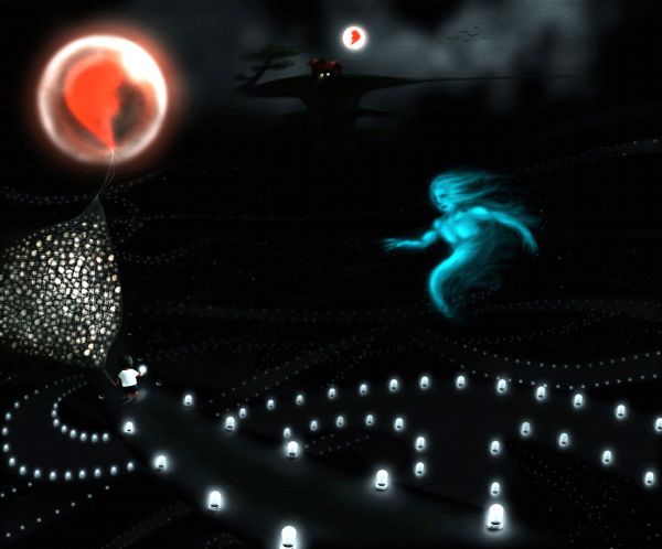
One day the Sun stops burning and the world covered with darkness. This is a story about a man who is far away from home when the darkness appears. The way home for him is very struggle because it's a labyrinth. A God of darkness wants to help him but also want to challenge his love, so he gives the man a million of light bulbs, which are enlightened by his love. Marking the labyrinth with light, he can avoid entering the same path. Now in front of him is the universe of light bulbs... Only love can help him come back to his wife...
Only the source was used, the remaining part is painting. I hope jawshoewhah likes this work but I have to say sorry to him because of my minimum use of source :(. I don't know why this idea came to me immediately after seeing this source...
Please check the Hi-Res before voting, thank you very much ^^ (5 years and 3672 days ago)

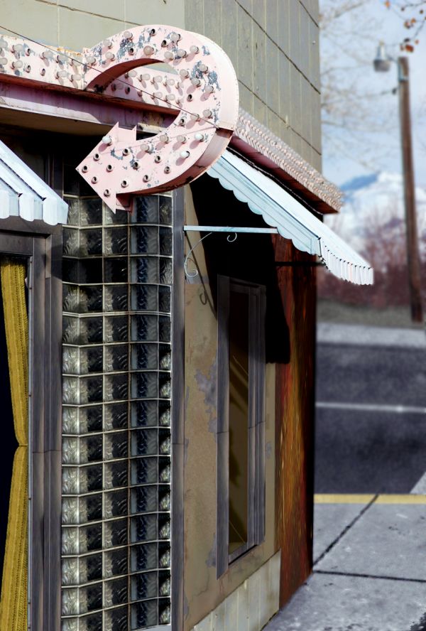
used only contest source here to complete this photo, lots of cloning of source elements and patterns derived from sample areas in the original. also standard patters from the photoshop patterns pallet. The only external tool used were tree brushes, you can find them here; http://www.brusheezy.com/brush/1337-Tree-Master-Pack (5 years and 3675 days ago)
Outside edge should be lighter, beer sign rotated a bit counterclockwise...the rest is good.

great job... not sure if you have used a web safe color as there seem to be quite a bit of pixelation even in the high res... may want to try and tone down the red a bit too... GL!!
Yeah it does loose something, especially where the shadows of the light bulbs are. A lot of "pixelation" between my work here at home and the uploaded version...I kind of want the red bright though.
Under new direction... new decoration... nice!
looking good i like the red Author. Good luck
Thanks Nator and cbldawg71 for the 2nd opinions much appreciated, thanks.
nice job! i like the change of background too!
Just a nit-pick. The angle of the first 'k' is almost verticle, where the second 'k' is slated more forward. A littl backward skew would fix that. That being said, nice restoration work
Wow you really cleaned it up. It's probably wee bit too red but that's just IMO. GL!
Nice work...good luck
Nice resto.
very good
congrats
Howdie stranger!
If you want to rate this picture or participate in this contest, just:
LOGIN HERE or REGISTER FOR FREE