nasirkhan: IMO we have to take inside photoshop of restaurant including peoples, furniture and then place them on moutain, river, road or ...... MOD please clearify ( 5 years and 3494 days ago )
nasirkhan: I mean photo of ... ( 5 years and 3494 days ago )
jawshoewhah: I think they should have clarified a bit on the restaurant source image. Call it a hunch but I don't think you have to take your own pictures and creative commons would be fine. Although taking your own would be more fun ( 5 years and 3493 days ago )
langstrum: I think it's not important inside or outside the restaurant, different angles will make more fun ( 5 years and 3492 days ago )
Chalty669: I think part of this website is flawed. My entry was deleted because I didnt' post a link to a brush I used, and I completely overlooked their notice. I find it funny that an entry gets deleted after 4 hours of work is done on it all because a brush which I've had installed for over 5 years. By the way I just made a brush similar in just 30 seconds. Really considering staying a member of this community. I'ts not like I'm taking the easy way out and just copying pictures from deviantart! ( 5 years and 3486 days ago )
Howdie stranger! If you want to participate in this contest, just:
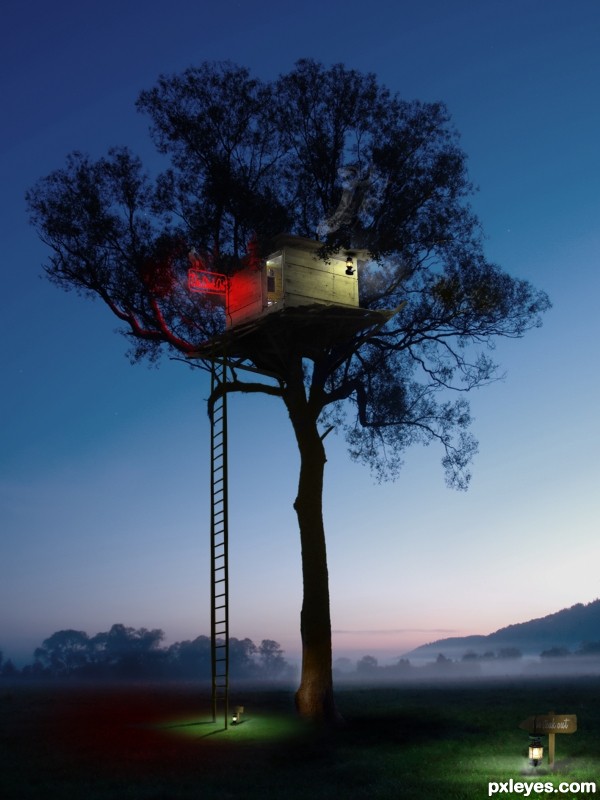
This is really well thought out and I really like the lighting you've achieved, but your SBS leaves much to be desired.
author says:
I did that because a mod asked what the source was for the sign and ladder. But there's none and it's easy to make it yourself. IMO its about the outcome and not about the SBS...
Author, I agree with you that the final outcome should be more important than the SBS. When I first started submitting entries I didn't want to make SBS's because I had just spent all this time on my image. I then realized that it let people see how much work really goes into your work. I also think this site is a learning environment because the SBS's. I enjoy your work and look forward to seeing more.
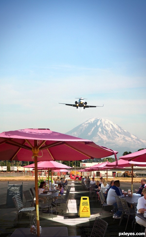
The restaurant extraction is indeed awesome. But I think the airstrip is too hidden. I would move the left and right sides of the restaurant away from the center and toward their respective edges in order to open up the middle to reveal the arrows on the runway more. That would also allow the yellow warning sign to stand out and be a greater focus.
author says:
Thanks! the cut out took me a few hours
Changed a few things, opened up the middle a bit and brought in a bigger closer airplane, changed a few colours, the mountain is brighter too.
Clever idea (although a KFC in the West Wing of the White House itself would be more compelling). nasirkhan is right on about the perspective. The KFC source pic's horizon line (which would be the location of the KFC's vanishing point) appears to run roughly at the level of the bottom 0 in the house number on the far edge of the building -- which is well below the horizon line in the White House pic.
Oh, I love KFC!!! The secret seasoning of 11 herbs... yum! Unfortunatelly we don't have KFC in Brazil anymore...
author says:
Thanks everyone for your comments and suggestions. I tried to adjust the grade of the south lawn I hope the Chicken house's perspective is better. Erikuri, my fried chicken is way better than the Colonels, besides if you eat too much KFC it'll make you fat, lol
Much improved perspectively. And bigger is indeed better! Plus I think the "no jobs" on the sign adds a hint of political commentary. [Not clear if downoffthedragon merely doesn't find the image humorous (not a requirement of the contest) or if he/she disapproves of disrespecting the White House (a legitimate opinion).]
author says:
I chose the Kentucky Fried Chicken building because I like their colors, Red, White, and Blue. Therefore my title: "American Classic"
Author, I totally agree with you! No, I don't use to eat so much fried food, I get sick, and I know it's not good for health. I hardly ever eat a tempura (japanese fried food)... But I like the KFC seasoning... If you say your fried chicken is better, send me some for e-mail!!!
RAZ0R [banned] says:
i heard Author has been frying chicken longer than the Colonel!
author says:
@ RAZOR... hell I am the original recipe!
@ downoffthedragon...don't diss'em if you ain't tried 'em
from regular view this looks pretty good and was well thought out. With the large preview you can tell the KFC is of a lower resolution. I would've suggested either downsizing the total image to match the KFC source or you could have downsized it and then upsized it so it was also pixelated like the KFC source.
dont take me wrong. the idea is great, but the place looks empty and abandoned. maybe if you put some people around in spacesuit and a spaceship in the driveway makes it look more realistic. I wiil hold my vote for now. good luck
I agree about light...But idea is great if u fix that u will have great image.Just flip the rock and do some masking...best of luck author
edit:and u could create some sphere maybe...
Thanks for the comments guys, I`ve neutralised the lighting and burned and dodged to preserve some highlights hope its better . As far as the lack of life, I chose an abandoned looking source on the basis that being a resturant in an unusual place wouldnt get alot of trade . I`d rather stick to that theory based on this restaurant being highly inaccessable but I do respect your opinions.
Credits to night-fate-stock - http://night-fate-stock.deviantart.com/
fairiegoodmother - http://fairiegoodmother.deviantart.com/ (5 years and 3490 days ago)
Brilliant work! I love the idea and your photoshopping skills!
Very nice. The ground lamps' perspectives are off (should be looking down on, not up at, them), however.
Nice job
I agree with Dan about the lamps.
This better ?
This is really well thought out and I really like the lighting you've achieved, but your SBS leaves much to be desired.
I did that because a mod asked what the source was for the sign and ladder. But there's none and it's easy to make it yourself. IMO its about the outcome and not about the SBS...
Author, I agree with you that the final outcome should be more important than the SBS. When I first started submitting entries I didn't want to make SBS's because I had just spent all this time on my image. I then realized that it let people see how much work really goes into your work. I also think this site is a learning environment because the SBS's. I enjoy your work and look forward to seeing more.
Romantic
Tree top diner..... very good work......GL
i think i would be regular customer in this restaurant! Love this entry and the idea! GL
nice..good luck
Congrats for your first place, Ressiv!
Congrats, really nice work
Congratulations for 1st
congrats !!
Very good work!! Congrats!!
Congrats on 1st place
Congrats!!!!
Thanx a lot all! Glad you like it
Chalty669 you've got a point there, it does show how much effort you put in it!
Congrats!!
Howdie stranger!
If you want to rate this picture or participate in this contest, just:
LOGIN HERE or REGISTER FOR FREE