(5 years and 3716 days ago)
1 Source:
- 1: source1
Thanks to:
- LotusHead at sxc.hu
- Glenn Loos-Austin at Flickr (5 years and 3714 days ago)
Photography and photoshop contests
We are a community of people with
a passion for photography, graphics and art in general.
Every day new photoshop
and photography contests are posted to compete in. We also have one weekly drawing contest
and one weekly 3D contest!
Participation is 100% free!
Just
register and get
started!
Good luck!
© 2015 Pxleyes.com. All rights reserved.
 Nicely done


Cool, looks real ;D
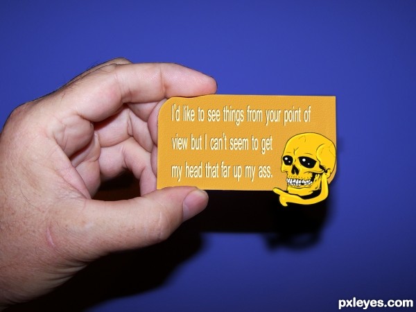
Nice, but I would darken the letters a slight, hard to see. Also with the text; Move "that" down a step. It´s to close to the scull.
Maybe you can have it "not centered". Otherwise good job!
hehehe..
Pretty good
Several points of view make the difference

Great...love this...good luck author
Very innovative to interpret "card" as business card and I always like when the entry goes beyond the basic requirements to provide some context (the hand in this case). I think we can all relate to the sentiment, but apparently its wordiness necessitated squishing the letters which makes it a little bit difficult to read IMO. The skull graphic seems totally arbitrary (why a skull?) and I question going outside the dimensions of a standard business card -- which is maybe being too practical, but I do think an unexpected message in a standard format is the point of this contest. Also, I would expand the title to "Nice to meet you. Here's my card." (if that much length is allowed). {Would "Nice meeting you. My card." fit?} [BTW a comma after "view" wouldn't take up much space.]
Funny and a different "take"on the format. I don't see a particular reason for a skull either but that doesn't bother me at all. BTW DanLundberg, you wouldn't put a comma in front of a conjunction such as but or and. That wouldn't be proper grammar.
Much better after the changing. GL
GL
i like the skull, it sets the mood for the business at hand
what a nice card lol
Cool, business card
Great idea......gl
cool entry, author! GL
nice job
Howdie stranger!
If you want to rate this picture or participate in this contest, just:
LOGIN HERE or REGISTER FOR FREE