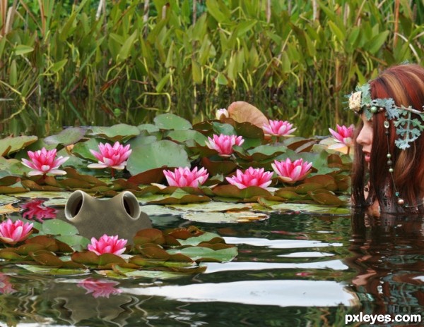
A used the Two Cup picture for my eyes on the bull frog and the clone tool. MarjoleinART-Stock from Deviation and filter tools. (5 years and 3632 days ago)
- 1: source1
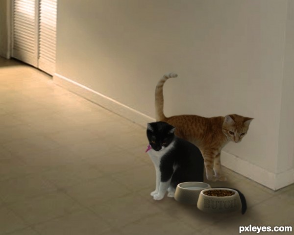
"LETS EAT!" (5 years and 3638 days ago)
Good luck 
Nice work but cats look a bit copy/paste...try to create few adjustment layers or use blur tool for the cats edges...and work a bit more on the shadows,under the cats and under the bowl's...good luck
agree with erathion, bowls and kitties are floating.
Easy fix and good luck.
MO is the same as above. 
i changed it a bit to make it seem not so cut and paste, let me know if its better 
Bowls look like they kinda floating there, maybe darken the shadow on the floor?GL
yes what loopy says: just a narrow and darker shadow at the base of bowls will make this much better  good luck and the kitties looking better.
  I use pen tool and stroke path and blur but there are other ways.
loopyluv and cabldawg71 are right on with their advice, but the kitties need a mini dark shadow where they touch the ground as well. Hopefully all of that will eliminate the impression that Butch's dish is encroaching on the black kitty tail.
what they said.... Reduce shadows MUCH MORE!
gud luck
Howdie stranger!
If you want to rate this picture or participate in this contest, just:
LOGIN HERE or REGISTER FOR FREE
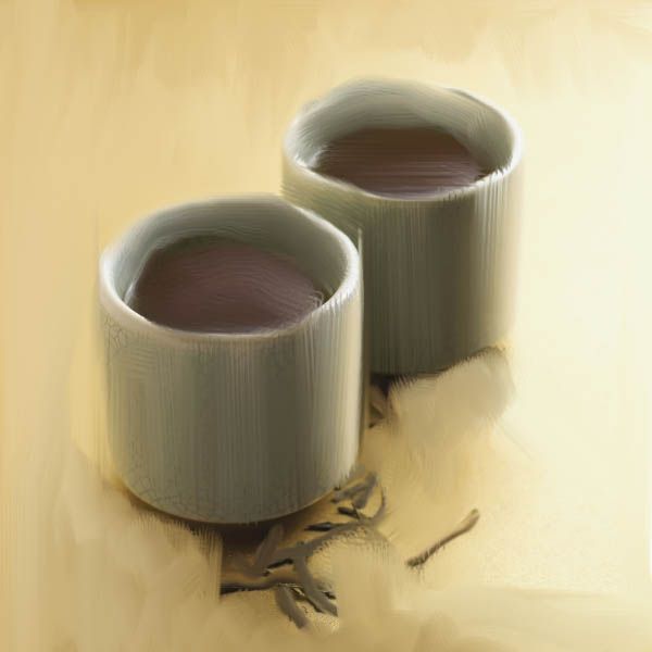
Used just brush tool and smudge tool.
(5 years and 3636 days ago)
Someone has CS5 :P
Yaaa but I used that technique of brushing only for the brown things over there. But I didn't like the effect and again started to use the smudge tool with new 'self-designed' brush.
Best of luck
gud luck
Howdie stranger!
If you want to rate this picture or participate in this contest, just:
LOGIN HERE or REGISTER FOR FREE
(5 years and 3636 days ago)
Nice 
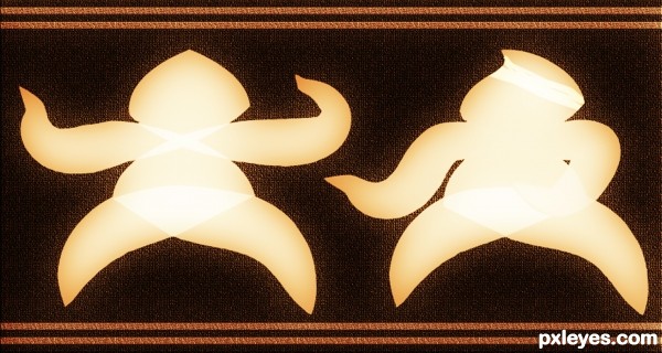
use of source is looks very low........ good luck 
nice but i think its a bit CBR (chopped beyond recognition) good luck though 
Agrees with Lamantine. You know I coined that antonym? (CBR'd)
At this point it looks like you could have made this without the source, hence my agreement with it being CBR'd. Can you see where we are coming from? Although it's not against the rules, it does take away from the creativity with the original source. That's all.
Hey Lamantine and Jwashoewah i know that it's not really related to the 1st image and this is the reason:
I've wanted to try my chance in a contest so I started to edit the image and i got this result i knew it was CBR'd but I didn't have time to do another one because i'm studying now for my final exams that's why I've uploaded it.
And thanks a lot for your comment
gud luck
Howdie stranger!
If you want to rate this picture or participate in this contest, just:
LOGIN HERE or REGISTER FOR FREE
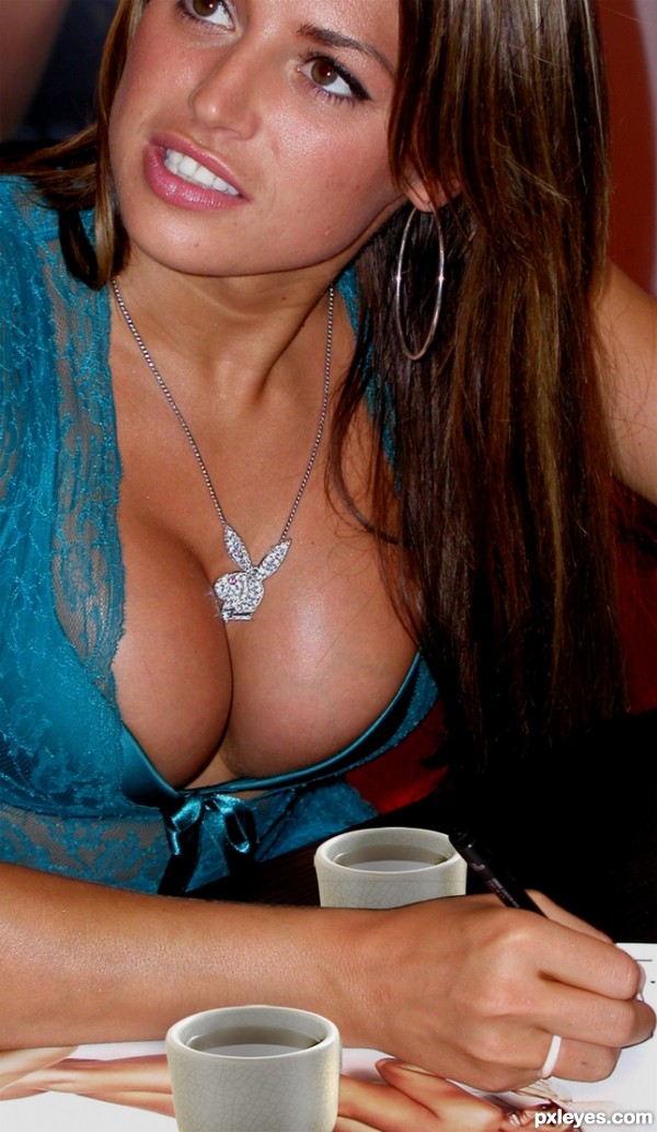
http://www.everystockphoto.com/photo.php?imageId=4312301 (5 years and 3633 days ago)
haha i was thinking along those lines but you beat me too it 
i think to make it better you could change the light sources on the cups...
Still looking for the source....... OH there it is!  Was a little distracted. I'm just glad she not pooping in them
But seriously, the cups are still showing the same brighter light source than the busty gal you chopped them into. Try adjusting the contrast levels on the cups layer or even dodge and burn. It would look more realistic. But hey, props to keeping me distracted 
hey.. where is the source image..? this should be off theme isn't it.. I swear I looked everywhere in the entry for source image..  btw jawshs is right.. take care of that..
I see I was not the only one distracted :P
I want to comment but that means scrolling away from the picture!
they look like collage... the luminosity and the contrasts are totally opposite. and being a free photoshop editing, i won't say the main subject of the creation is the center of attention, but i think it should be. Good luck
Two cups? Which cups? G cups? 
Sorry... Japanese tea cups are a bit small (or the boobs are a "bit" big...) and the backward one must be a slightly darker for shadows... 
thanks for the comments everyone, very helpful but seriously, who's looking that far down in the picture...i mean, come on now......
yea author.. nice picture..  and well said barracuda and erikuri..

Imagine whole set of cups...then no one could find source image parts...Good luck author,great cups,mistake idea,idea...lol
gud luck
luckily, being a female, and not breast obsessed, i can look past the image used for this one and see two chopped cups plopped down on a picture. There is so much more that could have been done with this idea. i get what you were attempting and all, but really, just because there is a pair of breasts in there, doesn't mean that its a decent chop.
work more on the execution of it. add dimension to those cups, shadowing to give them more "believable" standings in that picture. she is signing autographs, she'd have knocked over those tiny cups with her arm..or the obnoxious fake ta-tas.
don't know about all that but nice pair Author 

giggle! look at the varicose veins on the breast! she needs some "touch" up... hehe. and i firmly agree with jadedink, you just plopped the cups in. you guys really like that? hm...
not realy, just thought it'd be funny...
i dont know about vericose.
Howdie stranger!
If you want to rate this picture or participate in this contest, just:
LOGIN HERE or REGISTER FOR FREE
Photography and photoshop contests
We are a community of people with
a passion for photography, graphics and art in general.
Every day new photoshop
and photography contests are posted to compete in. We also have one weekly drawing contest
and one weekly 3D contest!
Participation is 100% free!
Just
register and get
started!
Good luck!
© 2015 Pxleyes.com. All rights reserved.

It's a nice idea, but you could have made the eyes inside the cups...
GL
nice
Howdie stranger!
If you want to rate this picture or participate in this contest, just:
LOGIN HERE or REGISTER FOR FREE