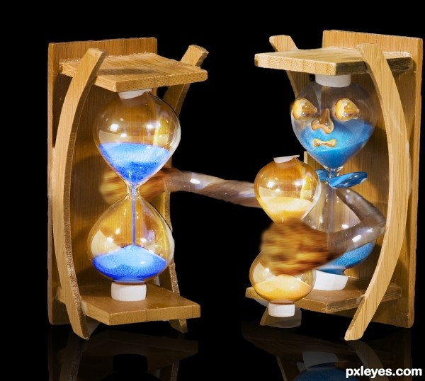
Only the source image and PS. (5 years and 3615 days ago)
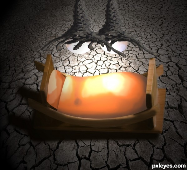
hope you like it... (5 years and 3614 days ago)
Very creative thinking! The bed looks good but the rest around it makes the image worse.
Are those lights above the bed? If so the perspective is off, instead of being above the bed they look like they are crawling to bed.
I agree with Chalty; I thought of something trying to reach the bed...
thanks for the comment. and the perspective is way off indeed. but i did it to make the picture somehow strange and creapy. and that you would get the idea that the 'lights' are hands that are trying to grab you.
nice one
good luck
Howdie stranger!
If you want to rate this picture or participate in this contest, just:
LOGIN HERE or REGISTER FOR FREE
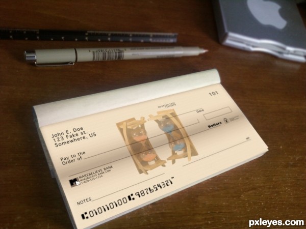
(5 years and 3614 days ago)
I like this a lot because it is basic photoshopping and it looks real. If I were you though, I would really cover up your name and numbers more in your SBS :o
thanx, its an old account thats been closed for years so i'm not too concerned about it.... : )
yea... definately cover them better.. nice entry tho
Author, you may not be concerned about it, but contest must be anonymous... Or mods will remove your entry! 
Edit: well, I wrote the comment above before voting; after voting I saw it's not your name! Author, it's a very realistic anc convincent work! GL... 
thanks, i went back and blurred it...
good luck
Howdie stranger!
If you want to rate this picture or participate in this contest, just:
LOGIN HERE or REGISTER FOR FREE
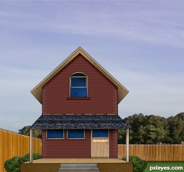
(5 years and 3614 days ago)
neat
Pretty house! 
You really didn't need the source to make this. You barely used any of it. Honestly, you didn't even need it.
good luck
Howdie stranger!
If you want to rate this picture or participate in this contest, just:
LOGIN HERE or REGISTER FOR FREE
(5 years and 3620 days ago)
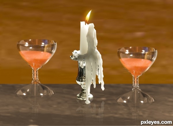
good idea, my only suggestion would be to reduce the opacity of the reflections and you'll have a great entry 
thanks i fix it
looks way better now 
Overall nice entry with some nice reflections. Not sure what the the white line is going through the middle, but it's a bit distraction. Also a full resolution file would be nice.
white line is going through the middle i mean it the glass is Transparent 
it is Separative between the wall and the table
Author, I understand that you were trying to show the transparency of the glasses by splitting the wall from the table. I would only suggest that you make the wall or the table a different shade or color instead of having the white line run all the way through your image. When I step back and look at your image my eyes migrate directly towards that area. There are plenty more details throughout your image which are overtaken by that line. This is just a suggest and after everything is said and done you have some nice work here. Good Luck!
thanks Chalty669 i fix it
Wow! Makes a big difference IMHO. Good Luck!
many thanks Lamantine and Chalty669
thanks 
good luck
Howdie stranger!
If you want to rate this picture or participate in this contest, just:
LOGIN HERE or REGISTER FOR FREE
Photography and photoshop contests
We are a community of people with
a passion for photography, graphics and art in general.
Every day new photoshop
and photography contests are posted to compete in. We also have one weekly drawing contest
and one weekly 3D contest!
Participation is 100% free!
Just
register and get
started!
Good luck!
© 2015 Pxleyes.com. All rights reserved.

hehehe... great idea author.. I thought the hour glasses looked like soda bottles hehehe
he he thanks for ur comments LOL
good luck
Howdie stranger!
If you want to rate this picture or participate in this contest, just:
LOGIN HERE or REGISTER FOR FREE