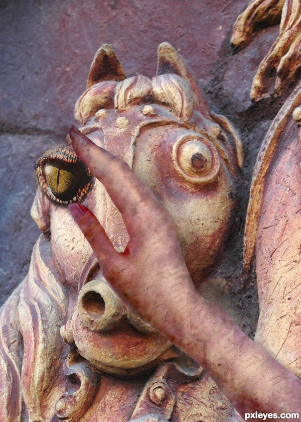
From the idiom "A still tongue keeps a wise head" (5 years and 3615 days ago)

Thank you to the following for the use of thier images:
Hand by demordian.
Croc by doc.
Stone statue by porah (5 years and 3617 days ago)
Link posted doesn't lead to hand used. Edges of hand should be softened. Light source of main image is from left, so hand shadow is wrong. Would be better to make SBS to show how hand texture was made (which isn't included in source links).
Thanks for pointing out wrong hand image - now rectified! Will look at shadow today. Hand image - used overlay. Am looking forsuitable SBS. Thanks for the help!
good luck
Howdie stranger!
If you want to rate this picture or participate in this contest, just:
LOGIN HERE or REGISTER FOR FREE

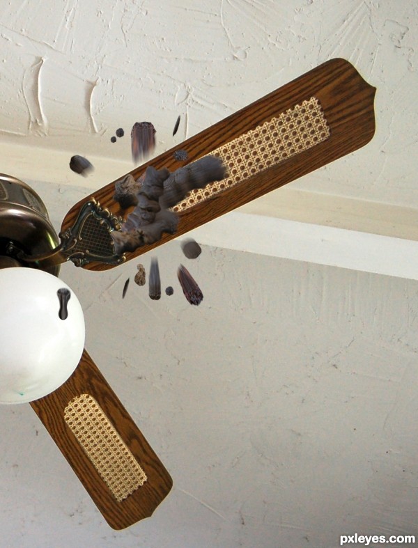
I added more splatter. (5 years and 3614 days ago)
| 6 Comments | When, the, Hits, Fan |
there would definitely be more splattering.
buahahahahahahahahahahahahha!!!!!
I added more splatter.
I have a feeling this might be... yup. You do like to push the boundaries don't you! :P
I just try to include the humor factor. 
good luck
Howdie stranger!
If you want to rate this picture or participate in this contest, just:
LOGIN HERE or REGISTER FOR FREE

my photo
added censor pixelation not to scare the children, looks like a brown heart now (5 years and 3617 days ago)
Doesn't work. 
Yes it does.. works perfectly dear.. I just had to censor it... dah.. it's perfectly understood..you're just being yourself... hehehe (and I got the doorstop in the first guess..hehehe)
Get it? CRACK of DAWN.. there's the CRACK and at the top is THE DAWN... hmmm.. it couldn't be clearer
Really? Too bad you were on ignore for your incessant provocative behavior. And what does your comment have to do with your entry? Don't you ever learn?
Meow Meow Meow LOL... but you were provocative before.. I'm all confused.. OMG.. does this mean we are dating oh egg headed one with the Erik Estrada Sunglasses... my little cuddle baby.. but remember.. you have to wash first... don't want any of your poo poo undies in the mix.. that would be gross 
You wuv me ..hehehe
You disgust me in many ways. I think your sanity is at question, as do others.
So ? Van Gogh was insane.. I have great Company...and the members around here... they love me.. a lot hehehehe.. you are the cranky potato
WAHHHHH.. you used my avatar with out my permission... WAHHHH.. you used Lens Flare... WAHHHHHH you used Plastic Wrap.... WAHHHHHH.. every one on this site is crap... WAHHHHHH...
give it up Bob.. you are just a whiny little goob.. and EVERYONE knows it... LOL
(sorry everyone.. I'm fighting with my boyfriend... Please feel free to comment... though cover your children's eyes.. this could get a bit steamy..)
I've said enough. Judge for yourselves.
You are done already.. awe gee.. you usually last longer.. Did you watch porn before we started?.. that's so rude... sigh
nice idea but that's really gross imho 
Thank you Lamantine and Kevinice, honesty is very appreciated.. as to it being gross.. that was kinda the whole Idea... as I was interpreting the Idiom verbatim... there really wasn't any other route for me to go and I had the dawn picture so this was the only possible route
EDIT: and Kevin.. I'm INSANE like Van Gogh... I wasn't claiming this was an art work on his level in anyway... this is more like a Piece of art that would go into Mad Magazine or Cracked...
 good luck
Lmao the comments are almost as funny as the picture. Controversial art? Why not. Good luck
Heinrich..hehehe YOU GOT IT.. I love controversy and art woot, and the conversation just adds to it...hehehe
good luck.
Author, sorry, I didn't see the entry before you put the mosaic on it... that's why I can't say who's wrong or right in this discussion; sometimes it's funny your bawlings, but, seriously, I wouldn't like to see it frequently ('cause I like you both!)... 
awwww.. little erikuri... don't worry.. Me and grumpy potato head have these confrontations about once every three months.. I think we're all used to them by now... I say something in the forum that really ticks him off.. he gets all bent out of shape and has to come over here to PXL and say something rotten to get me back.. it's all quite predictable... in fact.. it used to upset me now I just wait for it to happen.. hehehehe...  ...
...
This strikes me as Crack AND Dawn (or maybe Dawn and Crack given the arrangement of the composition). I would expect the dawn to be coming out of the crack in order to be Crack OF Dawn.
LOL.. your logic Dan is absolutely mesmerizing.. definite gold star for you  (I never thought of it that way)
This concept could have been REALLY funny... sometimes subtly is the key. As it is, it's just gross and relies on a crutch of potty humor that could have been really funny but it isn't, as it's badly shaded, and looks more like a bra than an arse.
Personally I`m not as offended by this as some, however I dont think it looks like an ass, IMO it looks more like 2 chickens eggs.....which luckily if adapted could create a less offensive "crack" image. Fresh eggs at dawn but one or both is cracked? or dawn emerging from a cracked egg ? just a thought 
as CMYK would say Annabat.. the puppets will follow... LOLOLOL.. you take time out of your BUSY day where you can't finish ANY of your chops.. blah blah blah whine whine whine.. to attack me... LOL..your are a gas.... LOL... now go back into the forum and chat room and sit and pine dear..  (you set yourself up for that one sweetheart.. and don't forget that)
EDIT: PS... whispering.. (if you were more consistent in your commenting.. you'd be taken much more seriously.. as this is not the case.. I really have no clue if you are being sincere or just following your homophobic best friend)
thank you Geexman.. I'm so happy this entry is causing so much controversy.. this is turning out better then I thought
I tried very hard to prevent it from looking like a real butt.. as annabat says.. it doesn't look real.. if it did.. it would immediately be pulled (though her comment is suspect... strange xenophobic worship I will never understand)... (I have hundreds of REAL butt pictures.. but then CMYK would poo poo it for me having a picture of MAN's BUTT.. and his homophobia would run rampant ... hehehe
It does have to stay Idiomatic .. so I didn't think I could play with the wording... 
Well, ummmm....this is...ahh...Ya know, the clouds are pretty. I guess what I really want to say is, why do you use the term "potato head" like its an insult, buster?!? 
not an IDAHO TATER... a New Jersey POTATO.. not the same thing 
Oh come on guys!! this is funny!!! lol...
Good job author, I for one LIKE IT!
i agree with loopyluv 
I LOVE controversy!!! 


good luck
weeeeee LAST PLACE... I LOVE IT... thanks everyone for you kind comments 
Howdie stranger!
If you want to rate this picture or participate in this contest, just:
LOGIN HERE or REGISTER FOR FREE
Photography and photoshop contests
We are a community of people with
a passion for photography, graphics and art in general.
Every day new photoshop
and photography contests are posted to compete in. We also have one weekly drawing contest
and one weekly 3D contest!
Participation is 100% free!
Just
register and get
started!
Good luck!
© 2015 Pxleyes.com. All rights reserved.

The light area behind his head and back don't really look like they belong there. Also, the inconsistant blur on his body doesn't look right.
I think you've illustrated a proverb/adage/saying rather than an American-English idom. That said, if there's tape over his mouth, then we shouldn't be able to see lips, but rather just a straight up-and-down edge.
Thank you for the comments! I will try to fix those as best as I can.
I like this image....
Just try to focus that man more than lens flair... That character is totally merging in background....
good luck
Howdie stranger!
If you want to rate this picture or participate in this contest, just:
LOGIN HERE or REGISTER FOR FREE