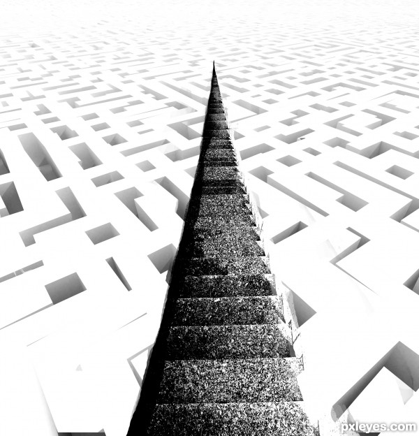
Thanks to gerard79 for maze picture
(5 years and 3613 days ago)
- 1: Maze

With thanks tothe following:
Playground by Agrid
Legs by klsa12
Ball by IJeyash
Boy by Annalog85 (5 years and 3609 days ago)
its a nice image but there are a few odd things about it... the lighting of the steps doesn't match the light cast on the figures (maybe flip the steps horizontally) i dunno if you meant to do this but the perspective is way off, as the figure on top should be much smaller. also since im picking nits, the child with the ball looks transparent around the boarders
Krystian - that's one mighty comment! - so one by one - the lighting on the steps - yes, but the figures have been flipped so much that they are dizzy! - well the little girl is anyway! Regarding the perspective, well, I'd love to say "yes I wanted it like that" but that would be lying! I'm not good with perspective, but on the whole I didn't think this one was too bad? (Obviously it is...) I will point out that the figure at the top is an adult and therefore meant to be bigger. And lastly that poor transparent child-yes you're right she does look it ,but honestly - she really isn't!
Nice concept, but the tiny steps at the top of the image don't really match Papa's big butt. Also the right-side railing's shadow that nearly covers the stair steps is at odds with the lighting of the upper two figures. And the left railing seems higher than the right railing which is unexpected.
DanLundberg - I see the small steps and the big butt......but - he had to squeeze himself on there to keep an eye on the children! The rest of your comments I take on board. Oh, and I owe an apology to Krystian - poor child WAS a bit transparent, I've doubled her up now and given her a good meal - she looks better now I think. She says she certainly feels better......
nice idea ........ 
Your biggest problem is that the dad is sitting with his ass like 12 steps higher than his feet are. So his legs are about 4-5 meters long? 
Ressiv said ass... giggle snort.. Very nice concept author.. good luck!!!
GL to you!!
Howdie stranger!
If you want to rate this picture or participate in this contest, just:
LOGIN HERE or REGISTER FOR FREE

(5 years and 3611 days ago)
nice ..... 
gl
Howdie stranger!
If you want to rate this picture or participate in this contest, just:
LOGIN HERE or REGISTER FOR FREE
(5 years and 3613 days ago)
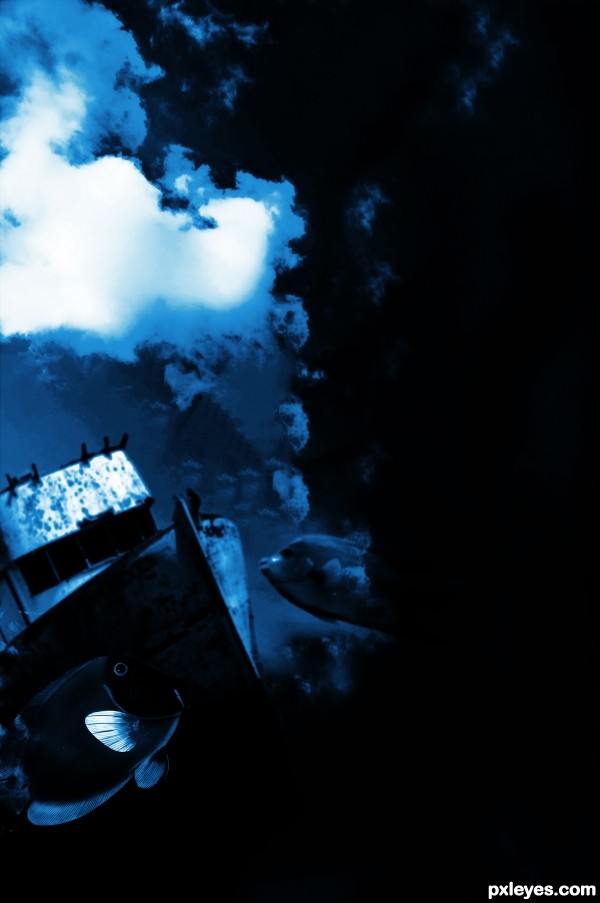
Nice idea, but it would be nice to have more image on the right side. Maybe crop it if your not going to add anything there. Good luck.
Is it just me, or does everybody else not see the stairs? Huh....
@Toothpick: the author used only the sky (I suppose...) 
i just don't get when people shoop a picture and use all kind of external stuff and pretty much use the original image as an unimportant part. it seems like the contest should revolve more around doing something to or around a picture rather than taking it apart.
just sayin :p
75% stairs(main object) 15% wall 10% sky
You CBR'd the source! Once again, source image contest you want to keep the original source recognizable. If I have to go to the SBS to find it (which I do) you didn't use it.
I was just hoping I wasn't the only one that couldn't see the source.
Howdie stranger!
If you want to rate this picture or participate in this contest, just:
LOGIN HERE or REGISTER FOR FREE
(5 years and 3612 days ago)
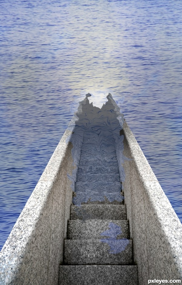
Interesting.. I do think that the stairs need a little bit more masking to get a more realistic result  GL!
GL!
Really good idea. Water doesn't act like that though. With this perspective the water is really hard to get right. Trust me, I remade your entry so I could tell how the water would react. The water would actually travel further up the stairs than it would on the railings. Good luck!
The surface of the water should be parallel to the stair treads we're looking down at. If the water came all the way up to the second step down, then the edge of the water would follow the faint line that starts at the left edge of that step and continues up (literally up as you face the pic) the left railing. Note that the water would then touch the railing's top edge right where you show water lapping. Ergo, you should be showing water covering the stairs all the way up to the front edge of the second step.
You should also make the water transparant on the staps, the opacity is to high. Also the water would transform the stairs, create wrinkels in the stair part thats underneath the water. Good luck!
thanks for all your comments again, ive changed it the best i could, but couldnt use the same source so it looks slightly different. but thank you again for the help
Better luck next time.
Nice try on a difficult task you set out for yourself. It will certainly be something I will be experimenting with to see the most convincing way to achieve what you were going for. gl
Howdie stranger!
If you want to rate this picture or participate in this contest, just:
LOGIN HERE or REGISTER FOR FREE
Photography and photoshop contests
We are a community of people with
a passion for photography, graphics and art in general.
Every day new photoshop
and photography contests are posted to compete in. We also have one weekly drawing contest
and one weekly 3D contest!
Participation is 100% free!
Just
register and get
started!
Good luck!
© 2015 Pxleyes.com. All rights reserved.

I think the stairs should extend all the way through the maze, but also gradually fade like the maze. Good luck!
all the best ...........
gl to you!
Howdie stranger!
If you want to rate this picture or participate in this contest, just:
LOGIN HERE or REGISTER FOR FREE