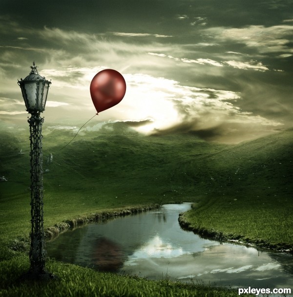
Thanks to Chulii-stock for her "Misty Mountains" (5 years and 3669 days ago)
- 1: Lamp
- 2: Sky
- 3: Misty Mountains
- 4: River
- 5: Balloon

 ( 5 years and 3672 days ago )
 Howdie stranger!
If you want to participate in this contest, just:
LOGIN HERE or REGISTER FOR FREE
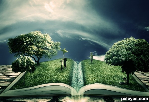
Ahhh... Photoshop was constantly crashing today and I lost the Step by Step guide.. I ended up re-doing the entry about 3 times. Well i hope it was worth it :/
Thanks to Jesuisautre (5 years and 3667 days ago)
another excellent entry
Shoulda known it was you....fantastic work. Beautiful color scheme. Very imaginative and almost "fairy-tale-ish" Is that a real word? You know what I mean!!!
awsome!!! ... great inspiration and motivation to try to do something better..
Yep, reading can open our minds and grow our imagination!... You really got to show us the meaning of reading good things! Nice entry, author! 
Great job
great as always......
Ok... this is great! and I mean REALLY great. The idea, and composition is... can I say great again?. You have some issues w/ lighting but over all, color me impressed. REALLY original.
Holy crap Author! Way to step out of the box. Awesome image and I didnt guess it was you first.
yes the image you have done is really good
but the idea is not yours
its a tutorial... i don't know but i have seen it somewhere
otherwise good efforts you have put in there author
Thank you all very much for the support! I didn't think that many people would actually like it.. Ankitsuhaill, i created this image myself, i used no reference tutorials or images, I give you my word.
Edit: The closest i came to using a reference was Lelaina's "The Magic of the Written Word"
http://www.pxleyes.com/photoshop-picture/4a8b0e00ec014/The-magic-of-the-written-word.html ... this was the image that inspired the idea.
Very nice idea! Whether it's from a tutorial or not. Just a few things; The grass in front is kinda ugly blurred. Can you keep that as sharp as the grass in the back? Also the blending with the book in the front is a little unsharp. Sharpening the edges around the grass would make it a lot better. Where is the water source, in the middle? In that case why is it white? if it's supposed to be water make it blue and ripple the grass thats in the water  Good luck!
hey please author don't take my comments in a wrong way....
i am very impressed by your work...seriously i am...
i just said about the idea that was from a tutorial but it is not certainly a copy of that and you have done much better than that tutorial
just fix some small errors like lighting
and you are on the top of this contest....
my wishes
Great work author ... Good luck! =) Fav !
This is really good. This could be great with a bit more work. The grass should extend the page on the left the same as it does on the top. The grass should also have a sharp edge on the bottom of the book. The water needs a lot of work, it also needs sharper edges where it meets the book and also between the underwater and above water part. At first I really didn't know what the water was, perhaps having the water pour off the page or just adding a duck would help. The shadows need more attention as well. Overall this is a nice entry which will score high, but with some minor adjustments this has the potential to be one of the greats. Good luck!
great finish
I'm speechless... thanks to ALL of you for your comments and your advice.. Chalty and Ressiv in particular, i've sharpened the grass, removed the soft edges at the bottom, added a waterfall falling from the centre. I hope it looks better this way.
Again, thank you all so much! I never expected this entry to do well... 
Very good! Just one last thing, the water kinda spoils the image for me. Try to create horizontal waves in the waters structure, the structure is really weird now. You could do it with the smudge tool, stroking horizontally. And in the front where the water is going over in a waterfall smudge a little vertically so that the water really looks like its transforming into the waterfall. Nice concept anyway! Good luck!
Fabulous work author...good luck
ooohhhhh dear.  i'm enthralled. you've blended and worked the sources so well together. you've captured my full attention. i can't say anything that someone else hasn't already say, except...wow. just pure ..wow.
Well worth it...  GL
GL
Great work author. Nice blending of images 
 .
.
Love your idea, very creative, gl author.
good work
This actually rocks! best entry in my opinion and yeh, slightly off your normal track but i knew it was you  specially when i read the style of the authors comment! :P nice work dude!
Really magic image! 
Lol and congrats on 2nd as well. 
Congrats!! Great job!
Let me say, that I'm really honored, that one of my entries was the inspiration for this fantastic entry!
Congrats for the second place!
In spite of PS crashing, you were rewarded! Congrats! 
Howdie stranger!
If you want to rate this picture or participate in this contest, just:
LOGIN HERE or REGISTER FOR FREE
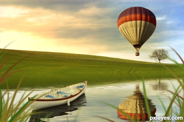
Pretty basic masking and a grass brush. (5 years and 3668 days ago)
great mood..excellent blend..love the reflections..GL!
I'm not great with reflections, but i'm fairly sure the tree wouldn't reflect on the water..other than that it;s a good image with a very nice atmosphere.
I think the POV would allow the balloon to reflect in the water, but that's just my opinion. However, I think the white boat wouldn't have such a dark reflection. Anyway, it's a good image.
Very beautiful image! 
Fantastic image author,great overall mood and fabulous colors...surface of the water is just perfect...well done and good luck author
Great mood, but the reflection wouldn't look like that. You reflected the above part of the grass now, but that could never be reflected by the water thats underneath it. You can't see the back of your head when you look in a mirror  A small reflected line of the grass should be visible, it should be high as the height of the grass. Also create a layer over the reflection with a blueish fill and set it to overlay because the color of the water should at least come a little through. Good Luck!
@Ressiv: I really appreciate the comment, but I disagree with the reflection. The further the reflection gets from shore the more you'll be able to see in the distance. I've looked at many reflection pictures and all of them have shown the objects in the background. Here is just one example. http://www.flickr.com/photos/imagonovus/3288806218/. Again, thanks for the comment and taking the time to view my entry. Keep up the good work.
This is an awesome image with great color and perfect saturation. Your reflection of the baloon is incredible but I have to agree with ponti55 on the tree reflection. I think it's way too far back to have a reflection in the water. I never would have noticed it if he didn't say anything...shame on you ponti55..LOL
Author, the link you posted also looks like a bad photoshop. Take a look at this photo, it shows exactly what I mean  http://farm4.static.flickr.com/3071/2879935420_80b3cdb7a3.jpg

gud work... & tree wouldn't reflect on the water y becoz tree so far to water..
otherwise too gud...
the lighting seems to be quite good

Nice job
Oooo, this is so picturesque!  Great lakescape
Congratulations!!
Congrats for your third place, Chalty!
Congratulations! 
Howdie stranger!
If you want to rate this picture or participate in this contest, just:
LOGIN HERE or REGISTER FOR FREE
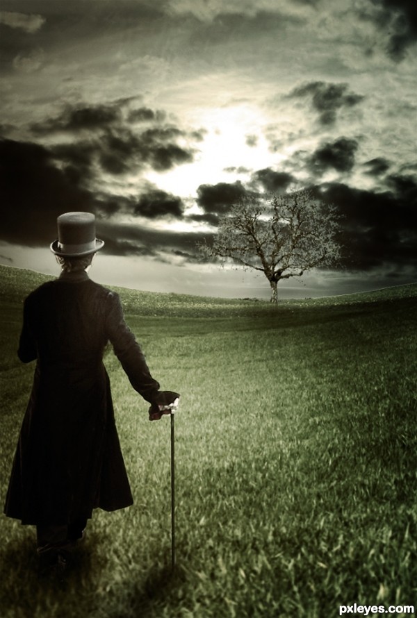
Thanks to Falln-Stock
Background cropped and warped, sky replaced, etc. Sorry about the lack of an SBS. (5 years and 3671 days ago)
this is a wonderful entry!!... somethin around the base where the person meets the grass looks a little off to me though... could just be me.. nice work though
all the best to u ......... 
The man reminds me of Willy Wonka.  Nice chop. I like the element of surrealism. GL!
Very good use of lightness & shadows. Best of Luck !
I love the feeling in this creation. Great job. Shows that sometimes less color is more!! GL
Good idea Willy Wonka yup 
very nice work author...good luck
This is yet another beaut!!
Awesome
Lol that would have been awesome to get first second and thrid  Good work this week!
Howdie stranger!
If you want to rate this picture or participate in this contest, just:
LOGIN HERE or REGISTER FOR FREE
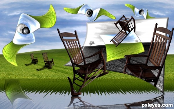
source and my picture of rocking chair (5 years and 3670 days ago)
pretty nice reflections
its beautiful  ............... all the best
Wow! I am really diggin' this one! Reminds me of a Dali. Good luck to you author! 
Surprise, Surprise, lookie who it is 
superb...
@jaw: what's the surprise? If you thought of surrealism, you thought of him... 
Author, fantastic work as always! 
This is fantastic...few effects are just WOW...well done author

I could see this on a wall in a museum!
Beautiful surreal image and the sbs is so detailed and nicely done 
Howdie stranger!
If you want to rate this picture or participate in this contest, just:
LOGIN HERE or REGISTER FOR FREE
Photography and photoshop contests
We are a community of people with
a passion for photography, graphics and art in general.
Every day new photoshop
and photography contests are posted to compete in. We also have one weekly drawing contest
and one weekly 3D contest!
Participation is 100% free!
Just
register and get
started!
Good luck!
© 2015 Pxleyes.com. All rights reserved.

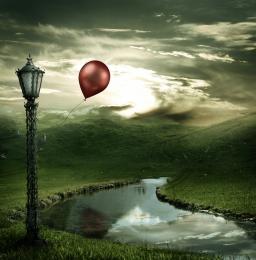
Stunning.
loving the way the clouds appear to wisp off of the top of the hills!
wow...very nice
Great work on the lighting
Nice one! Good luck!
Agrees with Lamantine!!
beautiful blending..............
Great choice of colors!
Remove the reflection of the balloon, the balloon is in front of the water so it can never give a reflection IN the water, a shadow: yes. Furthermore there's a reflection of a cloud which should be behind the mountain not in front of it.
The overall mood is good though.
So beautiful... GL!
awesome......
Nice mood! But the reflections are of the old source and don't fit this image. As robvdn said, also the balloon wouldn't have a reflection because it's in front of the water. Good luck!
I disagree with the comment about the balloon reflection but that may just be me. This is beautiful....the only issue I have is that there are two light sources hitting the front of the balloon. From what I see, the sun is behind the balloon so this is a little confusing. Great job though!
I give high marks for this one, But...... Every time I come back to look at this, that dang reflection keeps jumping out at me. screaming " I'm here and I'm not supposed to be and there's nothing you can do about it". Maybe I'm going crazy! I would really appreciate it if you could replace him with another. Good luck!
Absolutelly stunning work,love the mood,colors match so well,blending is fantastic...Congratulations author.
Wrong balloon reflection I think =) But Really nice work . Good luck =)
excellent... gudwork
realy cool and lovely
Great mood and very nice composition.
Nice 1! GL 2 U!
Great and full of hope
You did a good job with this author...
Nice work Ponti. Grats on 1st.
Congratulations!! Beautiful entry!
Congratulations and jubilations *sing*
Congrats, lovely work
Congrats....fantastic job
Congratulations for the 1st. place, Matteo!
Congratulations Ponti! 2 very creative entries!
congrats, you're so great...
Congrats! What an amazing landscape you've created
Howdie stranger!
If you want to rate this picture or participate in this contest, just:
LOGIN HERE or REGISTER FOR FREE