(5 years and 3654 days ago)

Howdie stranger!
If you want to participate in this contest, just:
LOGIN HERE or REGISTER FOR FREE

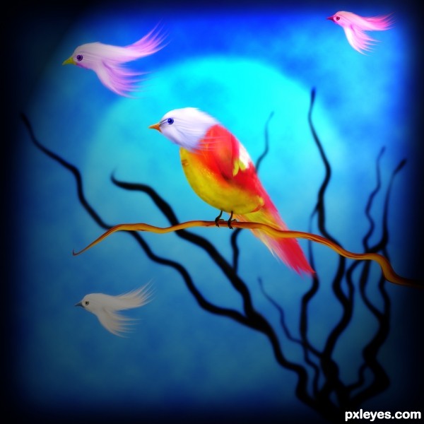
right after reading the amazing tut by George55 at http://www.pxleyes.com/tutorial/photoshop/1965/How-To-Create-Beautiful-Birds-And-Flowers.html, I was tempted to put it into practice,...but it was too bad to me that the smudge tool on my comp. didnt work well so I tried to find another way, was that I used the motion blur to get the effect of feather-look,...and I was surprised by the result...it is perfectly messy ugly!!!!LOL....but now here it is,....you just name it....and I call it Birdie... (5 years and 3654 days ago)

Inspiration of this image came from this quote:
"Life comes with no guarantees, no time outs, no second chances. You just have to live life to the fullest. Laugh as much as you can, spend all your money, tell someone what they mean to you. Tell someone off, speak out, dance in the pouring rain. Hold someones hand, comfort a friend, fall asleep watching the sun come up, stay up late. Be a flirt, smile until your face hurts, don't be afraid to take chances or fall in love, and most of all live in the moment cause when you look back one day knowing you have no regrets, its going to be what makes you smile."
Thanks to F-L-O-W-E-R-S and mjranum-stock for the stock images.
Much clearer in High Resolution. (5 years and 3653 days ago)

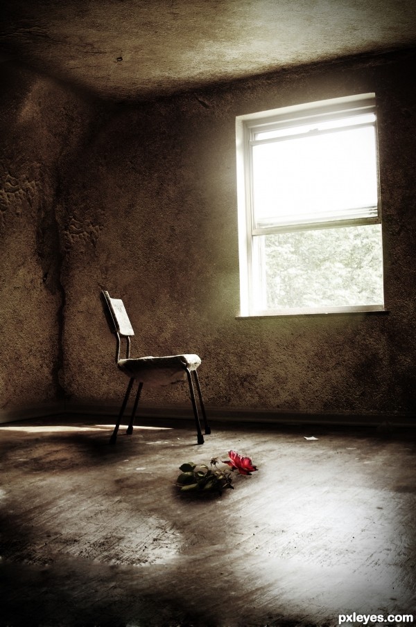
This picture has a thought behind it.
_______________________
Techniques used:
Warping (puppet warp for the rose [cs5 only]), Gradient maps (brown-yellowish), a lot of colour adjustments. The shine from the window is made with a radial- and motion blur. The walls are set to soft light with a lowered opactiy, masked to they blend together, free transfomed to give it depth and make it look realistic.
But as always I cant remember all the things I've done when I'm finished with my work. (5 years and 3658 days ago)
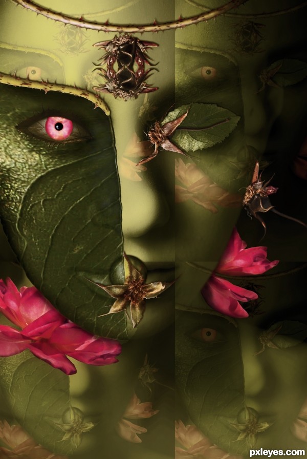
Great work, but I would get rid off the 4 axis theme and only show that main face with some flowers on the background. It's a great face by itself, especially the main vertical line distracts its a lot. Very good work with the source, love the leaf part of the face and eyebrow especially.
yeah widiar is right.. you should remove the 3d kind of stuff....
but i must say the imagination is really great... source is used really nicely
excellent thorn work!!! great job
very nice work...gl
great work! beautiful! just beautiful!!!!!
wow interesting
Superb!
congrats... woo hoo!!!
Congrats for your first place, Vertigo!
Congrats, fabulous work
A Great Entry!! Congratulations!!
Congratulations!
Congratulations
congrats
Congrats...
Thanks a lot for your nice comments and votes!
Congrats
Howdie stranger!
If you want to rate this picture or participate in this contest, just:
LOGIN HERE or REGISTER FOR FREE