(5 years and 3546 days ago)

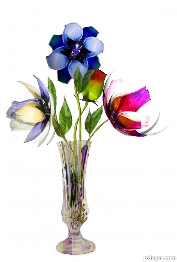
Only one source for the leaf (I was lazy), the rest is derived from the original source.
Tried a few new techniques and finished it with a lot of traditional hand work, check out SBS for details (and hi-res).
I tried to achieve a watercolour painting like effect, but also saved 2 original paper flowers almost intact, you can spot them from the final image. (5 years and 3548 days ago)
wow i really like this image!
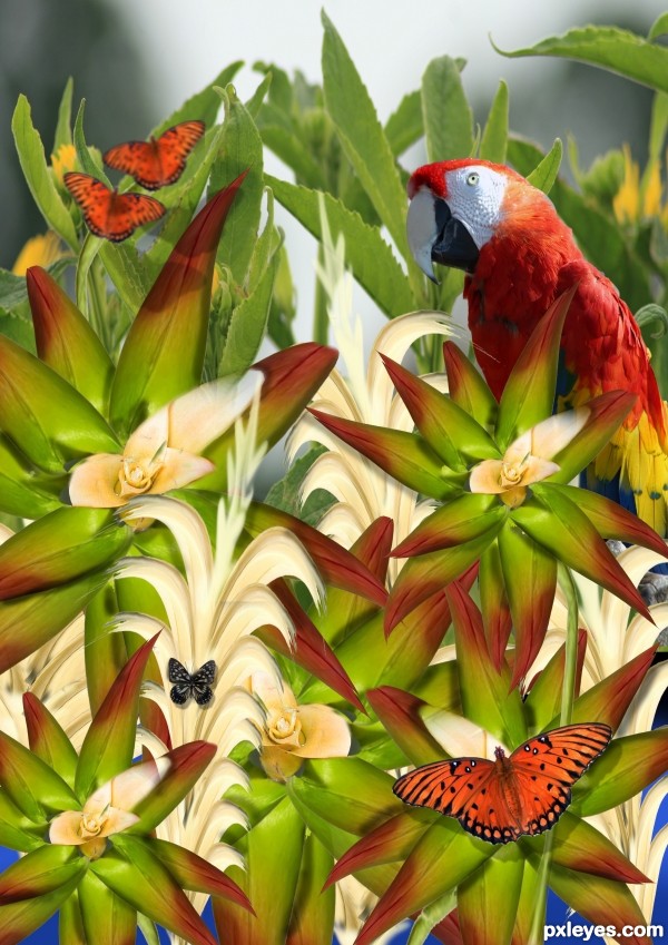
Nice image love the colors, have some suggestions for improvements, of course at the end of the day it is up to you. At the moment its looking a bit flat you need to add some shadows (not to dark) to the flowers given them some contrast and depth. The front butterfly also needs a shadow. And the back two butterfly’s need the white edges removed and they are to sharp compared to the B.G. image a little blur should sort this.
ok warlock thanks gona work on it
nice work making the flowers and leaves
Your overall colors and design are super!! I agree, there should be shadows all through the flowers. Also, if you were able to create these great flowers, you could also have created the butterflies and bird to take your work many steps forward. GL
Howdie stranger!
If you want to rate this picture or participate in this contest, just:
LOGIN HERE or REGISTER FOR FREE