Thanks to SheisprettyStock from Deviant Art for the vines. (5 years and 3628 days ago)
Howdie stranger!
If you want to participate in this contest, just:
LOGIN HERE or REGISTER FOR FREE

please view in high res before voting, thanks :)
Credits :
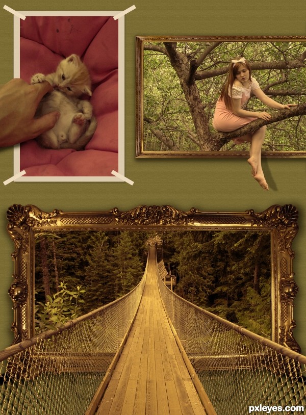
http://almightyblah-stock.deviantart.com for the suspension bridge image.
http://phoeebstock.deviantart.com for the image frame.
http://eirian-stock.deviantart.com for the apple tree image and tha cat image
P.S: The background is a simple default pattern overlay of grayscale paper available in photoshop... :) (5 years and 3627 days ago)

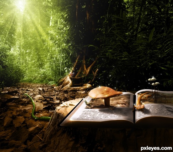
A story comes alive when you read it.
Please check high-res and used sources before voting.
Thanks certified su, TheTruthabout..., wblj, renaudeh, TexasEagle, Gare and Kitty, Armando Maynez, ::DEEBS:: is taking it easy and Christian Haugen for the images! (5 years and 3622 days ago)
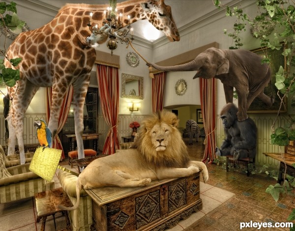
Nobody hold 'em! To Madagascar... hehehe! Or will it be Jumanji?...

Very nice compo! Just one thing, but it's only my oppinion: they came out of the picture, and I suppose the jungle was there. IMO (I said IMO) I don't think those vines are needed in the room... GL, author!
very very cool
Pretty funny, colorful and nice result. The lion is the most convincing animal in the image. If you could do something about the edges from the giraffe (imo the paws and body looks a bit too sharp, maybe a bit softer plus a bit of shading so it looks less flat), then it would be great. Good luck!
Interesting. I guess the elephant is the out of bounds (OOB) part. But everything is so unusual that it doesn't seem all that weird that a pygmy elephant lives in a hole in the right-side wall, drastically minimizing the OOB effect.
nice and very interesting composition, author!
looks cool...
Very clever image and some nice integrations in to the scene, do have a couple of suggestion for consideration, I would expect to see more shadow on the wall where the elephant is stepping through the picture frame, would agree that the edges from the giraffe are to sharp and need to be softer as with the lions paws, the lamp shade could do with some transparency and in doing this the parrots tail feathers would be visible.
Thanks everyone for the comments! @ wazowski, I blurred the edges of the animals and added extra shading. @DanLundberg, I know! The oob is a little limited, but I thought it would be ok considering the example which was given. @warlock, I did add a bit of shading on the wall although I didn't change the lamp because thats how it was from the original background picture. I think its one of those really heavy fabric lamps?
Giraffe looks good now! Good luck!
fantastic
Very nice work author

beautiful work ...........
awesome job with the lighting, realism and overall composition! love it
wow...................... REALLY OUT OF BOUNDS.
Stunning job, very realistic. Not sure if technically it's "Out of Bounds" but still deserves full credit. GL Must have taken a few hours to complete?
Again thanks everyone for the nice comments. @oasisman, it was actually around five hours
OY VEY... so many sources and balanced so well... great job author!!!
I like your work.
its really well done, bt IMO its not OOB, bt yet lots of work done here, good luck
Very nice work here. I'm impressed with how well you have removed the lamp, and how the lion fits just perfectly on that table. Everything fits so well together, and I spy zebra, awesome = )
Good entry.
Congrats for your first place, Chalty!
Congrats Chalty, wonderful work
Congrats! for amazing chop Well deserve
Congrats
Congrats Chad, that's the well deserved winning
Congrats Chalty! Lot's of OOB in this one
Congrats!!!
zx
Howdie stranger!
If you want to rate this picture or participate in this contest, just:
LOGIN HERE or REGISTER FOR FREE