well done author.. though a little more brightness would be good.. just because my eyes SUCK!!! and it's hard for me to see in dusk.. hehehe.. but if it's okay on your end.. by all means go for it.. It's a pretty cool image
author says:
I also see bad in dusk... I'm myopic 
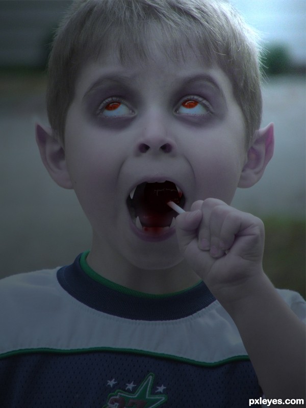
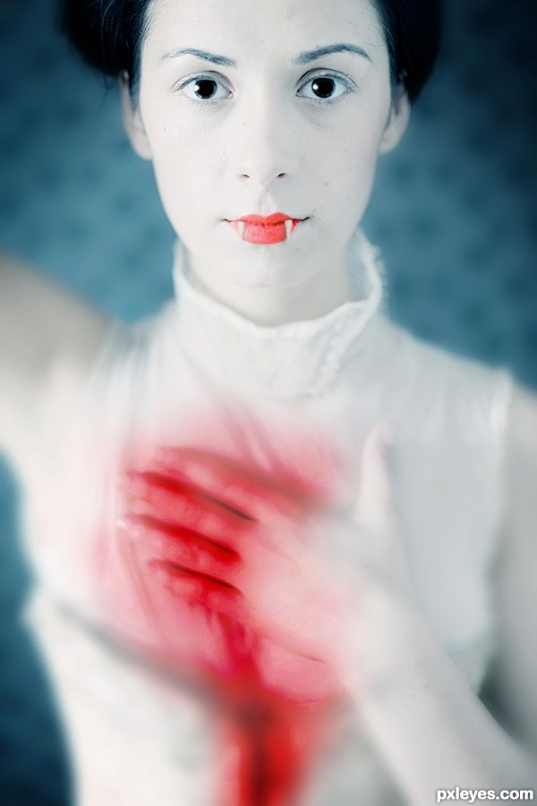
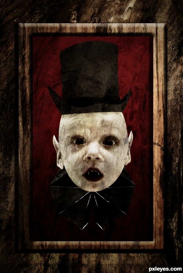
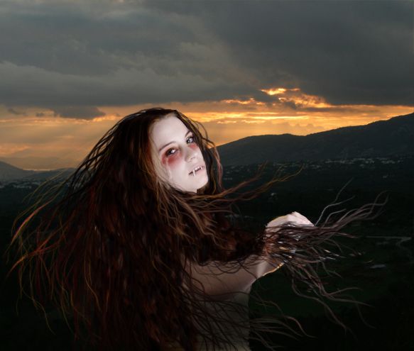
. It's simple: let's become vampires!
Cool head, Nevertheless,I think Step 5 of your SBS is better (albeit not great). The darkness here merely obscures everything without adding anything. Glowing eyes (and lollipop perhaps) would at least be creepy, and moonlight illuminating the background might add unsettling drama.
author says:
@ Slushy and Dan: I hope it's better now; I took off the color layer, and on step 5 I added pale blue lighting effect (omni) almost behind boy's head. It turned image a bit dark and with a kind of moonlight behind.
Nice image very pretty young lady...I personally think that you don’t need the bite marks they are not really adding anything to the image. The simplicity of the image is the key and the eyes have a massive impact on the viewer, portrait pose eye contact...
Background is too dark. At first glance the kid is missing the top of his head, and the wings don't stand out. IMO real wings would work better.
author says:
Oupss..
I forgot to shade it I'll shade it now.
author says:
to CMYK: 1-Yes the background looks darker when I uploaded it.
On P.S it wasn't dark. (I'll fix it)
2- I can't understand the part of the missing head
3- IMO I like these wings
author says:
Ohhh about the wings I don't want it to be wings I want it to look like if he's wearing it (Type of cloth)
Yes I know, I just called them wings because that's what they are in your source pic. Don't you think the hat is a bit too small and too dark compared to the source? The background is better now.
author says:
Yes you are right.
I've adjusted the size of the hat in Photoshop, used burn dodge tool and then used the liquify tool
I forgot to mention it in the SBS.
Very disturbing, but appropriately so. The head is outstanding, but I'm guessing the little notch on the left side is an extraction error and not a deformity. Quibbles: I appreciate that the hat and collar are just kitschy add-ons, but I think the bottom edge of the hat should either be a totally straight line or else curved at both sides (not curved on one side and straight on the other). [BTW choosing two curved sides would also suggest some curve in the middle would be appropriate to convey a further hint of realism.] Finally, a Victorian picture frame around it all accompanied by a title such as "Our Little Darling" would convey a more complete and compelling story IMO.
nice idea...good job on the ears but the vampire needs a body
author says:
Wowwwww Thanks a lot for the suggestions I really appreciate it
I'm working now on the image and I'll update it soon.
Any other suggestions are welcome.
author says:
Updated hope it is better now.
Waiting for other suggestions
Awesome! The assymetric hat (top edge and brim) really adds character. (More contrast between the two frame levels might be warranted, however.)
author says:
Done
jawshoewhah [banned] says:
I think you were probably taking on a more artistic approach so I can understand the distortion and so I don't think it really matters in this case so GL.
Howdie stranger! If you want to rate this picture or participate in this contest, just:
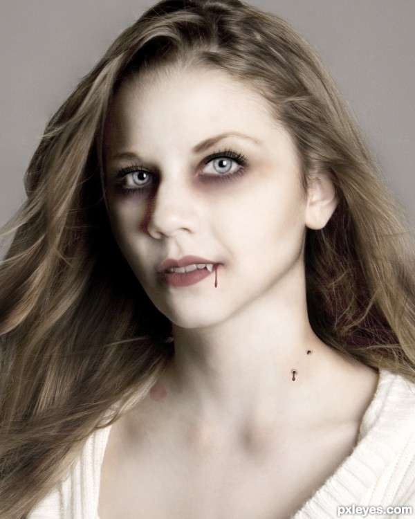
incredible work here
Nice effect with the blood, it's very natural. GL!
Howdie stranger!
If you want to rate this picture or participate in this contest, just:
LOGIN HERE or REGISTER FOR FREE