(5 years and 3625 days ago)

Howdie stranger!
If you want to participate in this contest, just:
LOGIN HERE or REGISTER FOR FREE
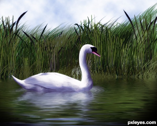
Only source used (5 years and 3622 days ago)
fantastic.....the water ripple is perfect,.........congrats,.....! common idea with a master touch.....perfect !
Nice, The water ripple under the swan is to distorded. The waves are a lot bigger there. I guess it's displacement map? If you place the swan lower in the image and than apply the displacement map you will get the bigger ripples. Good luck!
very nice - surreal feeling to it. Well done!
nice work -- background is especially good.
Thanks Ressiv , I have made some adjustment in swan and its reflection and also cropped image from bottom, which was showing distorted waves.
Now you make another masterpiece, congrats! The only thing I complaint is maybe one of the grass layer is in the wrong place, the one near the center of the image, at the same height with the head, it shouldn't be in front of other ones, and now it's levitated. I think you could remove that layer or put it to somewhere else. Good luck!
Wow...this is beautiful. Excellent work!
Thanks langstrum for your comment and nice words. Much appreciated.
Unfortunately I have merged all grass layers except painted grass, which is on its on layer. Anyway I have manage to hide the one, which you pointed out.
great work author,details are just amazing...i like grass a lot,contrast between and coloring...work on a water is great too,i like flow that u achieve to create...Only thing that i would change is to create whole image a bit lighter...any how this great work goes to my favorites...well done
You could make it even better if you used the ZigZag filter underneath the swan. Select the reflections layer, select with the circular selection tool a big elipse underneath the Swan and apply the filter (in the settings use the away from center option). After that you could straighten out the rippled circle on the back side of the swan. That way it will probably look like the swan is really moving in the water. Good luck!
Thanks Ressiv, for great tip. I have added ripple with zigzag filter.
Thanks erathion, I have made image a bit lighter. 
That's already better! Did you filter the water too? It kinda looks like you only did it to the swans reflection. You could do it with the water itself too, that way you get real waves. But very nice image anyhow!
Beautiful work , gl 
Great execution.... very nice scene!
I love the swan. IMO reeds and grasses seem pretty busy and flow of grasses go in different directions and pull my eye away from the center of interest. But it's still a beautiful composition. GL
Well made, nice composition. I like the subtle colors.
At first look I thought: "why is this photo here?" But at second look... wow... it's a PS! So perfect that I made a mistake! The lighting on it, the water, everything is quite realistic. This work is gonna decorate my favs gallery right now... 
nice work
Photo realistic.., Wonderfully done.. I love the water effect...... 


Very nice  !
!
voted High on this one ^^ !!
GL author
Superb! 
Congrats, Nasir! It's deserved! And shining on my favs gallery... 
Congrats on 2nd. This is a beautiful entry. 
Grats on the beautiful swan...so lifelike!
Congrats ......... 
Congratulations
Congratulations
Congrats Nasir, great construction, keep it up 
congrats nasir
Congrats Nasir on your fabulous creation...best of luck my friend...
Congrats for the second place Nasir!
wow congrats!! missed this one!
congrats!
Congrats!!
Howdie stranger!
If you want to rate this picture or participate in this contest, just:
LOGIN HERE or REGISTER FOR FREE
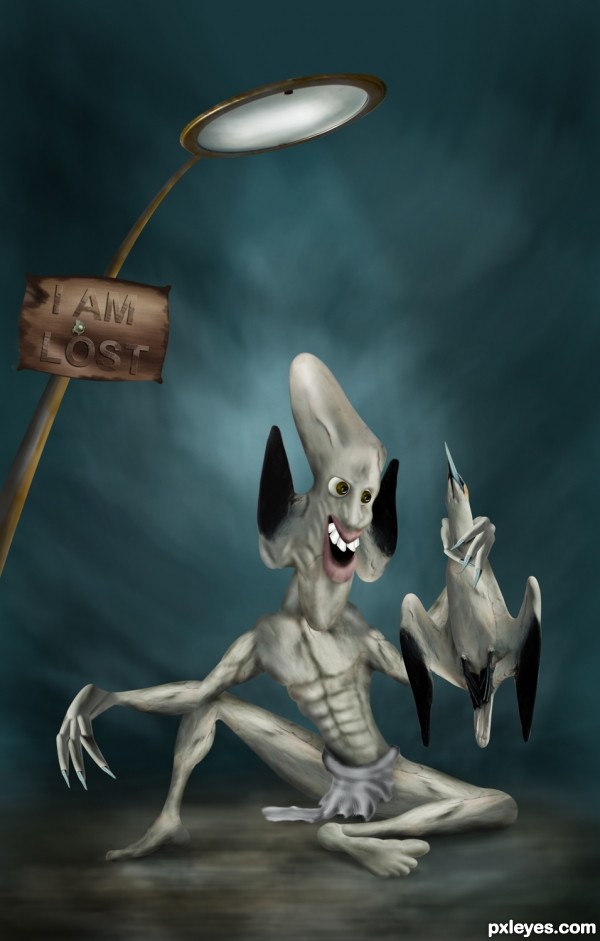
enjoy.......! (5 years and 3626 days ago)
coolllll....bravos!!!!
I know that's you  , great job as usual my friend!!!
superb job.......... ............... great work on lighting...........
  ....
....
I agree u r brilliant in this style .............  ........from where u get these characters.......
but i didn't understand "The Lost" means ........?
Wonderful work  Welcome back friend
thank u all.., and mr.Fish.., 'lost' means the alien is lost in the earth and he trying to survive.., and the style and characters i don't have a nswer for that.., what ever i makes Atlast it turns as usual..., and for u genuine.., i never used a tablet, using the mouse only.. nasir and langstrum.. Thanks a lot for the nice words it's really inspiring... 
thanks for the explanation ............. u r recognizable by ur background style ........i expect a different style from u next time......... all the best to u............. wish u high marks for this entry ............... 
well, 4 masters of pxleyes ( genuine, langstrum, nasir and swordfish) seem know you well,...btw I am a newbie here,....I just wonder who you are with this great work.....I like the way you used the provided pic to create this one,....
Very creative..... Nice job!
hehehe.. I worry about you.. great job..hehehehe
very nice ! good luck
very nice ! good luck
great work
he should go for a smile contest, lol (just kidding) great entry.
He must be very satisfied to be lost... 
Spetacular entry, as always!
Just small things... ok, he's an e.t., but foot is flat, you could shade between toes and sole; is his right thumb folded? 
very good work,good luck
Welcome back author, funny creature, very well done, goes my favorite and high marks.
Poor bird... ...great job author and extra points for humor...well done...
And nice to see u buddy...
Thank u Erathion..,
amazing as usual!! great to see u again 
Seriously weird but GOOD WORK! Can I be the one jerk who complains about little details lol? I see on his right hand that he has four fingers, but on his left it only looks like he has three...unless that's part of his alien features. 
EDIT: Okay well argued.  Nothing more to complain about. Nice job and good luck!
hello gmt.., plz do this.., place ur hand infront of a mirror (except the thumb) hold the fingers as in my picture and watch out whether u can see the little finger...  ..,
..,
Great going here too............
Great to see your work again ! Well done 
grt work friend......good luck..!!!!
He-he-he, in spite of being lost he looks happy with that catch! 
Congratulations, Anoop! Viva... 
Good work...... congratulations!
Congrats on 3rd. 
Congrats!!!
congrats.........
Congratulations
Congrats! for 3rd 

Congrats my friend 
Congrats buddy,i am glad u'r back,keep going with great work...
wow congrats!!!
congrats!
Congrats!!
Howdie stranger!
If you want to rate this picture or participate in this contest, just:
LOGIN HERE or REGISTER FOR FREE
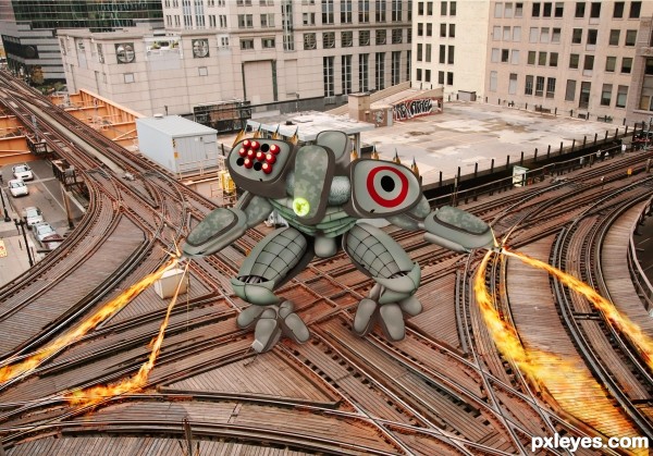
Apart from the back ground this is all made with the source. Fire was a pain in the ### to get to look rite. Among other things
Am working on the SbS now. (5 years and 3621 days ago)
Wow! Can't wait to see the SBS for this one. Great stuff.
Omigosh, that is fricken awesome. At first, I was like, "dude, where's the source picture?" Then, I took a look at the SBS, step 8 looks like crazy time. GJ!
It's crazy, completely crazy! And flames are perfect, I'll take a look at sbs again to learn how to do... GL! 


incredible work!
simply awesome!
Wow...the good stuff always comes towards the end lol. You did an amazing job. I wish you'd have used more of the bird though (rather than mainly the light) but the result is beautiful Great work and good luck...
Great construction, IMO it would have had more imact against an illustrated background rather than a photo....but still very good work 
lovely! it was a great idea to use a detail rather than the most obvious object!
Damn, the metal monster looks so fast and invincible! 
very nice work....gl
congrats
Howdie stranger!
If you want to rate this picture or participate in this contest, just:
LOGIN HERE or REGISTER FOR FREE
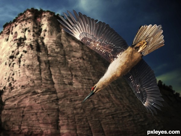
My rendition of the mythical giant mountain bird known as the Roc. (http://en.wikipedia.org/wiki/Roc_(mythology)
Comments and criticism are much appreciated. Thank you. (5 years and 3625 days ago)
Welcome back buddy  . You did a good job on the rendition but I think the feather can be done better by smaller brush size of smudge tool, and the size of the bird a bit smaller will be better for the composition. Also, a more blurry background is better for the main focus of the image.Good luck !!
PS: I think you should check the second link, it doesn't lead to anywhere, at least with me, and the background looks like a pre-manipulated image because the mountain is similar to a 3D image.
Thanks, buddy.  I fixed the second link and I'm working on a new background. Please stand by!
EDIT: And it is done. I did everything you reccomended, Langstrum. Thanks for the advice. Hope the new background works.
Hi, friend, were you lost? Nice to see you again... 
It's a very beautiful composition; when we see about the roc on Wiki, we find only b&w illustrations. So, with your entry, we can make our imagination flows about how a roc could be. Really nice entry, GL! 
I like the lighting.... Nice job!.... maybe little clean up on edges of wings, imo.
Great entry!
Thanks skeletor.  Don't know how much more I can clean up, though...the edges are pretty sharp and clean as far as I can see and the grey outline is part of the feathers.
EDIT: Sorry, my bad! Wings have hopefully been fixed now...
Very nice work author,IMHO background is to much blurry...in high resolution near eye of the bird u have one small red glitch...maybe u could made edges a bit softer,in this case blur tool or smudge,but my advice is smudge...Nice to see u again author...best of luck
Good idea and nice result...
Thanks all!  Erathion, I THINK I fixed it but I couldn't really locate the glitch to begin with...hope I blurred the right places :p
aahahaha nice idea!
Nice idea and great result 
Very good chop Author
Thanks, everyone! After looking more at the high-res...I realized that I did indeed miss a few white blotches between the wings. Thanks Skeletor! This has been now fixed, and the tips of the wings have been smudged slightly as well.
Oh, the wings are great! 
Howdie stranger!
If you want to rate this picture or participate in this contest, just:
LOGIN HERE or REGISTER FOR FREE
Photography and photoshop contests
We are a community of people with
a passion for photography, graphics and art in general.
Every day new photoshop
and photography contests are posted to compete in. We also have one weekly drawing contest
and one weekly 3D contest!
Participation is 100% free!
Just
register and get
started!
Good luck!
© 2015 Pxleyes.com. All rights reserved.

superb work! great tip on the ripples too
wow!
wow!
amazing!!!!
Impressive work, great SBS!
Beautiful work

very very nice work ,good luck
Awesome!!!!!
I'm very well impressed!
Congratulations!
The SBS is perfect.
Bother...In Step 12, I said I used a distortion map. No, I didn't. I used a *displacement* map. Otherwise known as that thingamacallit that makes ripples.
super creation......I like the way you used the provided pic,....
Great execution!... and very good use of source. Nice image!
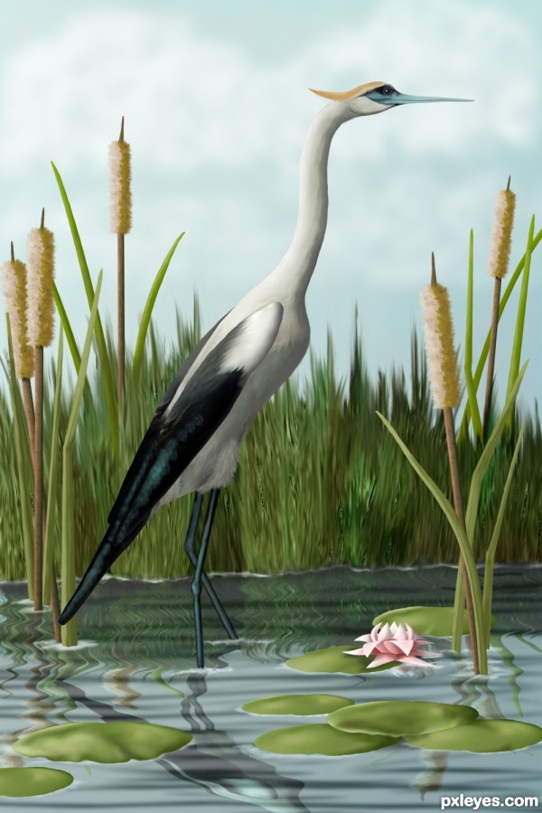
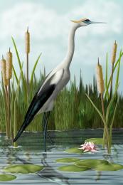
It's simply incredible how perfect is the crane. Sometimes when I go fishing at the dam I see cranes there... and it's the same, perfect, realistic. But I think cattails are darker, brownish.
Lovely. Reflections don't shrink, however, so the reduction in heights to 30% in SBS Step 11 was unnecessary. (See the reflection in this week's 'Shore' contest or stack stuff on a mirror.)
Gorgeous, great attention to detail too =)
Thanks, all, for your comments. Erikuri, I think cranes and herons are the most graceful birds, altho hawks are the ones I long to fly with. These cattails have gone thru the skinny green phase, past the solid brown phase and are in the blown beigey, yellow, fuzzy stage. Can I go fishing with you someday?

Dan, I know that at this angle, the reflections would be long and not shrunk, but...well...I liked the way it looked this way. I've got my artistic license here somewhere and I'm pretty sure I renewed it this year...hmmm...
Fabulous work author,u did great job here,i like small details,like feather's at top of the legs and greenish highlight...well done author
Very quality job author.., I think the body of the bird near the wing/tail need a little more darker shade.. ( may be I am wrong), whatever..., OUT STANDING JOB Goes my favorite.... and definitely on the top 3... Good luck
Really nice job here! I personally would've liked a mix of step 11(left one) and the final piece for the reflection. Regardless, a timeless piece. Good luck and Congrats.
When you enter a contest...no one should even bother to enter after lol. Simply beatutiful work...I wish I knew how to draw like that. :p
CORRECTION: Saw the SBS. Not even a drawing. WOW. That is quite an amazing piece of work there.
This is amazing! Good luck!
great job ! good luck
So, last night, just about asleep, thinking about this entry and feeling something still wasn't quite right with it, one of the little voices in my head whispered, "Birds' legs don't bend that way. They bend backward. Duh."


I redid the legs, which meant I had to redo the reflection, which threw the balance off, so I put another lilly pad in to rebalance it.
I think I deserve a gold star.
very incredible!
Well done! I like the fact that you stayed pretty close to the source image. Just a few things that could improve the image. There are still a few parts of the concrete structure visible in the grass in the background. The cattails in the background are just as big as the ones in the foreground. That way you loose depth in the image, I would either make the front one a lot bigger (I think this would create a lot more depth) or the back one smaller. Good luck!
hereisanoop, when I fixed the legs, I took the opportunity to darken the under tail feathers. Thanks! Ressiv, that was one of those details I didn't think of, concentrating on the balance of the image. I've made the back cattails smaller. I thought the unsmudged parts of the grass kinda looked like grass seed, but I went ahead and smudged them some so they wouldn't stand out quite as much. Thank you!
Great! It's a very nice image, to finish it all of you could transform the right legs reflection and move it to the right, it's not underneath the real leg anymore
Its done. Thanks again, Ressiv.
This is way cool Author
Great job! And thanks for the good SBS.
i would put this on my wall
awsome work author.....first place for sure...gud luck
Fan-Damn-Tastic!!!
absulutely stunnishing !

WOWIE
Gl author
Ravishing creation, Author! Congrats!
Lovely job...congrats!
Congratulations, Cheryl!
Congrats...... very nice job!
Thank you for the many comments and your votes.
Wonderful work, Congrats Cheryl
GRATZ on a very well deserved win.
congrats ..........
congrats ..........
Congratulations !!
Congrats! for your win.

Congrats on your deserved win
congrats for the 1st place, well deserved...
Congratulation for the great work and 1st place...
Congrats for first!
congrats!
Congrats!!
Howdie stranger!
If you want to rate this picture or participate in this contest, just:
LOGIN HERE or REGISTER FOR FREE