
Just source (5 years and 3488 days ago)
(5 years and 3492 days ago)
very nice idea...i have few nit picks,hat is to close to ship to be big like this,with sky like this u cannot have lighting on ship and on sea like yours...try to fix that author because your work have potential...i will hold my vote...good luck
nice..
Yes, the ship should be farther away and smaller, but good idea.
i like it ! g l
At this point the ship is run aground; it must be added behind the last wave, resized smaller and got some blur for DOF. Idea is good, just needs these adjusts.
Thanks all for your comments and advice. Changes made..
nooo it's too blurry now! and the vignette is too strong.
Thanks elficho I wasn't sure about that. Think it looks right now.
Funny...this used to be alot better! You still have time author...change it back a few steps. Everything is still too blurry and the hat used to be alot sharper.
Howdie stranger!
If you want to rate this picture or participate in this contest, just:
LOGIN HERE or REGISTER FOR FREE
(5 years and 3489 days ago)
Quite cute, but I wouldnt point the hats all in the same direction. Also, I'd remove the dropshadow and instead only some shadow from the hat on their heads. Good luck!
Yep, I agree with Waz; changing the directions you make them more natural looking, and the kitty on the left is OOF, so hat also has to be a bit OOF. GL!
I totally agree with the others. Use your edit/transform/flip horiz. tool to turn at least one of the hats the other direction. Rotate will also help give a different angle to one of them. Will make a world of difference in a really cute entry. GL
thanks all for comments I have changed it
hmm you should flip the hats on the first two cats. and make them slightly bigger
Cute little kitty kitties, I like the way you did the scarf's around their necks. Nice idea.
Very nice and cute work...blur the hats just a bit to match with the cats...best of luck author
AWWWWWWWWWWWWW!
Howdie stranger!
If you want to rate this picture or participate in this contest, just:
LOGIN HERE or REGISTER FOR FREE
(5 years and 3491 days ago)
Very creative work!
thank you my husbands a marine and he loves eagles so he was my inspiration
Hoorah! Nice tribute to your husband! Thanks to him for his service to our country, may he always stay out of harms way!
Very inspirational. Well done author. GL
great idea ! g l
thank you all for the wonderful comments
Good sentiment, but the black of the hat & eagle dies against the black background.
hha cool idea
OOOOOOORAAAAAAAAAH!
put the eagle on a different background and change the font to something more suitable to the us marines. less wavy, try a sans-serif
Like the concept. More emphasis on the patent-leather shine of the hat bill might help it stand out more against the background. I think the placement of the hat on the eagle is more jaunty than military. I agree with elficho that the font on the text may be too florid, but I wouldn't rule out serifs. The Rule of Thirds would prompt me to crop out the empty space on the right side.
Semper-Fi and nicely done!
How about the American Flag or the marine flag in low opacity for background? It could be a solution for contrasting to black of the hat.
Howdie stranger!
If you want to rate this picture or participate in this contest, just:
LOGIN HERE or REGISTER FOR FREE
(5 years and 3489 days ago)
Nice drawing.
Nicely made...there's pretty much nothing left of the hat, though.
thanks gamemastertips, the hat is a casualty of photoshop wars
CBR'd source (Chopped beyond recognition)
When you can make your image out of anything, it defeats the purpose of a source image contest and kills your score.
this is very nice
So let me get this straight jawshoewhah, if I put a hat on her like the rest of the entries, I would get a better score?????
Howdie stranger!
If you want to rate this picture or participate in this contest, just:
LOGIN HERE or REGISTER FOR FREE
Photography and photoshop contests
We are a community of people with
a passion for photography, graphics and art in general.
Every day new photoshop
and photography contests are posted to compete in. We also have one weekly drawing contest
and one weekly 3D contest!
Participation is 100% free!
Just
register and get
started!
Good luck!
© 2015 Pxleyes.com. All rights reserved.
Very cool!!!
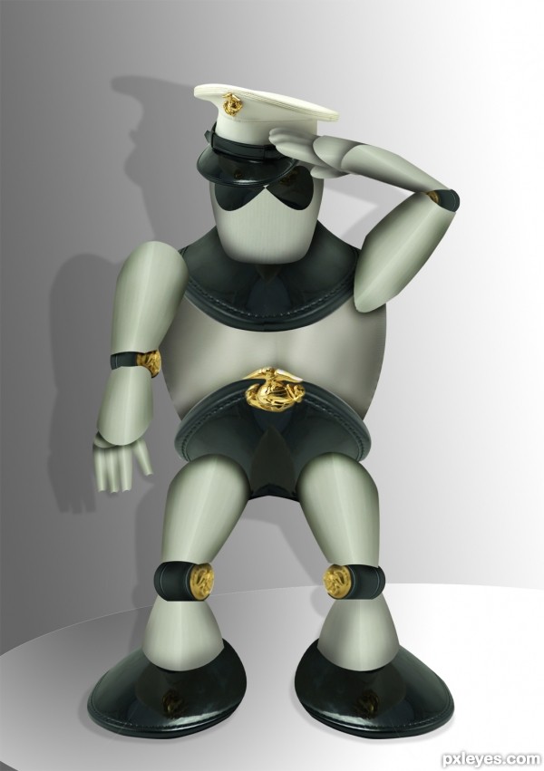
I suppose the knees joints could be reflected... Fixing that detail would be a hard task for me, but for you, author, it's a piece of cake! 
Just one thing: did you notice the reflection on the feet?
Very good. GL
very very cool work...gl
...... () ''''/

..... -_-./
.... " ;;
.... " ;;
..... - - And this salute for you...
very nice entry!
Howdie stranger!
If you want to rate this picture or participate in this contest, just:
LOGIN HERE or REGISTER FOR FREE