Idea has potential, but CMYK46 is right that the upper-left orange-sky light doesn't match the constrained, white right-side light creating the shadow. Furthermore, a "pathway of darkness" that leads to a dramatic sunset is not particularly foreboding.
Author very nice work on that street light.. Alan 2641 is right, the lighting and shadow are very well done. Great effect with the bugs to the light, I like how you did that. Your title seems appropriate, I see nothing hinting at foreboding in it .
Adding the streetlight gives more sense to the lighting (although it might be counter to the notion of 'pathway to darkness'). The bug trails in the light (if that's what that 'bird's nest' is meant to be) seem to be excessive, especially when the longer photo exposure they imply seems slightly inconsistent with the crispness of the moving guy. Visible stars seem unrealistic shining through the sunset, made more so by the lack of stars appearing in the dark upper-right corner.
Well I think its a brilliant concept sweetheART the old man walking towards his sunset years - lighting's fine enhances his lonely journey - fave ;} happy hippy hugglez
Author, there are a couple of pompous asses on this site, who seem to ALWAYS intentionally give negative feedback, hoping to influence the voters. They must have been raised by wolves, because they have absolutely no couth whatsoever. One of you pounces on newly uploaded work like stink on sh**! You two know who you are, and a lot of us wish you'd either mend your ways or go find another sandbox to play in, in fact why don't you start your own?! Some of us try to learn here, and your remarks do nothing to assist in that direction. The work that you two post is nothing fantastic by any means, either, so who are you to criticise others' work the way you do?
I find this chop very nice. The stars in the sky are REAL, it's a photograph. The 'paths' of the lightningbugs are also REAL, that also is a photograph. The shadow cast by the light is done well, and looks realistic. The blending of the sky and lamp I think is also done well. Keep up the good work, author.
And by the way, you two - comments CAN be edited, in case you didn't know - especially if you see that the author has made changes after first uploading.
well, just my two cents... the insects around the light are a bit too many, imo. the light is too high to cast the shadow as is. that is just math. but... the chop is wonderful! i like the mood and the composition. on a side note, i usually find that their observations are accurate and they have a great technical knowledge. and... any comment is much better than none at all... just my opinion.
good luck, i think you have a sound entry, it could be better, as could most, but it is really very good - smiles!
author says:
Haha , well, I am deeply "sorry" if I have offended anyone by creating this image, but I myself find that their comments are NOT accurate according to their own images.
author says:
Oh, also, thank you CMYK, at least you changed your comment.
I like this one! Very moody. But I feel sadness instead of darkness (but thinking well it's all the same...). I agree with lvstealth that if you reduce the insects flying around the lamp it would be better, IMO. And you know you have talent, don't worry!
Creative idea beautifully executed. I do feel retaining the vehicle tracks to the right of the path from the contest source creates a distracting element, however.
I agree with DanLundberg, it's a beautiful piece with wonderful atmosphere. If you eliminate the tracks you probably would have to bring the right side fence to the left to fill the negative space where the tracks were. (just filling with grass would still leave a negative space disturbing the symmetry.) That would mean extending the fence bottom a bit and some cloning. Now that's speaking purely from a design standpoint. The tracks could be part of the suggested story, maybe her lover just drove over the horizon and she's left waiting alone...who knows? In any case I still love the feel of this and it won't effect my vote either way.
author says:
Thanks for the comments guys..i didnt even think about the symmetry until you guys brought it up..very nice observation..i am going to leave it like this though, to leave the source image as is..so for now we'll have to go with spaceranger's story..lol
This is a nice montage of images. The blending and mood are well done indeed. Could someone please show me where the actual contest source image was used though.
author says:
thx for the compliments, and ichapell, its used as road but i lowered the opacity and changed the blend mode if u look closely u see the wood of the source image shining through
Sorry, author, but I can't see it either, not even in hi-res... maybe increase that opacity a bit so we can see the boards. It's good work otherwise, tho.
Author image is very very nice,i like that after Nuke effect but the usage of the source image is poor...use some elements from source image and add them here or something like that...i will hold my vote
author says:
ok, if u gonna watch the image in high resolution u can see i used the source image also in the nuclear station now
author says:
ok i had to thank the author of source image 2, i did that in author description i hope thats ok...
It's still remaining a fine dark line around the edges of the bride. And how about a subtle transparency on her, to make her more ghostly?
author says:
Thanks erikuri, you have very sharp eyes , removed that remaining fine line. Making her transparent does not work for me, therefore I have added radial blur effect to her. Hope it still giving ghost effect .
Well done author. Very eerie... I too would like to see a VERY slight transparency (almost imperceptible), but the radial blur is nice as well, and you're right..it is YOUR art!
Pleasant change of pace to not use the pathway portion of the contest source. Nice blending. Good job of adding clouds while dealing with the foggy hilltop. The far end of the tracks is a bit of a problem, however. The trees are too small (compare to hillside trees, for example) and the low-lying fog 
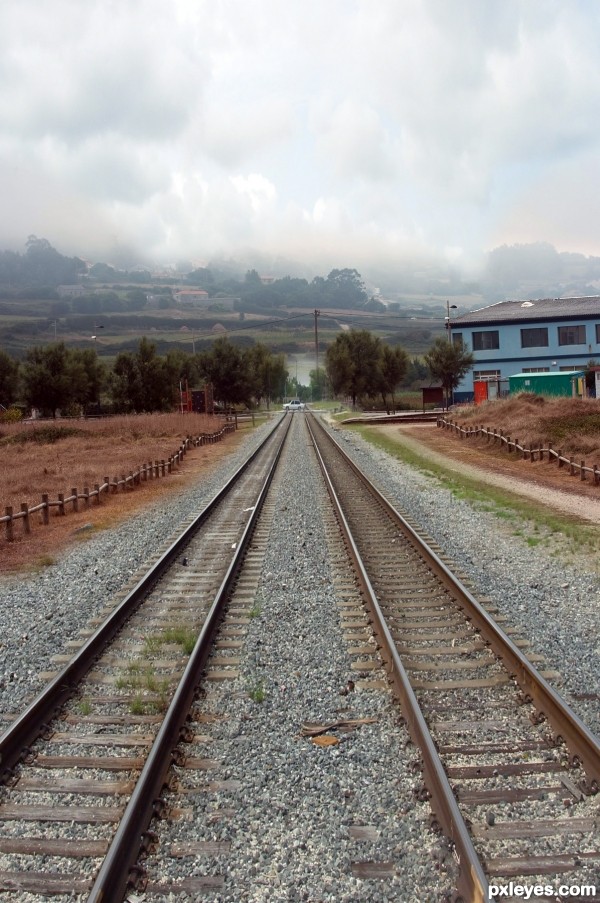
beyond them looks more like an out-of-perspective lake. (Squeezing the much wider railroad tracks into the path's narrower space is tricky.)
Fantastic blend and finally some realistic chop,we did not had that here on PXLeyes lond time ago......i agree with Erica about the car...well done author
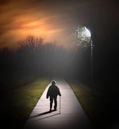
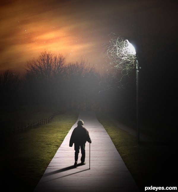
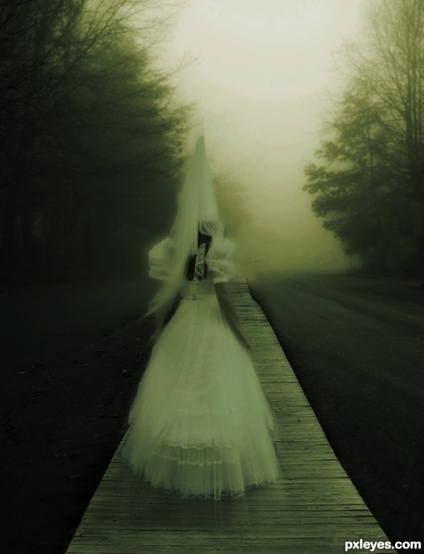
Good title change. Addition of the light source makes sense with the shadow now.
Lighting is very well done as is the shadow work
Idea has potential, but CMYK46 is right that the upper-left orange-sky light doesn't match the constrained, white right-side light creating the shadow. Furthermore, a "pathway of darkness" that leads to a dramatic sunset is not particularly foreboding.
Author very nice work on that street light.. Alan 2641 is right, the lighting and shadow are very well done. Great effect with the bugs to the light, I like how you did that. Your title seems appropriate, I see nothing hinting at foreboding in it .
Adding the streetlight gives more sense to the lighting (although it might be counter to the notion of 'pathway to darkness'). The bug trails in the light (if that's what that 'bird's nest' is meant to be) seem to be excessive, especially when the longer photo exposure they imply seems slightly inconsistent with the crispness of the moving guy. Visible stars seem unrealistic shining through the sunset, made more so by the lack of stars appearing in the dark upper-right corner.
yupz,......agree with Ichappell and Alan,......this kind of photo manips I like the most, very moody and moreover the lightning is very cool
Wow, Dan... your comments sting...I sure am glad you only have 100 vp then
Well I think its a brilliant concept sweetheART the old man walking towards his sunset years - lighting's fine enhances his lonely journey - fave ;} happy hippy hugglez
Author, there are a couple of pompous asses on this site, who seem to ALWAYS intentionally give negative feedback, hoping to influence the voters. They must have been raised by wolves, because they have absolutely no couth whatsoever. One of you pounces on newly uploaded work like stink on sh**! You two know who you are, and a lot of us wish you'd either mend your ways or go find another sandbox to play in, in fact why don't you start your own?! Some of us try to learn here, and your remarks do nothing to assist in that direction. The work that you two post is nothing fantastic by any means, either, so who are you to criticise others' work the way you do?
I find this chop very nice. The stars in the sky are REAL, it's a photograph. The 'paths' of the lightningbugs are also REAL, that also is a photograph. The shadow cast by the light is done well, and looks realistic. The blending of the sky and lamp I think is also done well. Keep up the good work, author.
And by the way, you two - comments CAN be edited, in case you didn't know - especially if you see that the author has made changes after first uploading.
well, just my two cents... the insects around the light are a bit too many, imo. the light is too high to cast the shadow as is. that is just math. but... the chop is wonderful! i like the mood and the composition. on a side note, i usually find that their observations are accurate and they have a great technical knowledge. and... any comment is much better than none at all... just my opinion.
good luck, i think you have a sound entry, it could be better, as could most, but it is really very good - smiles!
Haha , well, I am deeply "sorry" if I have offended anyone by creating this image, but I myself find that their comments are NOT accurate according to their own images.
Oh, also, thank you CMYK, at least you changed your comment.
There ya go, KY, see, I knew you could do it!
I like this one! Very moody. But I feel sadness instead of darkness (but thinking well it's all the same...). I agree with lvstealth that if you reduce the insects flying around the lamp it would be better, IMO. And you know you have talent, don't worry!
Stars are real, bugs are real, all resulting in a very pleasing image...
Very well done author
Nice Work looks good
Good image.
Congrats! for 1st place
Very well done, conglrats on your win!
Way To Go Tuck!
Congrats!
Congrats!!
Congrats Tucker...
Someone is proud of you (including me...) Congratulations, Tucker!
Howdie stranger!
If you want to rate this picture or participate in this contest, just:
LOGIN HERE or REGISTER FOR FREE