(5 years and 3512 days ago)
(5 years and 3517 days ago)
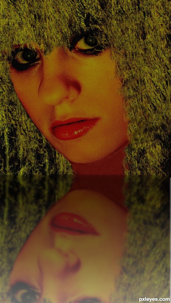
Fix reflection with gradient adjustment layer, dark at bottom, lighter to top.
Nice idea to use the slender pendent branches of the the willow tree as a fashion model's hair. Some 'hair' shadows on the face would make it seem more like she's actually wearing the willow wig. The black left-side cheek edge is disconcerting because the 'hair' behind it isn't appropriately shaded [see your Pretty Girl source image]. I admit I don't get the point of the reflection other than as a manifestation of a (not unreasonable) concern that mere branches-as-hair might be insufficient content for a high-scoring entry.
DanLunberg... I was ok with your comments until ... manifestation of a (not unreasonable) concern.... blah blah blah high-scoring.... ha ha ha ha ... what a maifestation of trying to sound like a total DB comment... everything was good until that part... then you just sound like.... well a DB.... thanks man! Maybe I just wanted to see a girl with green hair and a reflection... and by the way if you make comments like this and then actually enter the same contest yourself... you are a real DB... and to be exact I have made 99 entries at pxleyes and more if you count photoshop talent... and this is the first I have done a direct reflection and still didn't get it right... (Thanks CMYK for helping without being sarcastic... and a total DB = Dumb Bunny) ha ha ---

..... bet you thought I was going to say Douche Bag.... lol...
Glad you realized I was only trying to help. 
CMYK, your comments are always helpful and an inspiration to improve and get better. I made some reflections before, but not up close like that, and didn't realize they actually fade out as they get further away... I think the veterans on the site should make more tutorials or even think about putting out a book, like worth1000 did.... It may not get tooo many takers at first, but a good one starting as an Ebook on Amazon or something could get the foot in the door.... there is a lot of great talent on this site.... and yes (DanLundberg) you are one... sorry for busting your chops.... but uuuhhhmmmnnn that's what I do... lol... no hard feelings.
I love that you made this source into hair for this girl, nice idea. Good idea about the ebook, too, author. 
Some members feel the need to use "ten-dollar words" to make themselves seem superior, when actually it accomplishes quite the opposite effect.
Nice chop; and I agree with CMYK about the reflection. And don't worry about the rest. 
very cute entry author... reflections are time consuming.. here's a little hint that might help ... there's a great little tool by Flaming Pair called FLOOD TOOL.. it's free to try, and the more you play with it the more quickly you can learn to do reflections in a snap...(even if you don't buy it, you can use it and when you see how easy it makes reflections you may not need it at all)
Good luck author.. 
I have that flood filter, it's a lot of fun. Used it to 'flood my house' with water above the tires of my car, darkened the image, and sent it to family and friends for a little scare - lots of photoshop fun! 
Thanks Drivenslush and Pearlie for the advice on the flood tool.... I will have to give a go around!
Truly appreciated!
v/r
hhhhmmmnnnn.... The Author....
Howdie stranger!
If you want to rate this picture or participate in this contest, just:
LOGIN HERE or REGISTER FOR FREE
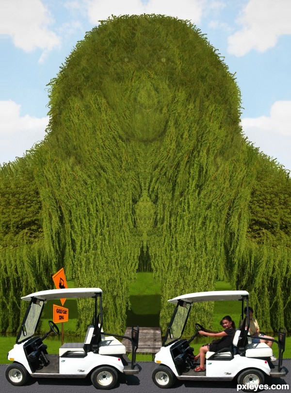
Spec Thanks to Oakley Originals for use of his picture found on Flickr photo sharing.com (5 years and 3516 days ago)
i think this one could have used a little more work but good idea with the golf  maybe if u made the golf cart in motion and didnt make doubles of the willow?
interesting idea!
Howdie stranger!
If you want to rate this picture or participate in this contest, just:
LOGIN HERE or REGISTER FOR FREE
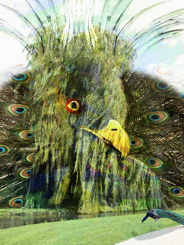
the peacock tree...took me about two hours. Any questions just ask. (5 years and 3514 days ago)
Sources are not usable. Source 1 is copyrighted, the rest are not Creative Commons licensed. Please read http://www.pxleyes.com/blog/2009/06/how-and-where-to-find-legal-source-images/
so what do i do? lol i am sorry i am new to this :P
i have notice tho u like to correct people are u like a manger or something?
Nope. Just helping out. What do you do? Read the section on how to find usable sources and go lookin' for 'em. There are lots out there...good luck! 
so how do i take it down..i dont want to like get people or myself in any trouble lol and i am still in high school lol, just love photoshop.
haha thanks for the heads up tho....i refound all the pics off flickr....and i will redo the image in the right way!
Great! No need to take it down, just go to My stuff/My contest entries/Edit image. (Don't forget to save a high res image).
Edit this image by replacing it with your new and improved version. BTW I think the mutant giant blue peacock head and breast distract from/add unnecessary confusion to the peacock tree. A real-sized peacock in the foreground would be better IMO and would be a way to indicate the scale of the peacock tree while adding a greater feeling of depth to the image. Also, if the tree's beak sticks out from the tree, it would cast a shadow down onto the tree.
haha thanks guys  lol i didnt even think of that lol
good luck 
haha thanks!
Welcome to Pxleyes! It's nice to see that you are open-minded for suggestions and constructive critiques! Keep going on, that's the way to learn more and more about the magic of photoshop... Do the corrections you need and good luck! 
yeah well i am not doing this to win hust to learn after all i dont see my self earning anything lol but the power of a challenge always get the best of me so i never turn one down...even if i dont win i still learn something!
btw is mine even remotely good? lol i dont seem to be getting any votes am i doing something wrong?
you have 167 votes. you will be fine. As far as your chop my 1st one was way worse then this 
ahah cool!
Howdie stranger!
If you want to rate this picture or participate in this contest, just:
LOGIN HERE or REGISTER FOR FREE
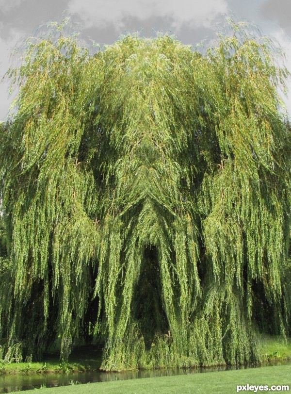
Nature is a funny thing, and not always funny, "ha ha".
weeping willow (source) (5 years and 3517 days ago)
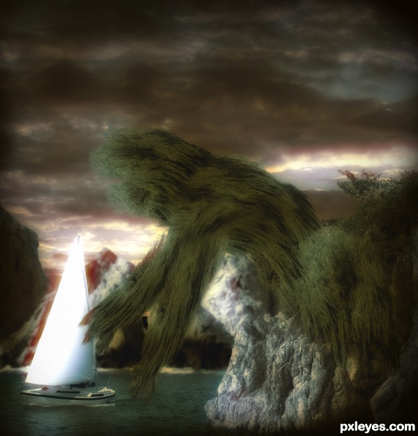
Well, it really reminds me of a monster...
I like it, kinda of frightly and scary, kinda reminds of my mom... lol... freaky, freaky, gruesome, is cool with be. Great entry and Keep on shopping!
Just a flip? Come on, you can do better than that. 
great eye you have!

kinda simple...
Howdie stranger!
If you want to rate this picture or participate in this contest, just:
LOGIN HERE or REGISTER FOR FREE
Photography and photoshop contests
We are a community of people with
a passion for photography, graphics and art in general.
Every day new photoshop
and photography contests are posted to compete in. We also have one weekly drawing contest
and one weekly 3D contest!
Participation is 100% free!
Just
register and get
started!
Good luck!
© 2015 Pxleyes.com. All rights reserved.

nice work .... I think make the eye and the mouth more visible
Arm should blend into body. Right now it looks pasted on.
Thanks Nisha and Bob. Have made some changes.
ahahhaa very cool
Howdie stranger!
If you want to rate this picture or participate in this contest, just:
LOGIN HERE or REGISTER FOR FREE