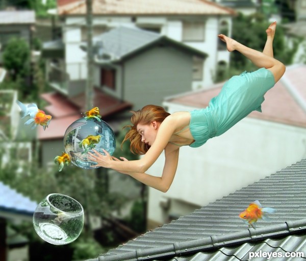
We all experience gravitational force, day by day. Your goal in this contest, though, is to create anything that illustrates the exact opposite of gravitation! Show off your blending skills and make anything or anyone float in mid-air on planet earth. It can be anything you like, but the more anti-gravity effects in your photo, the better. It's all is up to your imagination. Have fun!
DanLundberg: Shadows are going to be key to distinguish between poor Photoshopping and believable floating. ( 5 years and 3347 days ago )
Breno: Ditto! Here's an example: http://www.pxleyes.com/photoshop-picture/4a4a1d0321f1a/Perhaps-a-Space-Based-Home-.html ( 5 years and 3347 days ago )
Geexman: Great, I guess that means the photographers hanging stuff from strings, removing the string in PS and calling it a chop ...... I guess we`ll see ( 5 years and 3347 days ago )
DanLundberg: Breno's example of the winner from a prior 'Gravity Distorted' contest (an entry that I thought was very clever then and still think is still so now) is a bit more complicated than Geexman's just-clone-out-the-strings hypothetical. But he's correct that the amount of Photoshopping required should be one of the factors considered when scoring entries. And thanks to Breno's vigilance, what was clever the last go-around will be now be unoriginal. ( 5 years and 3346 days ago )
arca: Are we talking floating or flying ... does a person with "wings" count? ( 5 years and 3346 days ago )
arca: Comment on my comment ... it does seem that something large with tiny wings woud be "devying gravity" I mean that's what I think when I get on a jet! ( 5 years and 3346 days ago )
erikuri: @Arca: I think that wings don't count, based on Breno's example. Imagine something like the astronauts in space... ( 5 years and 3346 days ago )
Geexman: @ Dan, no its not complicated, a steady tripod, 3 or 4 photos, each photo on a different layer and the eraser tool .......no need to add shadows or screw with lighting ....yes its that simple! (basically outside source use will get higher votes from me!) ( 5 years and 3346 days ago )
Breno: @erikuri: Obrigado @Geexman: it was not even close to simple, since I had to get the job done all by myself - set the camera, run to get in position for the first shot, set the camera again, run for the second shot and so on, which was rather complicated because I didn't have anyone to tell me whether each position was right during the process and all the pictures should match. I understand that you appreciate the use of outside sources, but my idea (which I think was original) was getting the best looking result possible, regardless of the method used. ( 5 years and 3344 days ago )
Breno: ... and before anyone gets concerned, no, I'm not going to participate this time and no, I don't intend to use myself as a model in future chops/contests... I'm not supid, I'm well aware of the anonymity rules. ( 5 years and 3344 days ago )
Geexman: You`re missing the point Breno, I`m not dismissing the photography involved, these contests are about how well an image can be manipulated, composed etc using a graphics program..... in explaining the tremedous amount of work involved in setting up the photographs only confirms my point. If the photos are just right then it makes the chop simple. I think every chopper on here will agree that if we stumble on 2 sources with the same perspective, same lighting & same resolution we have hit the jackpot, as the chop is so much easier. In posting these types of entries how are they to be judged? If we all gave high marks based on the effort involved in the photography then surely thats a photography competition? This aint a personal thing buddy, I just dont agree with over staged sources in a manipulation contest. ( 5 years and 3344 days ago )
Breno: @Geexman: ok man, I see your point now and agree with you ( 5 years and 3343 days ago )
Howdie stranger! If you want to participate in this contest, just:
Thank you
Intergalacticstock
http://intergalacticstock.deviantart.com/art/Longing-8-59813547?q=boost%3Apopular+in%3Aresources%2Fstockart%2Fmodel%2Fwomen+fly&qo=42&loggedin=1
Thanks to:
- Imageafter.com;
- Lev Dolgatshjov and Christophe Schimid @ Photoxpress;
- cienpies, lusi, COBRASoft 2heads Advertising, weewillyd and jana koll @ RGBStock. (5 years and 3345 days ago)
A fantastic example, great source finds & excellent execution....very well done author!
I would be inclined to add a little blur to the vase and chair in the distance, as they seem that little bit sharper than the woman in the foreground but still a very good job
The dog outside is certainly well done, blends well with the background. Also the girl behind looks good with the light behind her. Maybe the shadow from the vase would cast closer to the viewer and othe rtiny nitpick is the wire from the lamp. Would be nice if that floats too , that would finish this image. Good luck!
Very nicely done.. My only nitpick is that there should be more shadow on the floating objects, especially in the foreground. I think it will make the light from the window pop. Good luck!!
i hate to be a geek here, but author, your image has wrong physics.. the water will flow downwards in the absence of gravity.. (Newtons first law).. So to me this is unbelievable... But as far as your execution is concerned, i find it impressive .. good luck ..
EDIT: I reread the contest theme.. Although the title suggests no gravity, the description suggests differently. I take back my geeky words and good luck again, author
Nice that the horse goes out of the canvas, gives a more spacey effect. I wouldnt make the manes so spikey though, give it a bit more wavey look (like it's blowing by the wind). Not sure about the shadows in the grass, I think with light from left you wouldnt see them (other angle). If you'd lift the tree a bit, it will look less cluttered with the fence. Just my opinion though . Good luck!
Thank you
Intergalacticstock
http://intergalacticstock.deviantart.com/art/Longing-8-59813547?q=boost%3Apopular+in%3Aresources%2Fstockart%2Fmodel%2Fwomen+fly&qo=42&loggedin=1
Kitt98
http://kitt98.deviantart.com/art/Glass-Bowl-5-154365133?q=boost%3Apopular+in%3Aresources+glass+bowl&qo=15
fabemiko-stock
http://fabemiko-stock.deviantart.com/art/Japanese-roof-22267827?q=boost%3Apopular+in%3Aresources+roof&qo=6&loggedin=1
good imagination
Great job! I had one of those "Why didn't I think of that" moments...good luck!
very well done author great idea well exicuted
Simply wonderful! I agree with CMYK - why didn't I think of that... Besides being a great idea, it's quite funny! GL!...
very nice entry..i especially like the depth
beautiful ........
brilliant excecution
Thank you for the nice comments.
Great job author...good luck
Nice imagination.
Congrats on 1st . . . .
congratz on a well thought out and excellent chop///you deserve the win
congrats
Congrats, fabulous work
Congrats! for well deserved win. Great idea and very well executed
Congrats!!
Congratulations, Maye! I really love it...
Howdie stranger!
If you want to rate this picture or participate in this contest, just:
LOGIN HERE or REGISTER FOR FREE