(5 years and 3491 days ago)

Howdie stranger!
If you want to participate in this contest, just:
LOGIN HERE or REGISTER FOR FREE
(5 years and 3485 days ago)
Now... That what i call a masterpiece..... 


super , good luck!
wow....very enchanting! ! !
yeaahhhh.......agree with anoop,......this is super,...how could you be that good.....LOLs,....and the winner is..................LOLs 


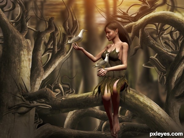
Very nice image! It's a little pitty you used a 3D program for the model, a picture of a great model would fit better in a photoshop contest. Small suggestion, the background has the same amount of blur all over, maybe you could create some more distance by blurring trees more to front a little less and blur them more further away, like in steps... Hard to explain  Good luck!
splendid
I could tell you did this from looking at the thumbnail......it's well within your style. I would've liked to see a shadow beneath the 3d model where she's sitting. Other than that good job and good luck!
Truly lovely ... agree about the blurring ... a little more depth of field would make her pop and a bit of a shadow under would make it perfect ... but it is pretty close to perfect as is!
Bravo!
beautiful .......... 
Perfection...well done
Congrats...
Lovely entry - congrats!
congrats & well done buddy 
Congrats
Congrats!!
congrats
Congratulations!
Thanks for Your comments and votes.
Howdie stranger!
If you want to rate this picture or participate in this contest, just:
LOGIN HERE or REGISTER FOR FREE
(5 years and 3488 days ago)
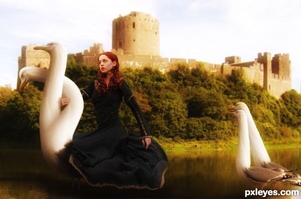
hehehe.. you are weird author  in a very good way, (Maybe the adult bird's body could be a little larger to accommodate the girls bottom?) but in fantasy, this image should be just fine
  good luck and good imagination
Thanks Slush, being called weird by you means a lot.
About the girls butt: hers isn't that big and you haven't seen the butt of an adult bird of this species...
like the dreamy quality of this entry -- nice work
I loved it.
Strange, stranger and strangest! Great concept, truly an unusual twist. Super!
lovely ........... 
Very very nice one...good luck
Congrats Rob...
congrats
Congrats
Congrats!!
congrats
congrats author!!!
Howdie stranger!
If you want to rate this picture or participate in this contest, just:
LOGIN HERE or REGISTER FOR FREE
Will add text to SBS images,sorry short on time (5 years and 3490 days ago)
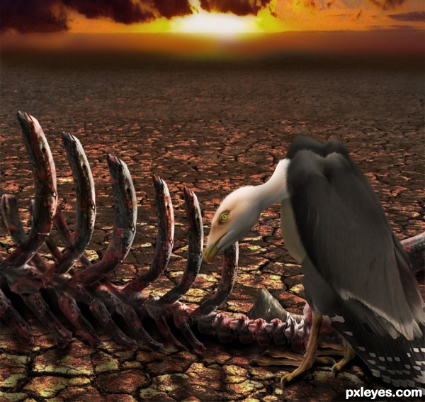
Good idea. The clowd perspective is wrong, it looks like they are going down and touch the surface. Also the skeleton is to bright on the viewers side, since you've got a very dark shadow on the surface, the skeleton's own shadow should be the same darkness. Nice bird creation! Gl
Thanks Ressiv, valid points! I`ve changed the whole sky to something more fitting and shaded the lower parts of the carcass a little more 
Very dramatic and touching. I like it... 
I like how you assembled the picture from parts of the original, it's an impressive work. The thing is that the colourfull sky creates a too strong of an entity that puts the foreground on second place, therefore nomatter how many details you place on the eagle and the carcase, the prime colours (sky) that take 40% of the picture will make those fade away,
You could either make the sky only 10-20% of the pic, or making the eagle and skeleton overlaping it, or.. using the sky in the original pic: the grey purple one.
Excellent work, I would only make the sun a tad brighter - just a thought.
Great transformation author...well done
Howdie stranger!
If you want to rate this picture or participate in this contest, just:
LOGIN HERE or REGISTER FOR FREE
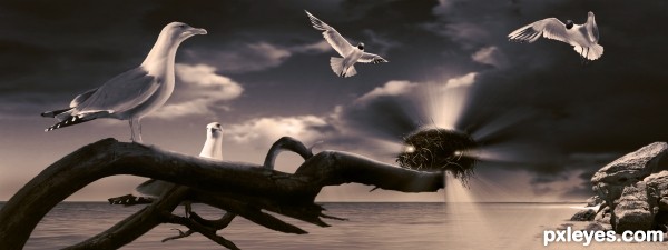
check out high res too... :) (5 years and 3491 days ago)
Beautiful... If it wasn't a seagull, I'd say it was the Holy Spirit. 
Nice concept, for some reason the nest seems to be off perspective to me, the first thought i got was that i was really far away, then i noticed it was on the branch, maybe you should remove from of the intense light placed on the bottom part.
awesome entry!
I really like this but I have to agree with akassa the composition makes it look as if the branch is heading miles out to sea (unless thats the intention), maybe a little blur could be used on the parts of the image in the distance to bring the nest back.
thanks for the comments guys...
I have to disagree with the perspective issue. I think it depends on how you're looking at it... but I have made changes to the light on the bottom of the nest, and fixed a few issues with the actual nest re the placing i.e. the bottom left corner... was infront when it needed to be behind the branch...
as always your comments are much appreciated
very nice...
great job, love the color and the mood 
very... very nice job. I realy like it ;D The color balance is perfect and it looks so mythical. Congrats!
Your light sources are all over the place. The bird is lit from the left, there is a sun  on the right behind the rocks, the clouds are lit from above right, and the light rays coming from the nest aren't illuminating anything...Good concept, CLEAN lines, but you need to consolidate the lighting and make it consistent.
MossyB: I think you are getting your left to right mixed up... the rocks are lit from the left hand side with the shadows on the right hand side exiting the frame... the sun is highlighting the central part of the clouds, highlighting the left rim ... assuming the sun is slightly off to the left also... so the lighting direction with regards to the rocks is fine...
so based on the sun being on the high left it's safe to assume that there would be a light source illuminating the birds on the left... if you look at SBS I added light to the face side of the gull as light from the nest... the rocks needed no adjustment as the light from the nest is also on the right... and as for the nest not illuminating anything... its illuminating the branch the gull and the two gulls hovering above... please refer to the sbs guide... step 6 explains the gulls 
Thanks for your comment 
Howdie stranger!
If you want to rate this picture or participate in this contest, just:
LOGIN HERE or REGISTER FOR FREE
Photography and photoshop contests
We are a community of people with
a passion for photography, graphics and art in general.
Every day new photoshop
and photography contests are posted to compete in. We also have one weekly drawing contest
and one weekly 3D contest!
Participation is 100% free!
Just
register and get
started!
Good luck!
© 2015 Pxleyes.com. All rights reserved.

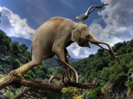
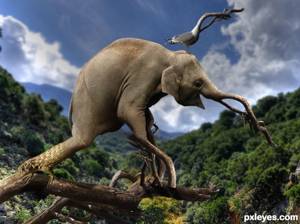
This is really creative and cool! Maybe there should be a shadow under the actual body of the elephant, on the log, since the legs have shadows...
I had a feeling it was you author!! Great piece Best of Luck
You are absolutely right Giulia! I made a slight improvement.
Incredible ...what an imagination! You have come up with a wonderful concept and great excecution of the whole thing; I particularly like the eyes and the lizard (which I did not notice at first, which made it even better). Bravo!
hehehe
nice work ........
I like this....nice and freaky!
funny image.., very nice
I love it !
This image is what we call "integrated to nature"... Very nice surrealism!
great imagination
Nice imagination...I love surrealism...Good luck author
very nice work
Pretty wild. GL!
It's a bit of a pity that the image isnt bigger, but for the rest too funny result, well done imagination! Good luck!
Very cool concept author...good luck
Congrats
Congrats Tucker terrific work
Congrats...
Well done Tuckinator on first place
Great win - congrats!
CONGRATS!!!
congrats
congrats
Congrats tuck tuck, crazy genetics at work there lol
Congrats
Congrats!!
congrats
Congrats :]
congrates author...well done
Congratulations!
Congrats little dude..you are on a rooooooooooooooooooolll !!!
Howdie stranger!
If you want to rate this picture or participate in this contest, just:
LOGIN HERE or REGISTER FOR FREE