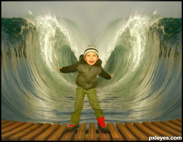
(5 years and 3461 days ago)
i will update sbs soon
(5 years and 3462 days ago)
Photography and photoshop contests
We are a community of people with
a passion for photography, graphics and art in general.
Every day new photoshop
and photography contests are posted to compete in. We also have one weekly drawing contest
and one weekly 3D contest!
Participation is 100% free!
Just
register and get
started!
Good luck!
© 2015 Pxleyes.com. All rights reserved.


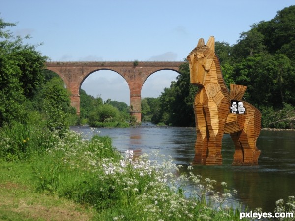
 (Horse needs more of a reflection...see bridge reflection). GL!


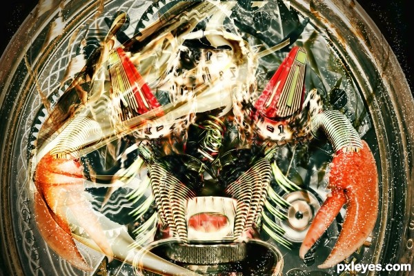
cool image...GL
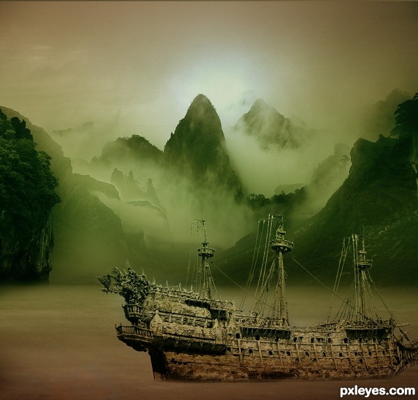
Did you mean "Moses?"
@MossyB: Moises is the Spanish name for Moses.
Like the idea -- think maybe you could straighten the boards so they are in one line
Very clean and fun image!
Cutie! Quite effective.
Howdie stranger!
If you want to rate this picture or participate in this contest, just:
LOGIN HERE or REGISTER FOR FREE