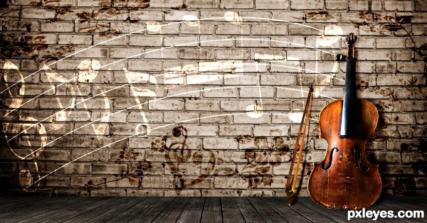
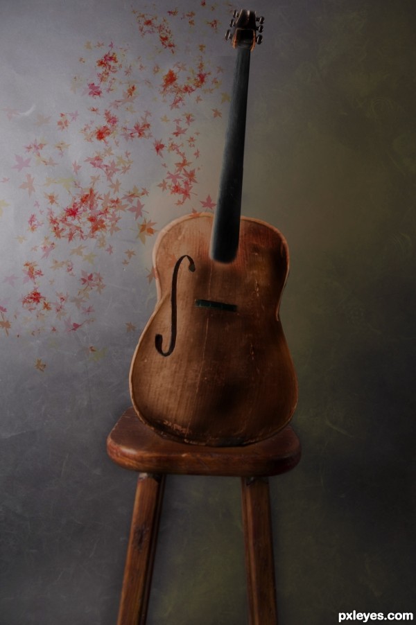
Comments and Critiques please. I feel like it's missing something and I should add a lot more.
EDIT: Changed perspective of violin to what looks right to me, tell me if it still it weird.
Added a bow, hope that didnt ruin the image. (5 years and 3473 days ago)





GREAT SHOT!!!
i quiet like it author, but to me the cello seems a bit flat the way its leaning against the wall.... they are rather big musical instruments... can you make it a bit more three dimensional ???

as i said though... i do like this idea
Violin is distorted.
composition is very nice,colors are cool but as Bob sad distortion of the violin is stab the eyes...
Thanks for comments . I think i undistorted it or it looks to me like i did and i added the violin bow.
Howdie stranger!
If you want to rate this picture or participate in this contest, just:
LOGIN HERE or REGISTER FOR FREE