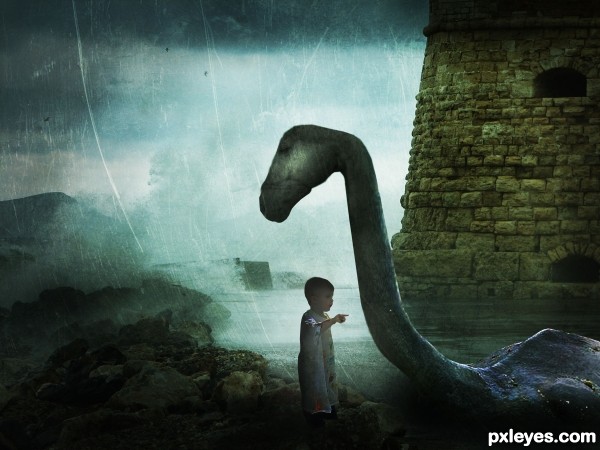
Credits to ~ttwm-stock , valpictures , Jaimie Duplass , Archin Camille and =night-fate-stock.
Im not very satisfied with it, so suggestions are welcomed.
Updated. Thanks everyone. (5 years and 3516 days ago)
- 1: Nessie
- 2: Horse
- 3: Boy
- 4: Background
- 5: Texture




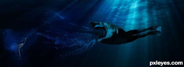


It's too dark. Mood lighting is one thing, but when it's like a bad case of glaucoma, you need to lighten the image. It's almost impossible to see your figures, they basically look like shadows.
EDIT: Much better. Your focal point is easier to appreciate now. Good work.
I brightened the image. Thank you.
Very nice mood author, and great imagination...good luck
I would suggest working a little more on the detail around the head, at the moment it looks very two dimensional, and it doesn't fit with the rest of the image. I also notice (even in low-res) that there is a section of very overstretched pixels around the neck, try to avoid that by duplication and cloning.
Good luck.
nice mood,but Its not new.stick with your own style.That's your real talent
textures are always fun! and i like your overlaying texture here (familiar, i think i've used that quite a few times! )...one thing, i might suggest using a soft edge eraser set at a 15 or 25 % opacity and erase a little more around your main focus of your piece...so that the texture doesn't detract from the focus. also, might make the boy a bit more visable, right now he's getting lost in the business.
 all in all, i say good luck to you!
i agree with ponti on the pixels on the neck...and on the bit of the head looking "flat" ... could us a bit of work.
Wonderful!! Love the mystical style!
Thanks a lot for all your suggestions. I'll work on that
Nice job overall, some very good points made above. The only thing that concerns me about the composition is that the little child is right under the monsters head, yet seems to be looking off into the distance rather than up at its face.
Work Updated. Thanks everyone
Did you try to place the kid a bit to the left and rotate his head so that he looks at the monster's head and not like ignoring him? I know it's not easy but it would have a great effect.
Lol I`m partial to a loch ness image myself .... Great image author & very best of luck!
Nice.
cute idea.... colors work well here.... little dark...but nice....gl author
I really llike that you did something different. That's the only way to grow. I agree about having the child looking up, but congrats on a good entry! GL
Howdie stranger!
If you want to rate this picture or participate in this contest, just:
LOGIN HERE or REGISTER FOR FREE