updated (5 years and 3421 days ago)
- 1: source1
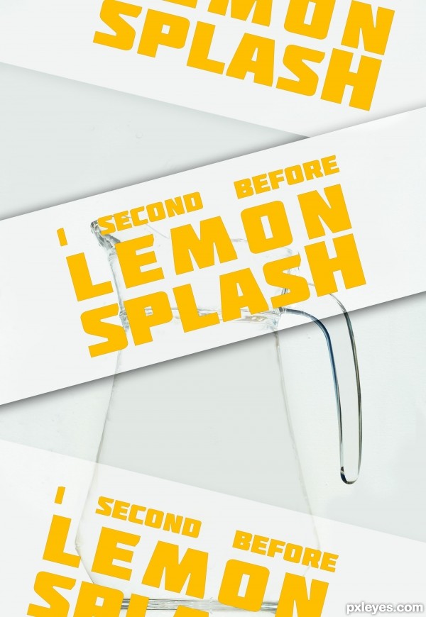
typo poster
eraser tools
no sense ...
in french: Pas d'idée, ni de message en particulier, juste une image ou j'ai travailler la gomme ...
(5 years and 3421 days ago)
What font pack is that?
typo source = font pack = http://www.fontsquirrel.com/fonts/Molot
THANKS!!!
I like it.
Can barely see the image with the posters going down in front of it. Next time just leave the wording in the title or description so we can see what you created.
Howdie stranger!
If you want to rate this picture or participate in this contest, just:
LOGIN HERE or REGISTER FOR FREE
thanks for all the constructive criticism, I appreciate it and it was just what i wanted :). (5 years and 3425 days ago)
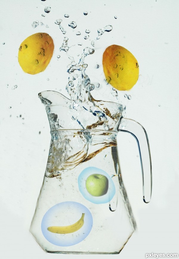
Top left lemon still needs some help with the eraser tool...
Thank you, your comment is appreciated  .
.
what about the bannana and the apple??
Yeah I must say I am a little confused by the fruit in the pitcher, and why are they surrounded by purple....?
The weird shapes around the fruits in the water don't make sense, and the color reflections at the top of the water in the pitcher needs to be slightly adjusted.
sorry, my first attempt at making bubbles, ill try to fix them up a bit  .
.
I would avoid text on the image unless it's integral to the message/meaning/point of the image beyond title of the entry (which does not seem to be the case here). Also, why is the banana smaller than the apple which is smaller than the lemons contrary to one's usual expectations?
I was going to make it bubble writing instead, don't know why i didn't.
And their... midget fruit..... yes that's right  , maybe the lemons are too big, which is why they're being rejected
  .
.
very nice try author...in the future,when u make bubbles always is nice thing to use same color as water or other bubbles and splashes...gives a bit more on realism...best of luck
Howdie stranger!
If you want to rate this picture or participate in this contest, just:
LOGIN HERE or REGISTER FOR FREE
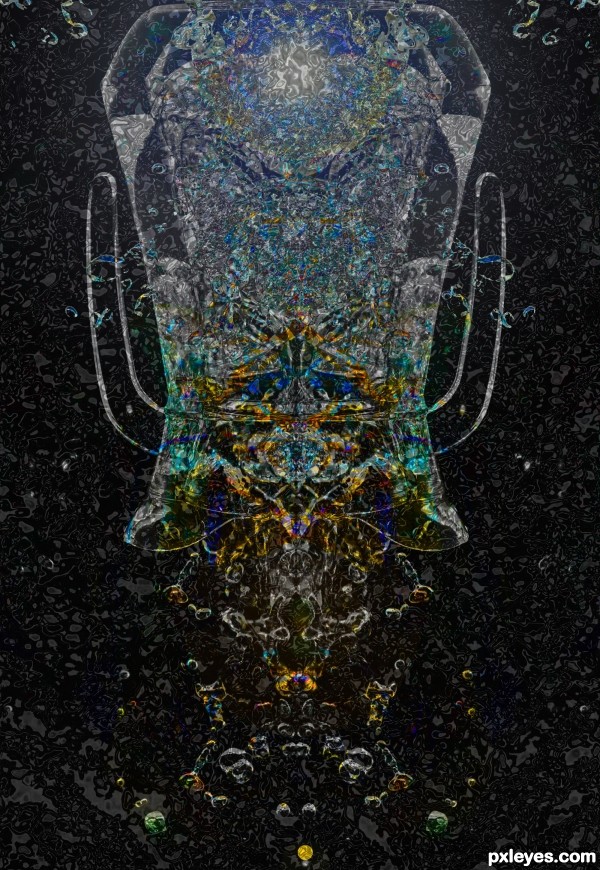
This is a deep sea jelly fish. (5 years and 3426 days ago)
could to see this as a mural,...large!
Interesting concept. I think some black space above the 'head' would better define the jellyfish. Plus the near-perfect left and right halves (especially for the background) is boring. Also, it all seems rather flat to me.
Howdie stranger!
If you want to rate this picture or participate in this contest, just:
LOGIN HERE or REGISTER FOR FREE
THANKS A LOT TO:
http://luckystock.deviantart.com
(5 years and 3424 days ago)
Personally I don't think there is anything bad about it. It's a step forward in the human race and knowledge. It's a personal choice that people make.. I know for a fact I would never do it but everyone has their own choice.
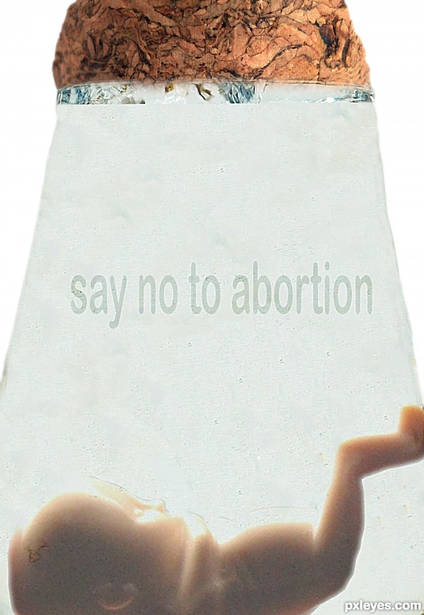
Coming back to the Photoshop side of things I think you managed to get your point across quite well. IMO maybe make the text stand out a little bit more or change the font. I don't know it just doesn't work for me. Good Luck!!! 

I love posters telling me what to do !

I'm with CMYK..says it all...
Strong image, Author  IMHO you'd better use capital letters. You could also add slight relief to the letters by means of pillow emboss. Good luck!
I would reconsider the entire image.. at the moment all i see is a fetus, a stopper that looks like brains and a weird grey light beam. It's a very deep thought with a strong message, but you have to think about what would fit in better with the given source. Maybe take the time to rebuild a new jug, or maybe use the glass to shape a pouch or a sphere to place the fetus inside.
Good luck 
I don't believe in people that try to dictate to the rest of the world, but I won't stick you in a jar!
I see nothing of the original source in this image. Bad photoshopping, grainy, stretched and makes no sense to me.... if you are going to be anit-abortion then make a clearer image and spend some time on it to prove you believe in your own words....
Freedom of choice, freedom of women, freedom to live or die......... my freedom is not your freedom!
What about the baby's right to live? Maybe you should have used a fetus with its skull crushed in. I guess it makes it easier to pull the dead baby's corpse out. See that? I made a statement about the image AND the statement at the same time!
I believe in your message but the photoshopping REALLY needs work, especially toward the top.
I can't help but think people are 'fav' the message but not the way you have photoshopped the content of the comp. ?? Each too their own i guess....
oH my!
Yikes, well you sure are getting a lot of buzz about this, but not really for the right reasons. Photoshop first, and then see if it portrays your message. We get the message but only from what the title says, but the actual image needs work, and that is what this site is about first and foremost.
So about the image, the only thing I see from the source is a bit of water at the top and the shape of the jar, and that isn't really photoshopping the source image. So I agree with Ponti55. Just a few suggestions for future references is all 
Howdie stranger!
If you want to rate this picture or participate in this contest, just:
LOGIN HERE or REGISTER FOR FREE
Photography and photoshop contests
We are a community of people with
a passion for photography, graphics and art in general.
Every day new photoshop
and photography contests are posted to compete in. We also have one weekly drawing contest
and one weekly 3D contest!
Participation is 100% free!
Just
register and get
started!
Good luck!
© 2015 Pxleyes.com. All rights reserved.

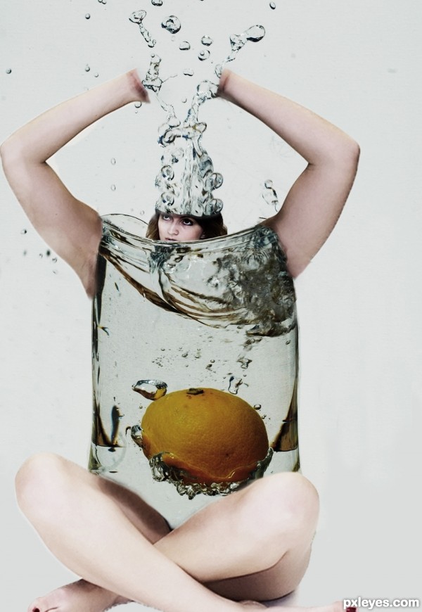
With some liquify to give a female form to the glass, a better attention to proportions and no hand amputation, this would be awesome. And no handle, as well. Anyway, it's a try.
Agrees with grey. The first thing that came to mind was Beetlejuice
I agree with Val, but damn this is funny...this lemon/orange is in her's uterus...
This is so weird and disturbing lol. I do agree with the others, though. Creative idea, just needed a bit more tweaking.
Howdie stranger!
If you want to rate this picture or participate in this contest, just:
LOGIN HERE or REGISTER FOR FREE