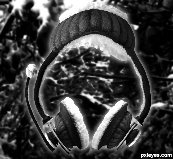
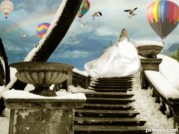
the cotton that cover your ear is made of ice. suitable when you have fever.
no outside source
(5 years and 3511 days ago)
Photography and photoshop contests
We are a community of people with
a passion for photography, graphics and art in general.
Every day new photoshop
and photography contests are posted to compete in. We also have one weekly drawing contest
and one weekly 3D contest!
Participation is 100% free!
Just
register and get
started!
Good luck!
© 2015 Pxleyes.com. All rights reserved.
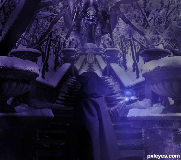
 Source 1 is the small monk. I put this on late last night and now i'm looking at it with 'fresh' eyes i think there is too much red. I will see if i saved this as psd file and upload a SBS (haven't done SBS before) I take all your comments on board and will see what i can do to improve this image (it needs it) Many thanks,


Good idea, but the background overpowers the image.
Thanks mate.. updated with a darker Background.
Love the ice cotton! Made me laugh!!! Fun entry.
Uhm, i never heard of puppet warp, but i'll google it . When liquefy gives you those wawes adjust it with a pen selection. I hate liquefy!!!
Great construction author...extra points for the idea...best of luck
Howdie stranger!
If you want to rate this picture or participate in this contest, just:
LOGIN HERE or REGISTER FOR FREE