The photos I used are my own.
(5 years and 3400 days ago)

Thanks to sxc.hu & Nick Bobby for 'Lovely Cats' (5 years and 3404 days ago)
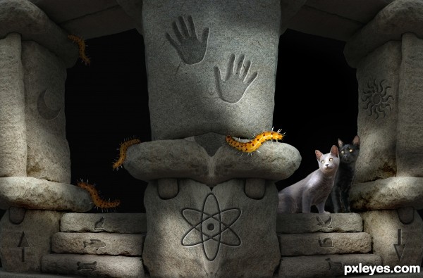
Nice creation author...u have to fix gray cat because u don't have light source which would highlight her like this...also in high resolution is clearly visible halo around the cats...
Thanks for the comments, but I am waiting for some other  commentators. After that I will think about your suggestion.
Yes, lighting and colors are funky, and mismatched. Great job on the cat shadow, by the way.
Decrease white outlines around cats & try to make symbols in stone more realistic. Right now the edges are too sharp, and most don't conform to contours of the stones.
The cats have light colored pixels showing, and the light shining on the grayish cat doesn't match anything else in your scene, same with the light reflection on the caterpillars. Inconsistent lighting is a vote killer for a lot of members...
Thanks for the comments all of you. I have made some changes now with help of my commentators suggestions.
This is an interesting image....with a message.... I like the way you worked out the lights and shadow now.... and also corrected the masking on your cats.... Good luck author.
Oh, love those cats  Adorable!
Howdie stranger!
If you want to rate this picture or participate in this contest, just:
LOGIN HERE or REGISTER FOR FREE

Thanks Melissa Schalke, steampirate (5 years and 3402 days ago)
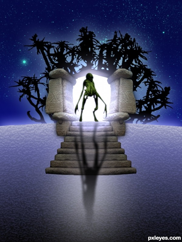
The creature doesn't look backlit, and the shadow should conform to the contours of the steps, as well as have more edge blur and maybe a bit less opacity.
Thank you for the help.
Good work with the portal.
The background looks unconvincing. Folks here use vegetation rocks or premade background to make the environnement look realistic.
Use imageafter.com and sxc.hu to find blendable stock.
It looks ok, but I think you should have used other kind of plants or background as greymval says... and the foreground is not convincing for your kind of work. The alien looks cool. The rocks.... look ok. Good luck author.
Howdie stranger!
If you want to rate this picture or participate in this contest, just:
LOGIN HERE or REGISTER FOR FREE
Photography and photoshop contests
We are a community of people with
a passion for photography, graphics and art in general.
Every day new photoshop
and photography contests are posted to compete in. We also have one weekly drawing contest
and one weekly 3D contest!
Participation is 100% free!
Just
register and get
started!
Good luck!
© 2015 Pxleyes.com. All rights reserved.

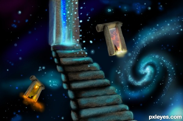
love the colors
The galaxies are beautifully done.
This image is really nice..love the colors..and the high res is good..the only problem i have with this image is the insides of the structures..the images are stretched out and distorted..my eye kind of naturally is drawn to that..but thats just a nitpick..still very nice..GL
TO INFINITY AND BEYOND!!!!!!!!
nice image.... good luck.
Great concept =)
Howdie stranger!
If you want to rate this picture or participate in this contest, just:
LOGIN HERE or REGISTER FOR FREE