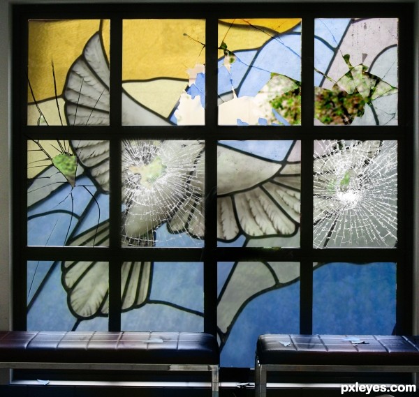
Source image used to making this entry. (5 years and 3309 days ago)
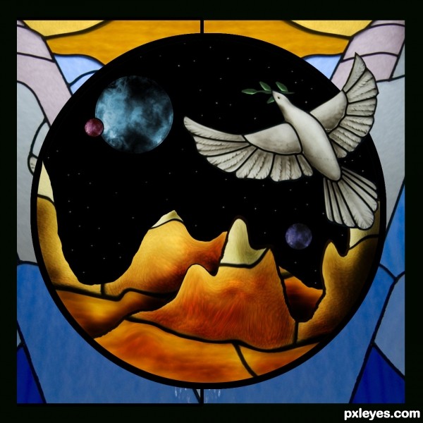
Only source image used in the making of this entry. Your comments and suggestions are appreciated, thank you. (5 years and 3309 days ago)
Nice! GL! 
Nice job...very well constructed!! My only nitpick is the glow around the planets...Looks out of place with the rest of the stained glass pieces..Best of Luck 
Edit:Looks really good author  I like the changes you have made
Thank you jawshoewhah. Christy, I will take the glow away. Thanks.
After seeing step 3 I thought you were doing great! Then you added the background, which took it out of the realm of stained glass and into something else. There's nothing wrong with that in terms of the contest, but I own a stained glass studio and in the real world, this would not work. Good luck anyway, I still like your image! 
Foreground is great, but (as CMYK46 has noted) the background doesn't connect. If the foreground is supposed to frame an opening looking out into space, then the planets and the stars behind them should look three-dimensional, not flat. Although it's not clear how any of that relates to your title.
CMYK: Thanks for your comment. I agree with you. I have a stained glass window in the house, and you are right, I had to have done something different, but this time, I wanted to do something like this. I know, the space and planets do not go with the picture, it is the meaning I wanted to put on it. A dove flying high above, as she does not find peace on earth. Dan: I think I answer your question about my image relates to the title. Thank you for comments.
very nice work author...GL
Nice change! :0
I don't have a stained glass window. I was just really impressed with the chop. With or without the glow it looks cool. Still one of my favs! 
Oh how cool!
Howdie stranger!
If you want to rate this picture or participate in this contest, just:
LOGIN HERE or REGISTER FOR FREE
(5 years and 3312 days ago)
wonderful!
Thanks 
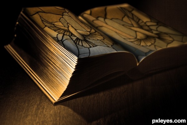
Moody and evocative. This is simplistic art at its best! 
i like this one...
Fabulous job author...Mood is perfect...well done
this is very lovely! i love the medieval look to it!
nice idea and lovely work ......all the best to u.......... 
Its so simple but I love it!
Howdie stranger!
If you want to rate this picture or participate in this contest, just:
LOGIN HERE or REGISTER FOR FREE
(5 years and 3313 days ago)
Looks good!
GROOVY!!!! 
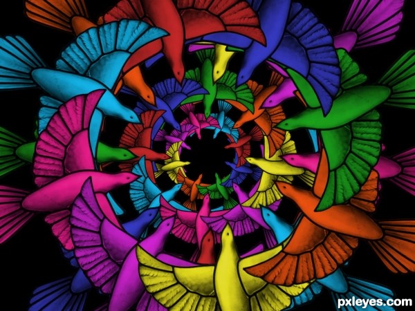
Psychedelic! Far out even!
Nice color palette .)
Love it!
nicely done...!
cool
very nice work and cool effect...gl author
oOo!!! Cool! Very psychodelic!
Howdie stranger!
If you want to rate this picture or participate in this contest, just:
LOGIN HERE or REGISTER FOR FREE
(5 years and 3307 days ago)
Except for the foreground, it's not a bad chop. The only suggestion I would make is blur the foreground just slightly. It would give it more depth. In high res, some edges could use some touch up but only noticeable in high res. GL!
Good idea author!! Now I personally have never tried to make glass shards but to me they look like they lack depth...kinda looks like paper and not glass....Hope that makes sense  Best of Luck
It might look better without them.
Thanks, removing them in a moment.
In real life, if you have an window like that, when a part of it is broken the craks are only on that part, they cannot extend to the other pieces, for example the midle left piece, the crack should not extend up or down. I hope you understand my point of view.
OH NO! JOSH! THEY BROKE YER GLASS!! hehehe  Good work here.
Author final product is very very nice...I don't agree about glass shards...think they made very well but that is MHO...maybe u could create some rays of light passing through holes to achieve more effectiveness...Any how...high marks from me
@ MnM FunnnAY!!! 
good work author........
Awww, thats not nice! I mean the image is, just what happened lol. Great job at achieving that effect.
Howdie stranger!
If you want to rate this picture or participate in this contest, just:
LOGIN HERE or REGISTER FOR FREE
Photography and photoshop contests
We are a community of people with
a passion for photography, graphics and art in general.
Every day new photoshop
and photography contests are posted to compete in. We also have one weekly drawing contest
and one weekly 3D contest!
Participation is 100% free!
Just
register and get
started!
Good luck!
© 2015 Pxleyes.com. All rights reserved.

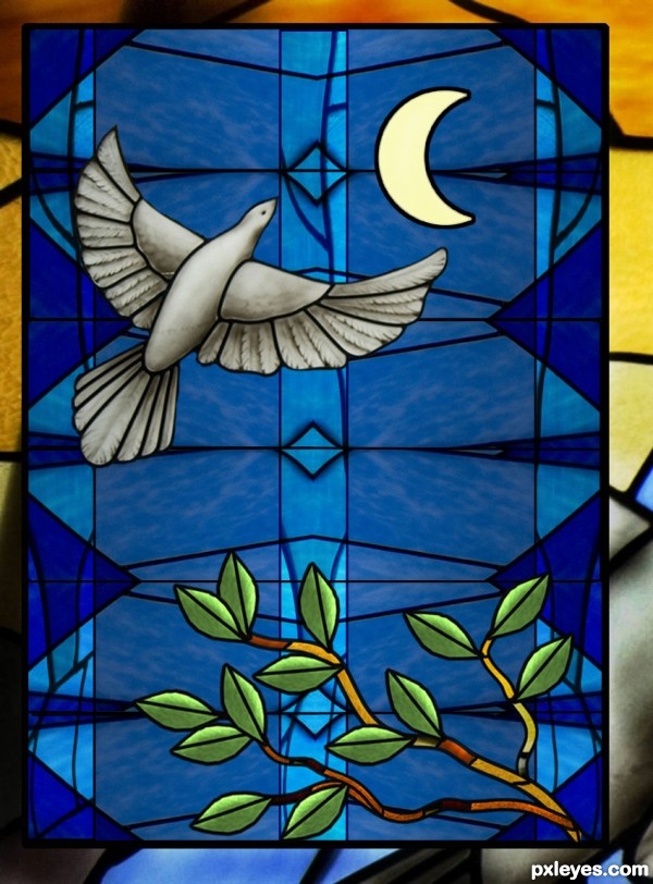
Nice entry! GL!
Looks good. I would have added more color.
Nice. The crescent moon is an interesting element, but a different color such as pale yellow would give it a greater impact. The crisp, uniform borders of the dove's glass pieces should follow through to all the pieces.
Thank you for your comments and suggestions..... I appreciate that.
CMYK: Thanks about color. Dan: Thanks about the pale yellow moon.
very very nice work author...I have one idea for u...u could create branch from the parts of the source image...i know that u have perfect skills for something like that...That will give a bit more effectiveness to the image...and u could place it in any lower corner...just an idea author...
Thanks Erathion... hope the branch looks good... Good idea!
Wow author i love...awesome work with the branch...Now is perfect...well done
very nice work!! so realistic!
beautiful gl
gl
oOo pretty! I want this as my window!
Howdie stranger!
If you want to rate this picture or participate in this contest, just:
LOGIN HERE or REGISTER FOR FREE