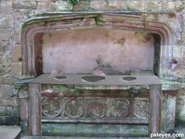
Priory gets new toilets
Edit:
Added a touch of Gaussian blur to source image to blend...as suggested, hope that looks a bit better. (5 years and 3399 days ago)
Photography and photoshop contests
We are a community of people with
a passion for photography, graphics and art in general.
Every day new photoshop
and photography contests are posted to compete in. We also have one weekly drawing contest
and one weekly 3D contest!
Participation is 100% free!
Just
register and get
started!
Good luck!
© 2015 Pxleyes.com. All rights reserved.


Trying blurring the source image a little to help blend it with the background Best of Luck
Still too sharp edged in the front, making it look cut and paste with a bad distortion. The dark edge is part of the problem. Very creative idea, though!
Howdie stranger!
If you want to rate this picture or participate in this contest, just:
LOGIN HERE or REGISTER FOR FREE