(5 years and 3502 days ago)
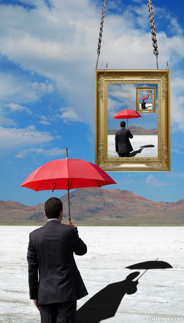
- 1: Chain
- 2: Picture Frame
- 3: Fish Hook
- 4: Salt Flats

The concept was built in the process. The only complicated part was the making of the water, which I taught myself through and online tutorial (http://photoshopcontest.com/tutorials/26/displacement-water.html). (5 years and 3505 days ago)

thanks to obsidian dawn for the light and sparklies brushes (5 years and 3502 days ago)
HOLY CHIT BATMAN! I love this! Very nicely done!!!!!
ok now I need to pic yer brain... but gotta get PS first
I don't know if it is on purpose,but this first guy lost his shadow??
Crap! Thanks! Definitely not on purpose
 (your avatar)
Thanks for the tip.. Duke!
boring...... still a same idea which someone already used before
Uh, oh, Bingbong forgot his/her TACT home.
It might not be very original but it looks good, the only problem I have with this image is that i don't like the warped chain rings that now have a 2D effect, and that the left one is smaller than the right one. But these mistakes could exist cause you ran out of time or something, i guess.
yes the idea is lil bit common here but the execution was well done tho,.......well I am sort of agreeing bingbong 'the my grumbling mom sounded like girl' ....hehehe
love the shadow!
"insert sarcasm here"
Hey bingbong88 way to break rule #3.4:
Don't make negative comments without suggestions for improvement. (eg. "THIS SUCKS", "WHAT A MESS", "LOW VOTE FROM ME", ...) The author will be discouraged by these comments can do absolutely nothing with them. There's nothing wrong with critique. But, it should come with a suggestion. * DON'T talk about your favorite holiday destination in someones entry. "end sarcasm"
I know it's a common effect and tequniue! It's Droste effect! Guess what Bingbing:


 Why don't you place in something first before you go around saying something sucks because I feel like Pot, and you seem like Kettle.

Jimmy crack corn, AND I DON'T CARE!!!!!!!!!!!!!!!!!!!!!!!!
Besides I've seen your portfolio.
Thank everyone else for the comments!
And yes Greymval, I ran out of time. The idea came to me and I wanted to put it into effect while I had time.
bingbong088, I have to say just a little something here. I myself have "TRIED" to duplicate pictures that I have seen as soooo wonderful and eye-appealing. I have also been called out on it (in a more constructive way) but those same people have also understood that there are lot of shots out there that MANY will LOVE and MANY will TRY or SUCCEED in duplicating or even making better. One picture inparticular was the below link and I tried to do it when I first started photography to see if I could learn such thing as to make what I like seeing. I was not able to at the time and then I thought recently I made it work.

http://www.pxleyes.com/photography-picture/4cef32d2b35ff/Til-Death-do-we-Part---.html
Now in the case of here... I know the photographer can do sooo much with the talent this person has and I really like how the author has done this shot. I might not be a PS person but when I see this I really like it. YES I've seen it before but as someone once said...
We've seen a lot of shots a lot of times that we remember and will continue to see people replicate them. You could have asked..."haven't I seen this before?" and I'm sure this author as well as most others would come back with "yes, it's this person or photographer and I tried to replicate it or do kind of the same thing". Or something like that.
Just be open-minded to everyone. I've been in the situation before as you probably saw with the above link. It's not like they are claiming every idea as their own. When they do, then by all means, call them out
ok so it wasn't a "little somthing"... I have the gift... or curse of gab
shadow's edge seems way too sharp, blur it a tiny bit to make it look more realistic
I would if I could Kid...
i think the shadow is fine the way it is..and why not author?
Oh it could probably stand to do with a little more blur and maybe less opacity. It's too late because it's past the submission (and editing) deadline.
im famouse person right now lol everyone just need to aim on me that all
its my opinion whatever u think yah im hater .....lol
y make it so serioous idont get it
and another person aim on me get benefit as well
???
How doesn't another person benefit from you commenting "boring" on their entry? They DON'T.
You know what's really boring??? Your portfolio.
Great work and just ignore the foolishness. Not worth your time ... it is better spent creating lovely artwork like this one!
Yeah, I know but it's just more fun to put them in there place
Extremely great droste effect...well made author...best of luck
The drost effect is a bit trite and overworked as a concept, but your execution is very good!
Now THIS was better than I expected
Howdie stranger!
If you want to rate this picture or participate in this contest, just:
LOGIN HERE or REGISTER FOR FREE