This tutorial was inspirational:
http://night-fate.deviantart.com/art/manipulation-tutorial-7-89088380
Layer masking with curves, color balance, and levels layer adjustments applied. (5 years and 3387 days ago)

Made one month before. And now I'm sharing it.
I would like to thanks:
http://faestock.deviantart.com/
http://lovehorses14.deviantart.com/
http://forsakewolf.deviantart.com/
http://f-l-o-w-e-r-s.deviantart.com/
http://laszlo-616.deviantart.com/
for providing s t o c K! (5 years and 3390 days ago)

Credit to :
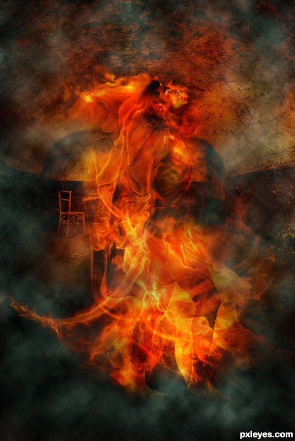
1.LadyDeath666.deviantart.com : for fire.
2.Jascha400d.sxc.hu : for background image.
3.Falln-stockdeviantart.com : Smoke Brush
The other image is my own.
(5 years and 3387 days ago)
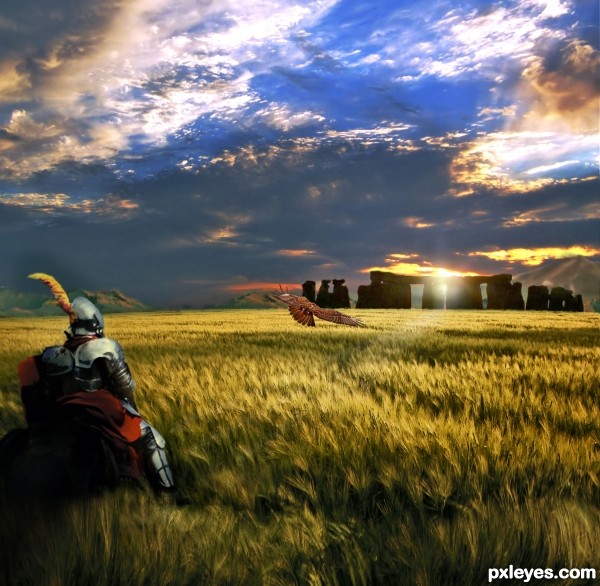
Interesting image. The bird is way too low to have any dramatic presence in the pic. It would have much more contrast & visual impact against the darker area of the sky.
Lots of elements nicely put together! The hawk is a good contrast against the golden wheat and Stonehenge pillars. Very nice work, author.
With the sun setting behind Stonehenge, the knight should not be showing a bright reflection from the other side...Inconsistent lighting.
1. In the meadow.
I suggest you make the grass look like it's on top of the horsy- either add a mask to the horse or copy a piece of the tall gras and put it on top of the knight layer.
It would be more interesting if it looks like they already entered the meadow.
2. Darken their back.
The light on the knights armor comes from the back, but in your environnement the sun is setting in front of the characters. So, either try to remove the shining on armor and horse hips with clone stamp or add a new layer and paint over with black & blend after .
Wow dude! Now this looks cooler than in my imagination !
!
There are some mask probs left corner (better seen in hi-res), but you can fix them quickly.
Nice job!
very very nice effective work...great job author...GL
Howdie stranger!
If you want to rate this picture or participate in this contest, just:
LOGIN HERE or REGISTER FOR FREE