Thanks Wonderlane,MAXFX, D.H. Parks,seanmichaelragan, naquib,davco9200,Vely,joncandy,Marek Kosma,ahisgett,Galyna Andrushko,Alan Vernon,Stanislav Komogorov,Wikipedia
(5 years and 3383 days ago)

Thanks to:
- martinluff and Ken Lund @ Flickr;
- ortonesque @ Sxc.hu;
- starush and Guido Cognoli @ Photoxpress;
- mjio @ RGBStock;
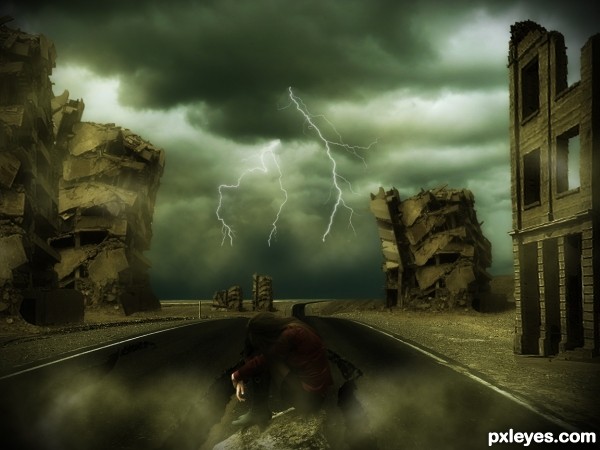
- Obsidian Dawn for lightning brushes. (5 years and 3382 days ago)

My first attempt on Gimp.
Thanks to:
- Ayla87, andreyutzu and n9knorris @ Sxc.hu;
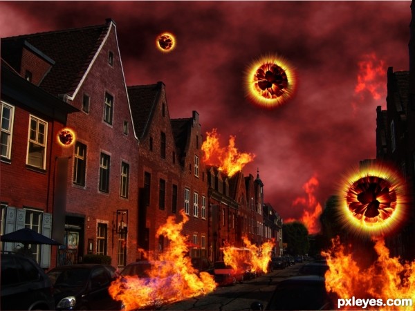
- "How to explode a planet" tutorial (in Portuguese) @ Baixaki.com.br.
(5 years and 3380 days ago)
hey dear
you should play with some light
More links.
http://www.flickr.com/photos/alanvernon/3200782322/
http://www.flickr.com/photos/alanvernon/3199939305/
http://commons.wikimedia.org/wiki/File:Mufflon_MGH.jpg
http://www.photoxpress.com/stock-photos/stone/water/fall/1953251
http://www.photoxpress.com/stock-photos/beach/sea/water/2489409
All the links work. crlt+c crlt+v
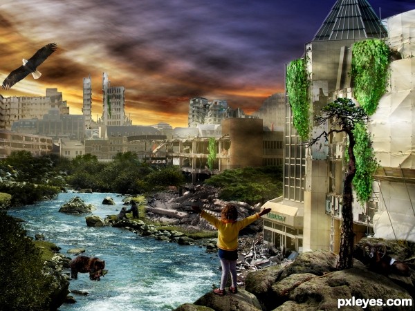
I rather like this one I like the solitary human and animals, it gives a definate feel that something has happened. I like the pose of the girl who seems to be celebrating that life is still existing
 ..... but other than that its good work author.
The only thing i would say is that some of the buildings look a little washed out in the background and maybe play a little with your lighting on the buildings
Regarding Keilly22's observation, if you duplicate the background layers that are washed out it should give them more presence & stronger color.
mayby you could use some blend modes or filters or just anything to let it look more like one image and not different images cut and pasted !

I wish you very much luck on the path of creating
GL author
Howdie stranger!
If you want to rate this picture or participate in this contest, just:
LOGIN HERE or REGISTER FOR FREE