source and my photos (5 years and 3349 days ago)

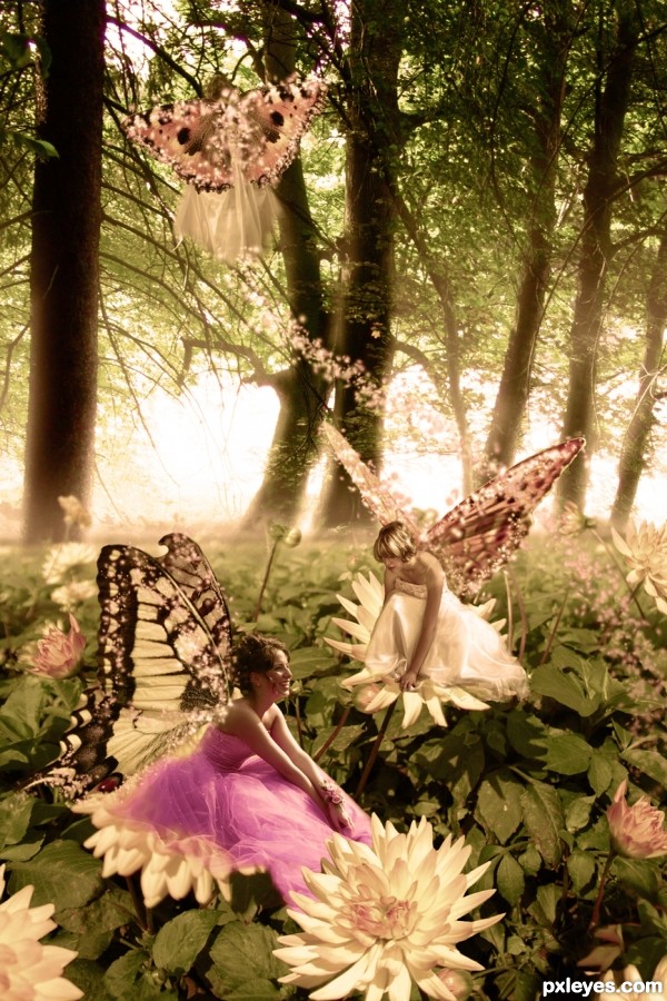
It took me a while searching for the right pics and cropping them. I added some flowers to the foreground to make it more attractive. For the mystic light coming from the background, I made a new layer with a black and white gradient and blended it over the layer with the trees. I used a smooth scattered brush in light pink and white for the fairy glow.
The overall color adjustment was made with an orange photofilter and a new layer with brown color and less opacity. (5 years and 3350 days ago)
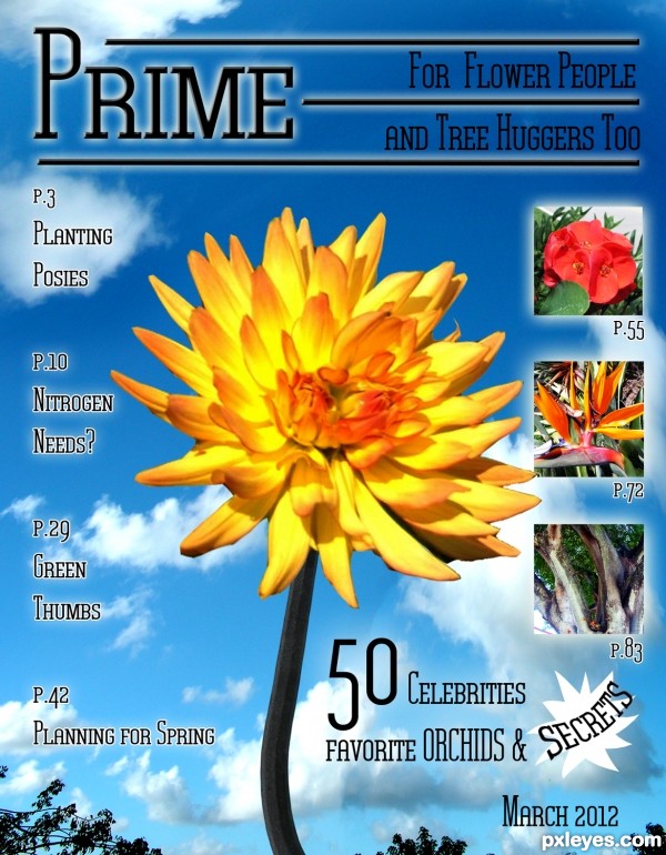
Creative! This reminds me of an old contest in the PST days. It was a great contest. Good stuff, author!
wow, creative. I will buy this issue.
As a tree-hugger, I represent that title! Nice graphic design, author!
That's a beautiful birds of paradise.
Fantastic covers author...very neat,bright and positive...well done
thanks everyone, and yes erathion, this is my style of draft advertisements I used to make for magazine ads, I'd make the base then have the client add all the text and messaging stuff, thanks for stopping by
Howdie stranger!
If you want to rate this picture or participate in this contest, just:
LOGIN HERE or REGISTER FOR FREE